
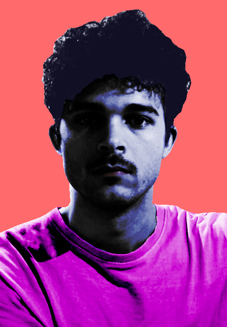
Ive contemplated doing this Brief a lot. I Confidently chose this brief as soon as i read it; even before reading the others, but i think i was also tunnel visioned on the idea of doing patterns. as much as i know surface patterns can go towards so many different things rather then interior design, i feel as though if i did this brief the 'hero' aspect of it isnt my thing and would borderline be a lie if i chose anyone to do it of, real or not. there are characters and people i could choose, like scooby doo (or anyone in the gang), luigi, freddie mercury or even my own father, as they are interesting for me to dive into and figure out stories and ways to relate them to patterns etc. But i dont think i coulddo it and feel satisfied as they arent 'heroes' to me. I havent taken the term 'hero' literally, i more took it as someone in my life to whom i have grown up knowing that has a suffiecient and interesting background to me (sorry dad, love you lots, too close and personal you know?).
i still however really liked the idea of patterns or creating a surface of art that is summing up a story at a single glance. The idea of doing that specifically enticed me. all the other briefs, as interesting and open as they are, didnt feel like something i could do and be satisfied with. what materials i use never interest me, and the digital world and how we are percieved is something that also just doesnt interest me, its something quite daunting to be honest and not the most happy topic. Anyway, something i want to do for my dissertation and so i want to try and do it for my projects too is look at things like retro and nostalgia, but also the 60s/70s and the hippie counterculture including the music and psychaedelia art that almost ran those decades (more specifically in america, but was in other places too). That whole art style and movement isnt around anymore and is also one of the most imitated onces at that, but in such a way that its never felt the same, and is glorified for media and the modern times. This being said, I wrote my own brief...
i still however really liked the idea of patterns or creating a surface of art that is summing up a story at a single glance. The idea of doing that specifically enticed me. all the other briefs, as interesting and open as they are, didnt feel like something i could do and be satisfied with. what materials i use never interest me, and the digital world and how we are percieved is something that also just doesnt interest me, its something quite daunting to be honest and not the most happy topic. Anyway, something i want to do for my dissertation and so i want to try and do it for my projects too is look at things like retro and nostalgia, but also the 60s/70s and the hippie counterculture including the music and psychaedelia art that almost ran those decades (more specifically in america, but was in other places too). That whole art style and movement isnt around anymore and is also one of the most imitated onces at that, but in such a way that its never felt the same, and is glorified for media and the modern times. This being said, I wrote my own brief...

I feel like writing my own brief was the best way for me to get into it and also be able to relate it back to what ive been interested in for third year anyways. It basically states to pick a culture, subculture or counterculture and create work through research on it, creating a piece at the end showing their stories and culture. whatever that may be.
now im not too sure if a decade of time can be classed as a culture, but the counterculture within the 60s is what i want to look at and explore. like i said before theres all the things from the music to the psychedelia that i find really interesting. the movements that they have done whether for political reasons or not. Just their whole vibe and aesthetic in general is something i would like to analyse.
now im not too sure if a decade of time can be classed as a culture, but the counterculture within the 60s is what i want to look at and explore. like i said before theres all the things from the music to the psychedelia that i find really interesting. the movements that they have done whether for political reasons or not. Just their whole vibe and aesthetic in general is something i would like to analyse.
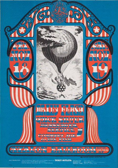
One of the main starting points i have into this is the Big 5 of psychedelia art in the 60s.
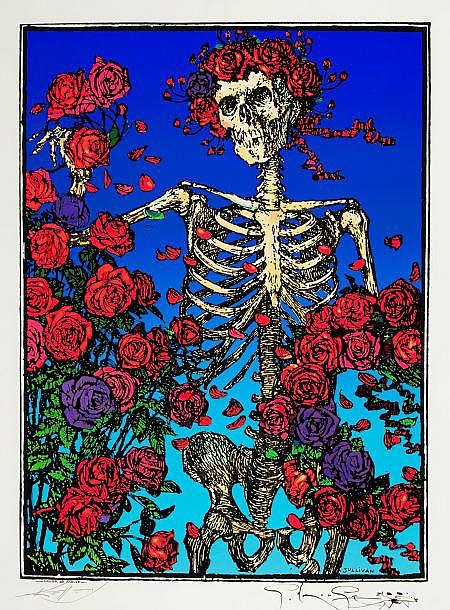
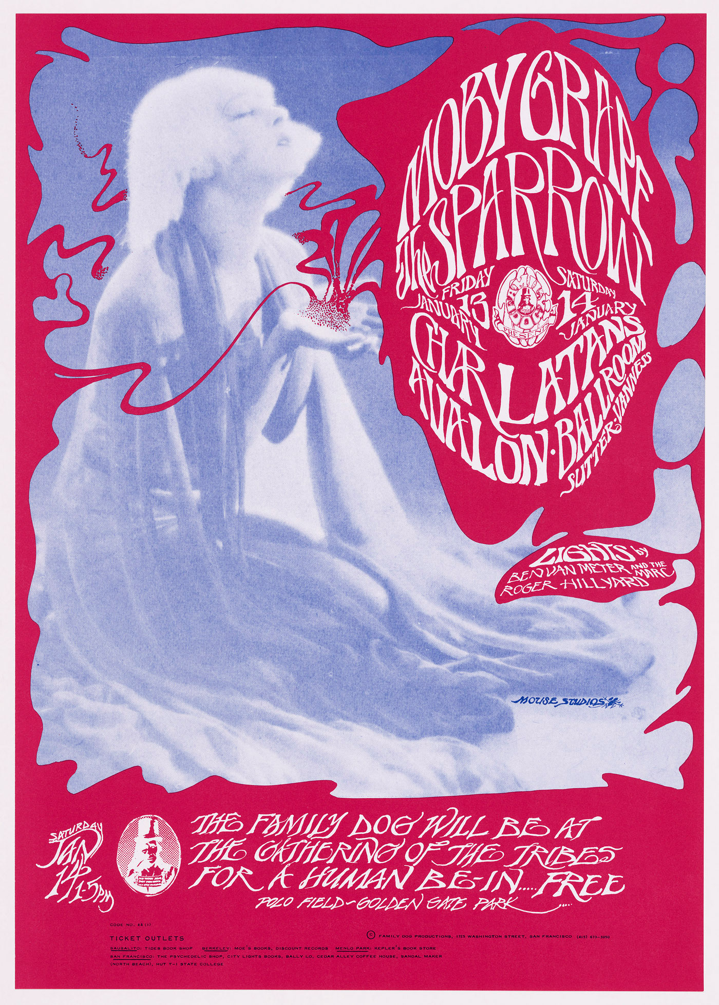
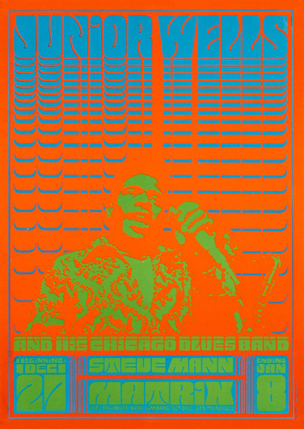
Alton Kelley is mostly known for his designs for rock concert posters and album covers. he is also creditited along side other artist stanley mouse, for creating the beetle on all journey album covers, and the skull and roses image for grateful dead.
He has a really nice use of colour, the limited palette also feel so refined and specific. sort of forcing us to look at it more becuase its so vibrant at times. you can also tell that his way of doing his art is through print and also handmade as there are imperfections throughout (but who doesnt have those), noticing them though and then keeping them in give his work a sense of confidence and completion, i feel.
He has a really nice use of colour, the limited palette also feel so refined and specific. sort of forcing us to look at it more becuase its so vibrant at times. you can also tell that his way of doing his art is through print and also handmade as there are imperfections throughout (but who doesnt have those), noticing them though and then keeping them in give his work a sense of confidence and completion, i feel.
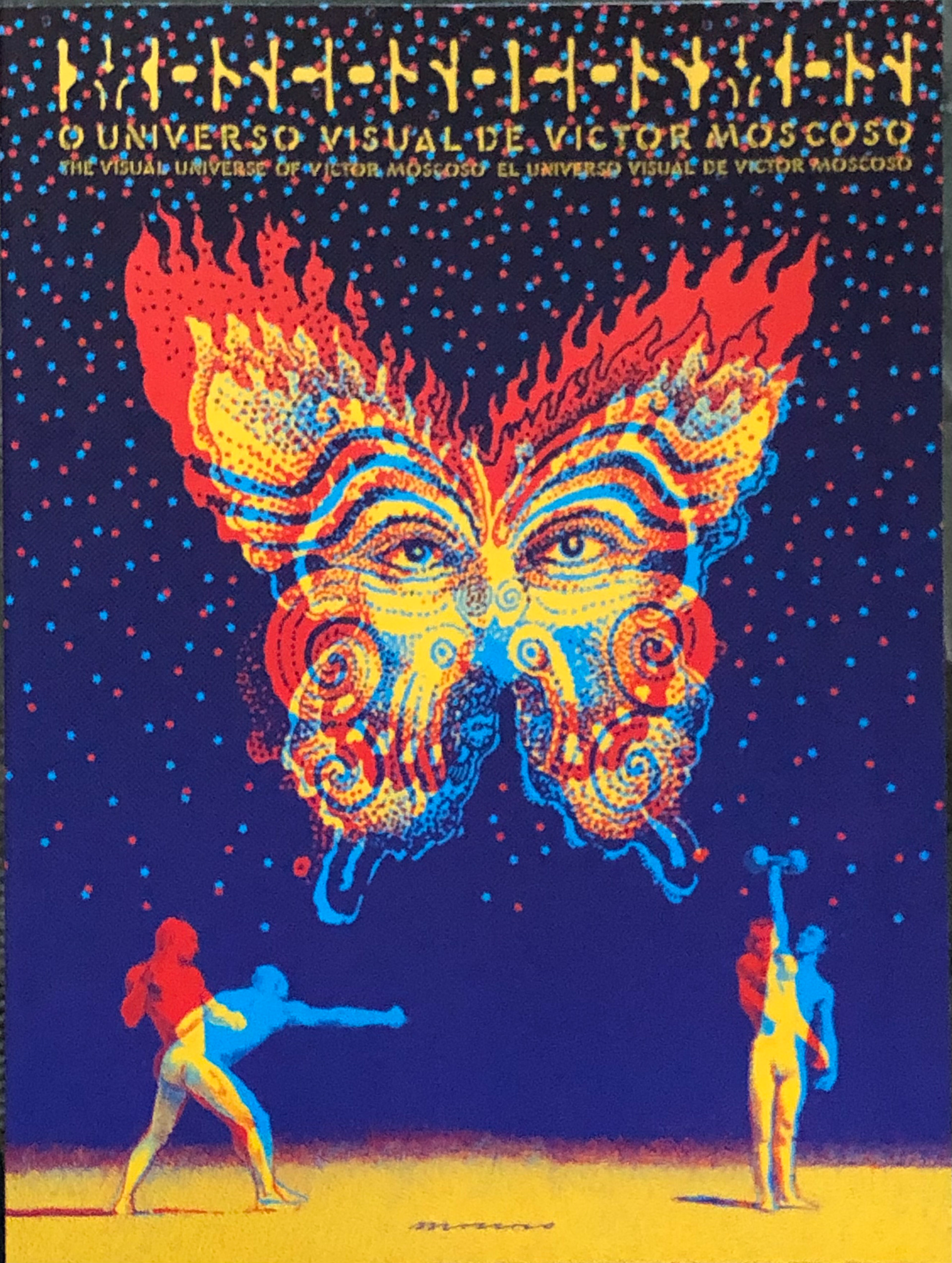
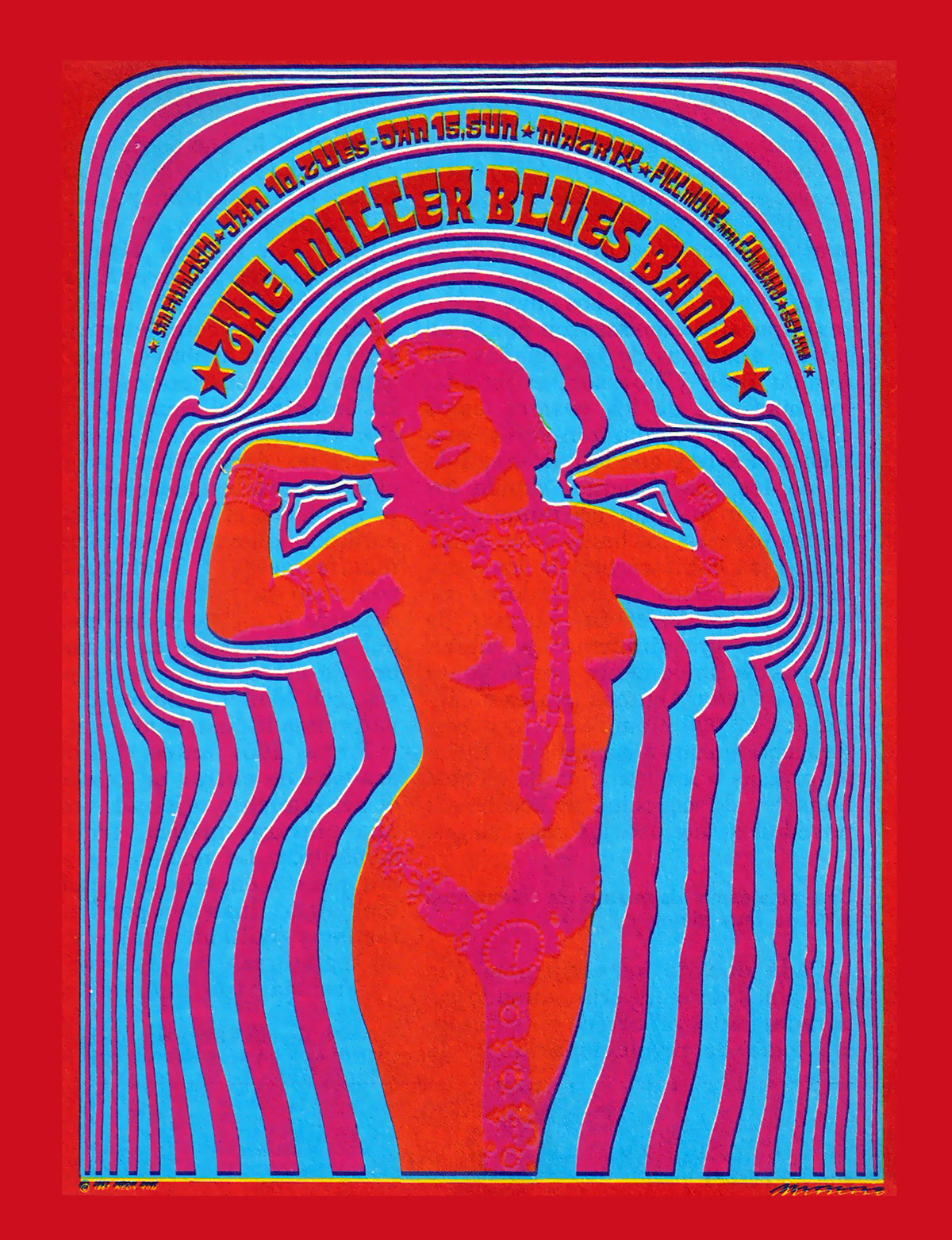
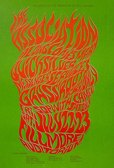
Victor Moscoco also created some really interesting and eye catching rock posters and advertisements. he was also the first rock poster artist to use photographic collage in his work. He created the cover 4, 10 and 13 for Zap comix, a small satirical comix series. it only had 17 publishes over 46 years.
https://www.coverbrowser.com/covers/zap
https://www.coverbrowser.com/covers/zap
Rick Griffins first pyschedelida poster was for theone - year anniversary of the psychedelic shop on haight street. they were so impressed by his work that they asked him to design more. He was also one of the founders of Zap comix.
Rick griffin is definitely my favourite of the big 5, i love how smooth and noticable his style is. his choice fo colour is so specific and bright, yet also washed and has a clean finish to it, in these specifically chosen pieces anyway. hes also done a lot of pen and pencil work alongside his defined paint/pencil colour art. his art is very defining of the rock and roll 70s easthetic, its sort of all over the place but has a high resolution, which wasnt very common at that time given psychedelia art took over for a period of time, at that a lot of flat colours. alongside the rise of pop and optical art.
Rick griffin is definitely my favourite of the big 5, i love how smooth and noticable his style is. his choice fo colour is so specific and bright, yet also washed and has a clean finish to it, in these specifically chosen pieces anyway. hes also done a lot of pen and pencil work alongside his defined paint/pencil colour art. his art is very defining of the rock and roll 70s easthetic, its sort of all over the place but has a high resolution, which wasnt very common at that time given psychedelia art took over for a period of time, at that a lot of flat colours. alongside the rise of pop and optical art.


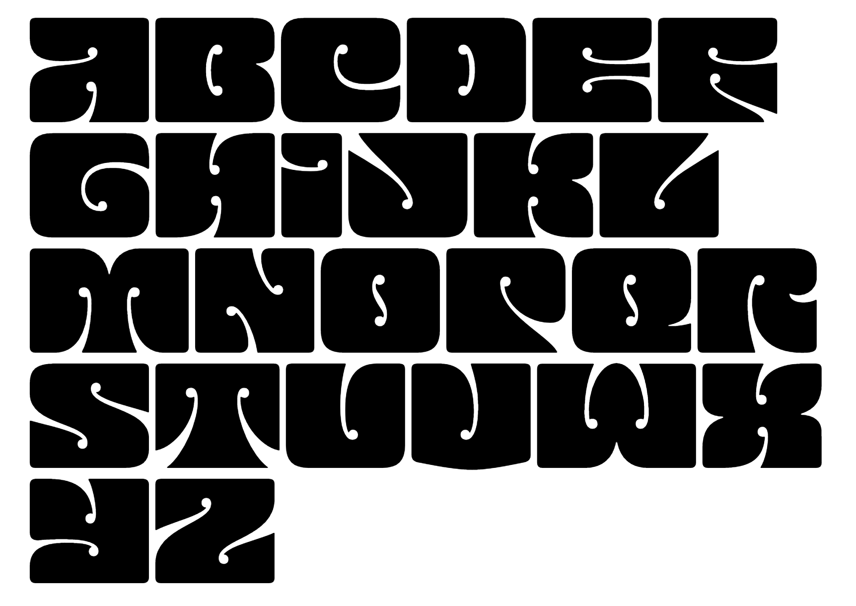
Wes Wilson, king of confusing typography. partly his font was created to fill up space and make it something that people wanted to look at. as much as fonts are created for different situations, formal, informal etc, wes' font was created to be eye catching, to make people have to look longer to understand what was being said. he says he would ''try to put together colours that were really exciting... all based on this idealism of 'things are going to get better' ''
i think his type is really interesting, the open counters and counters are very unique and allow the letters to be stretched and contorted to fit into the frame given much more naturally then other types. it doesnt have any serifs and every letters is almost squashed into a square shape, so there are no clear bars or ascender lines, though they are there. also no lower case versions so its has the same purpose as a display typeface.
https://www.npr.org/2016/05/13/477900499/psychedelic-font-how-wes-wilson-turned-hippie-era-turmoil-into-art


and lastly of the big 5 is stanley mouse. at a very young age he started selling his own art with his family created mail service. later to live with fellow 5 member alton kelley to create art for the band grateful dead. also creating art covers for journey, they also developed t-shirts.


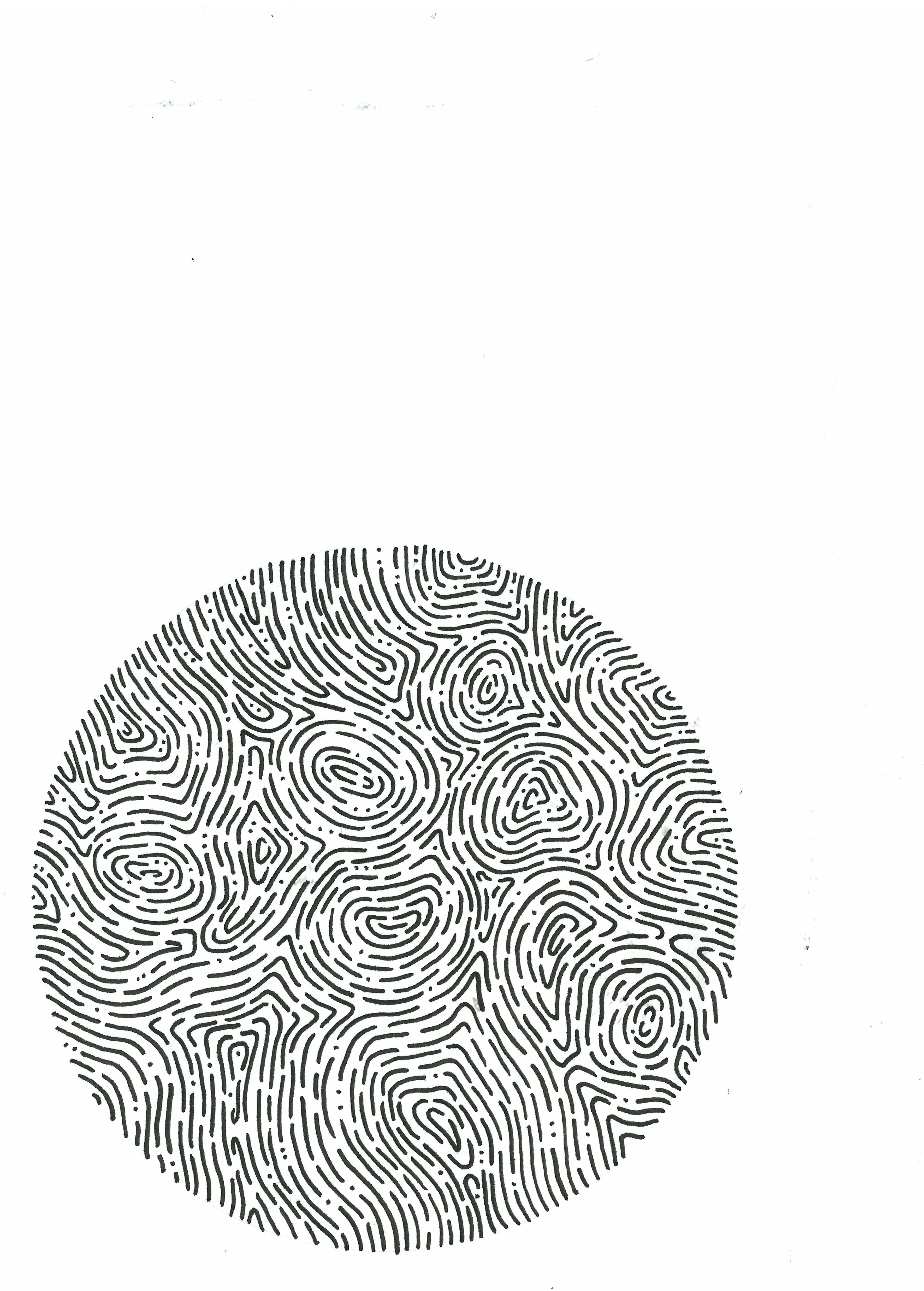
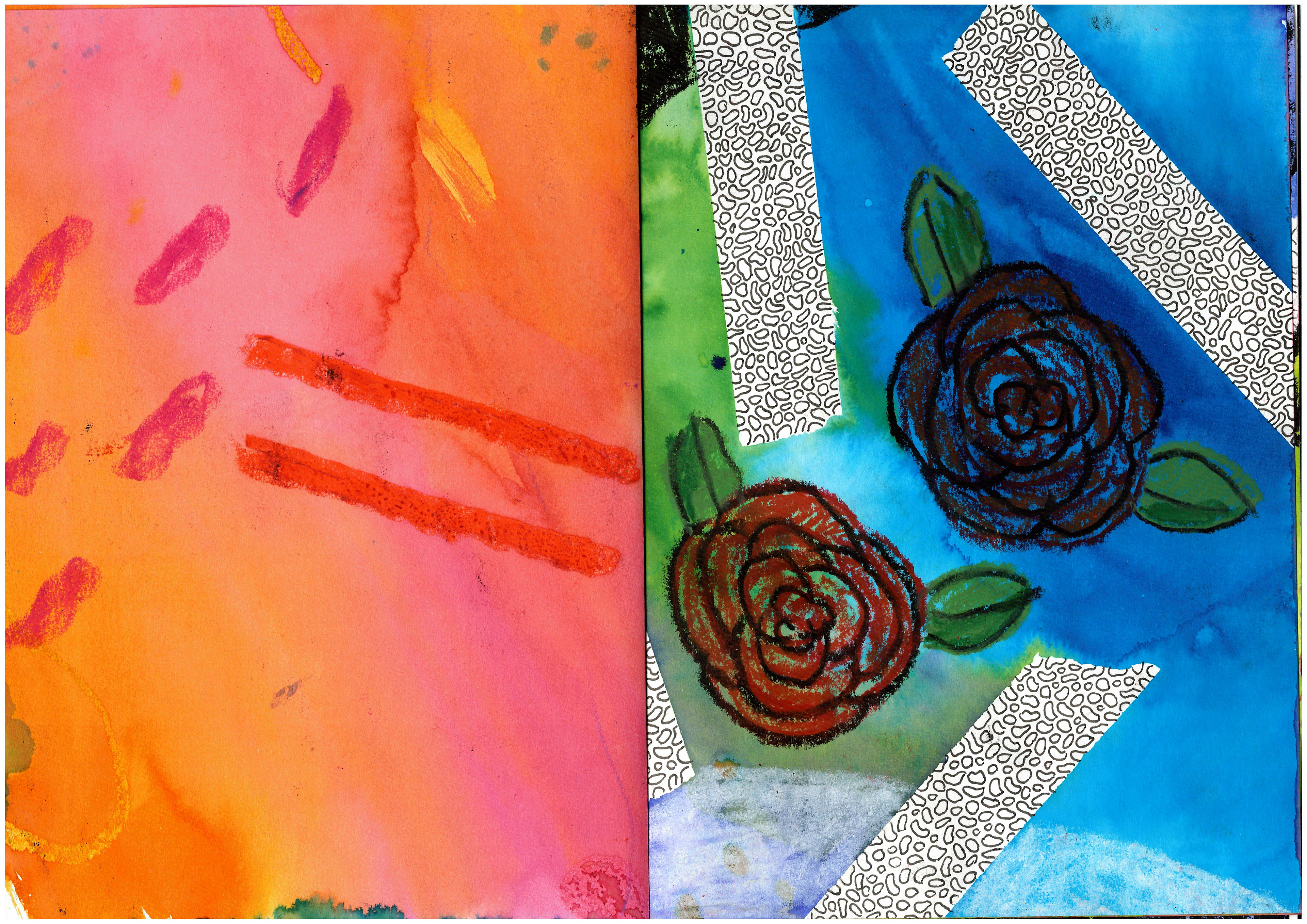
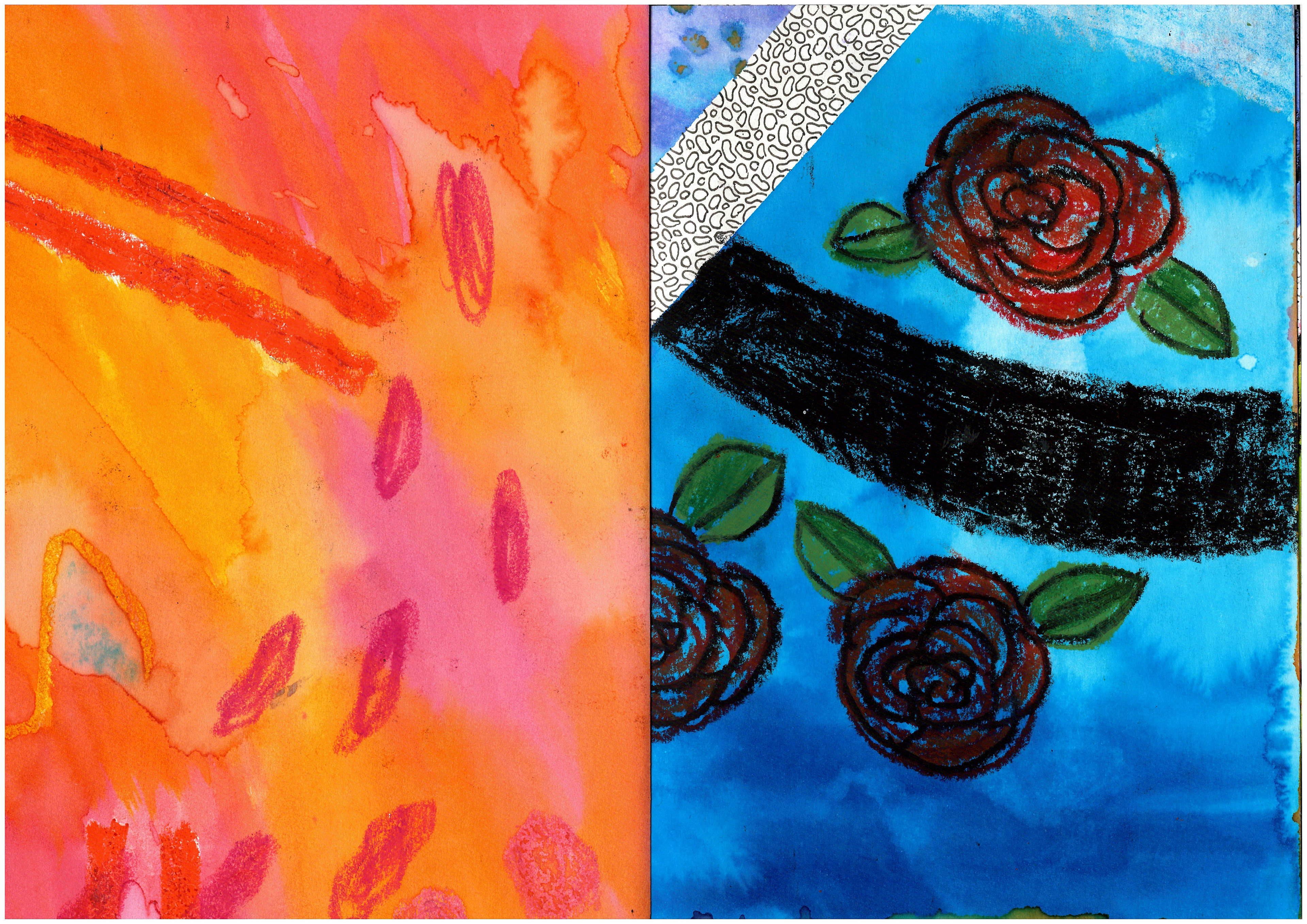
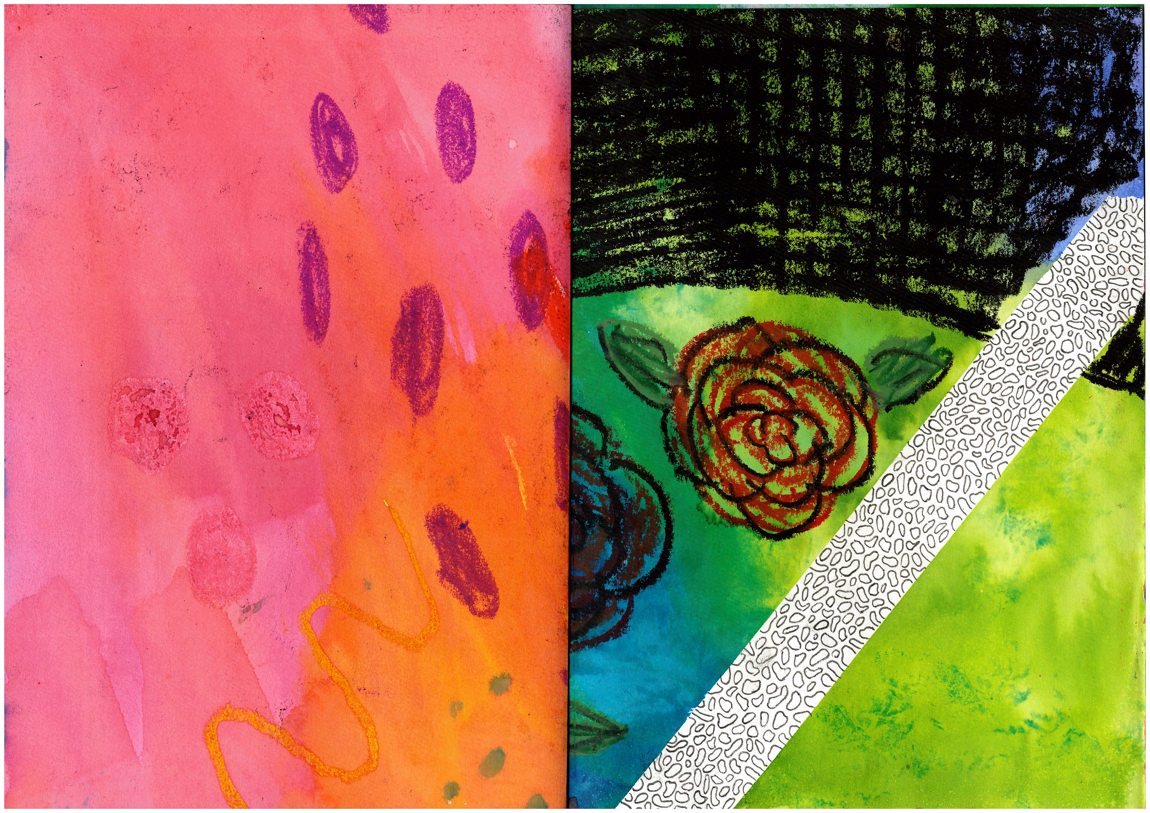
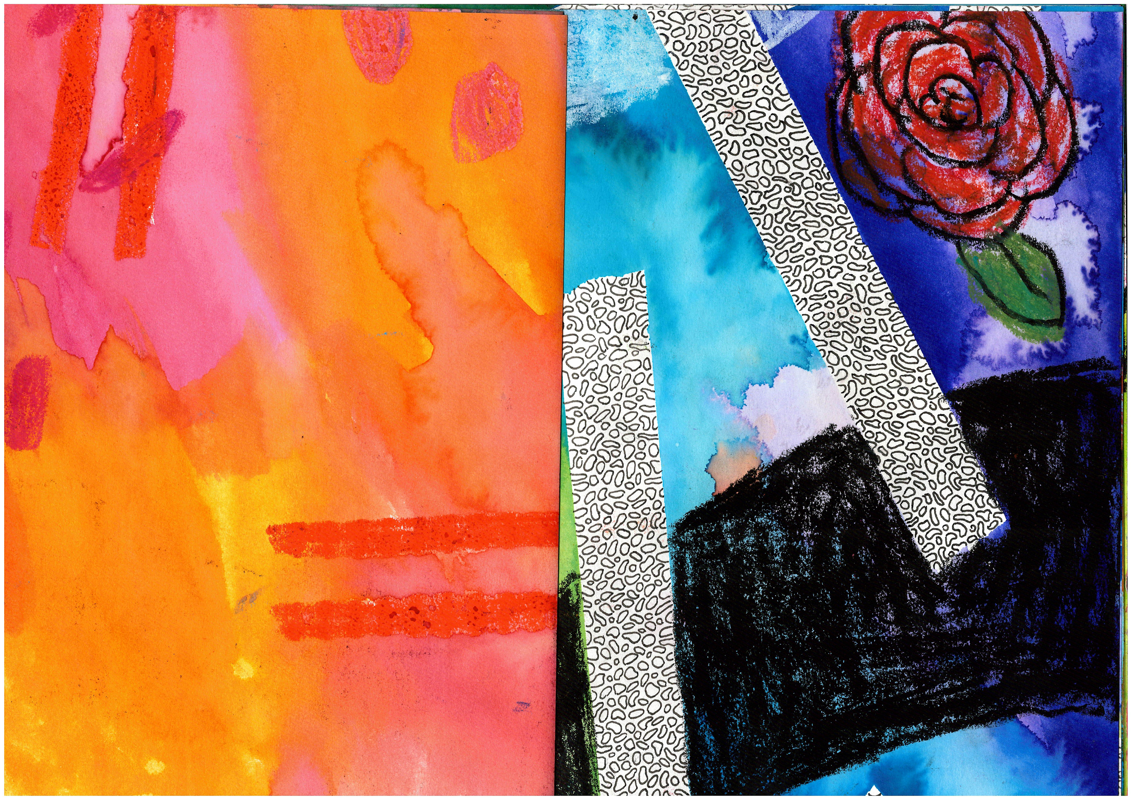
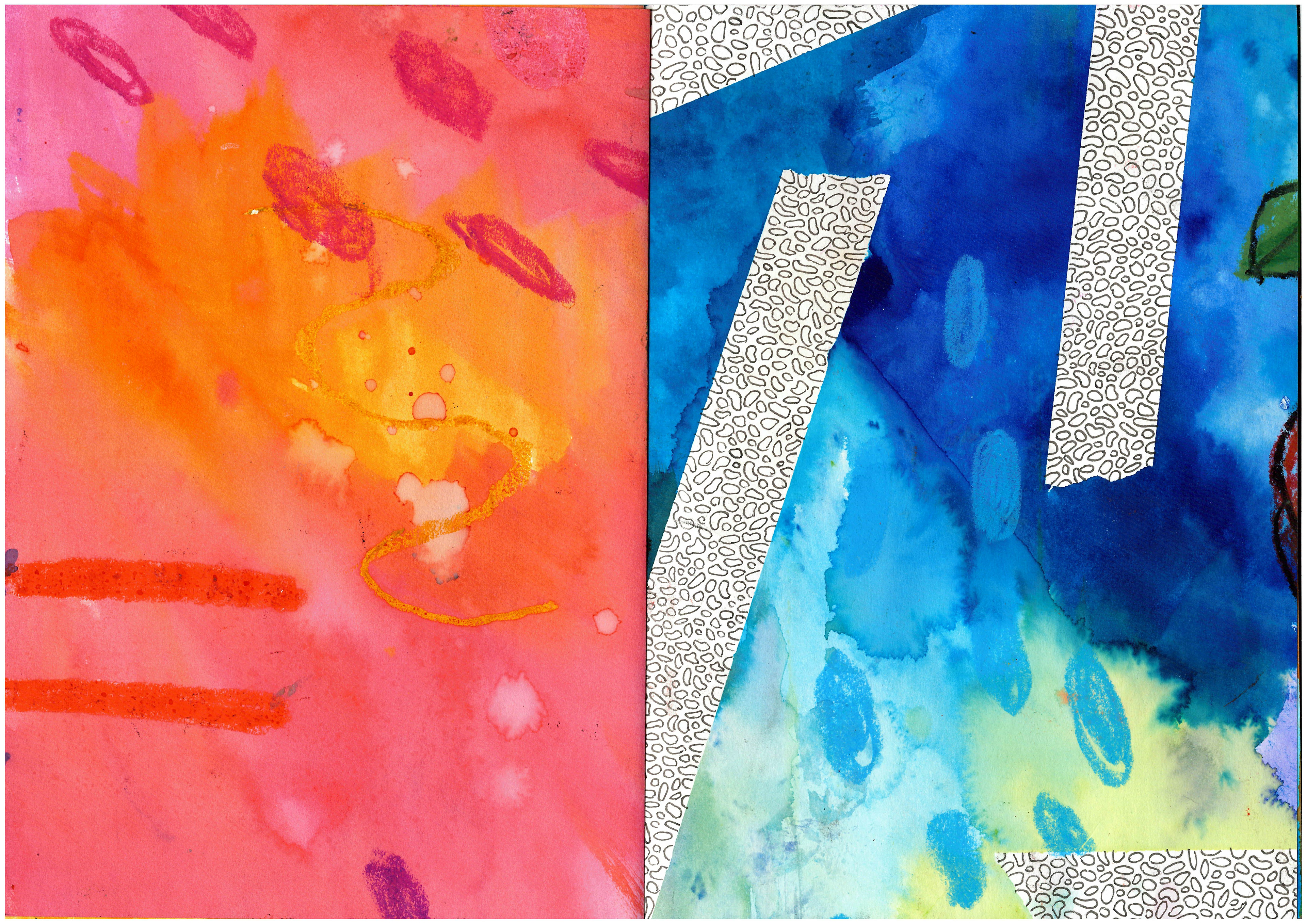
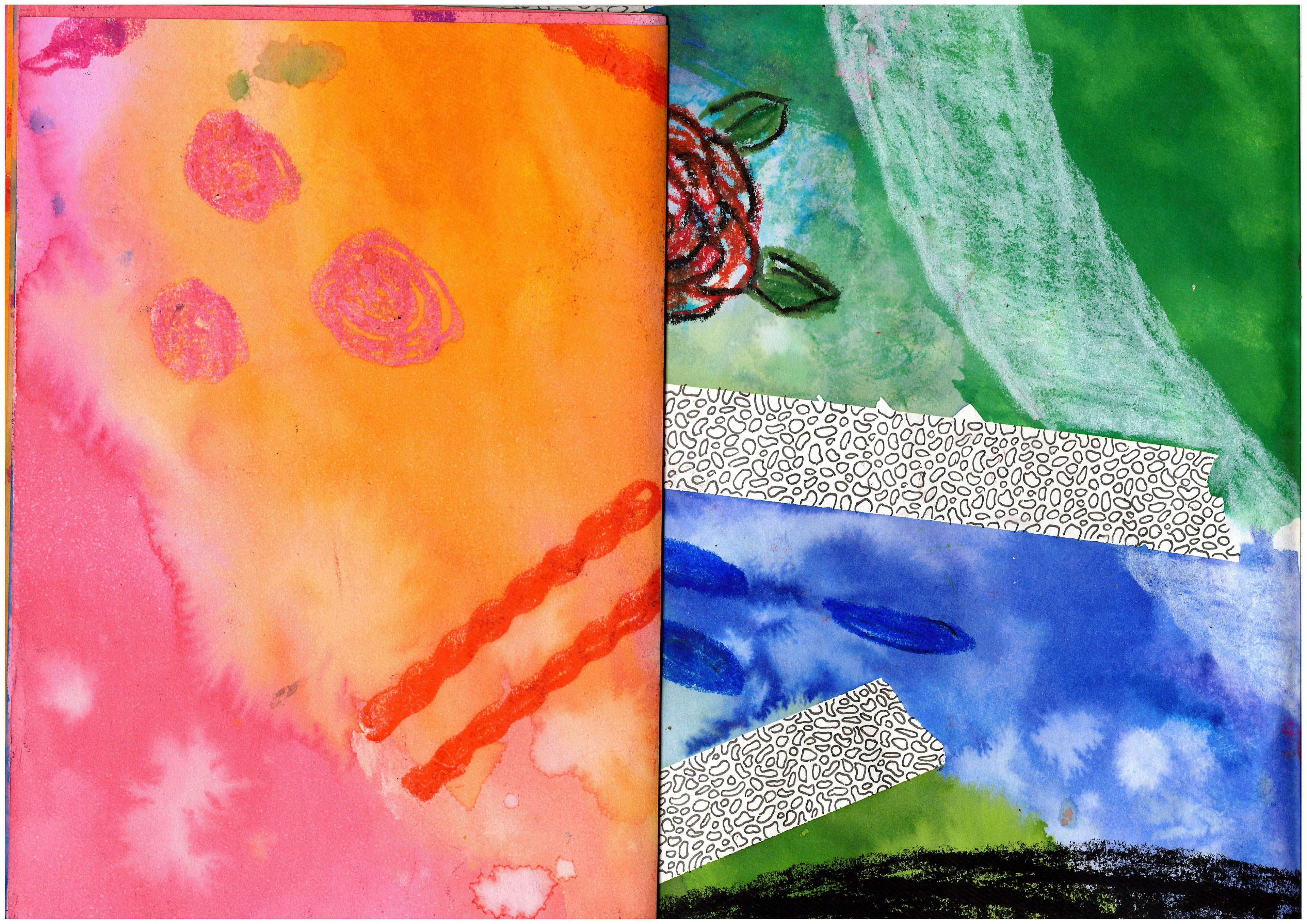
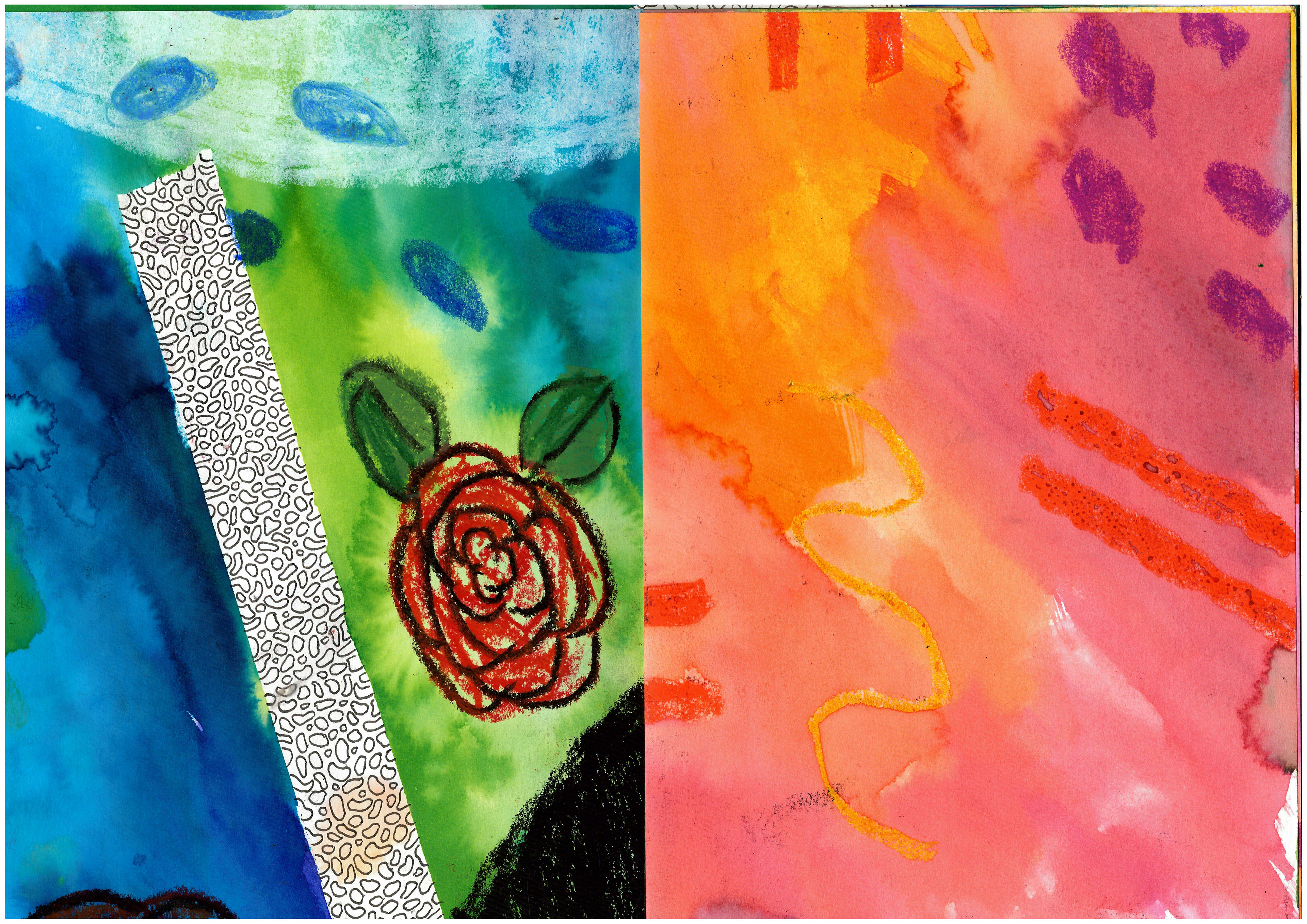
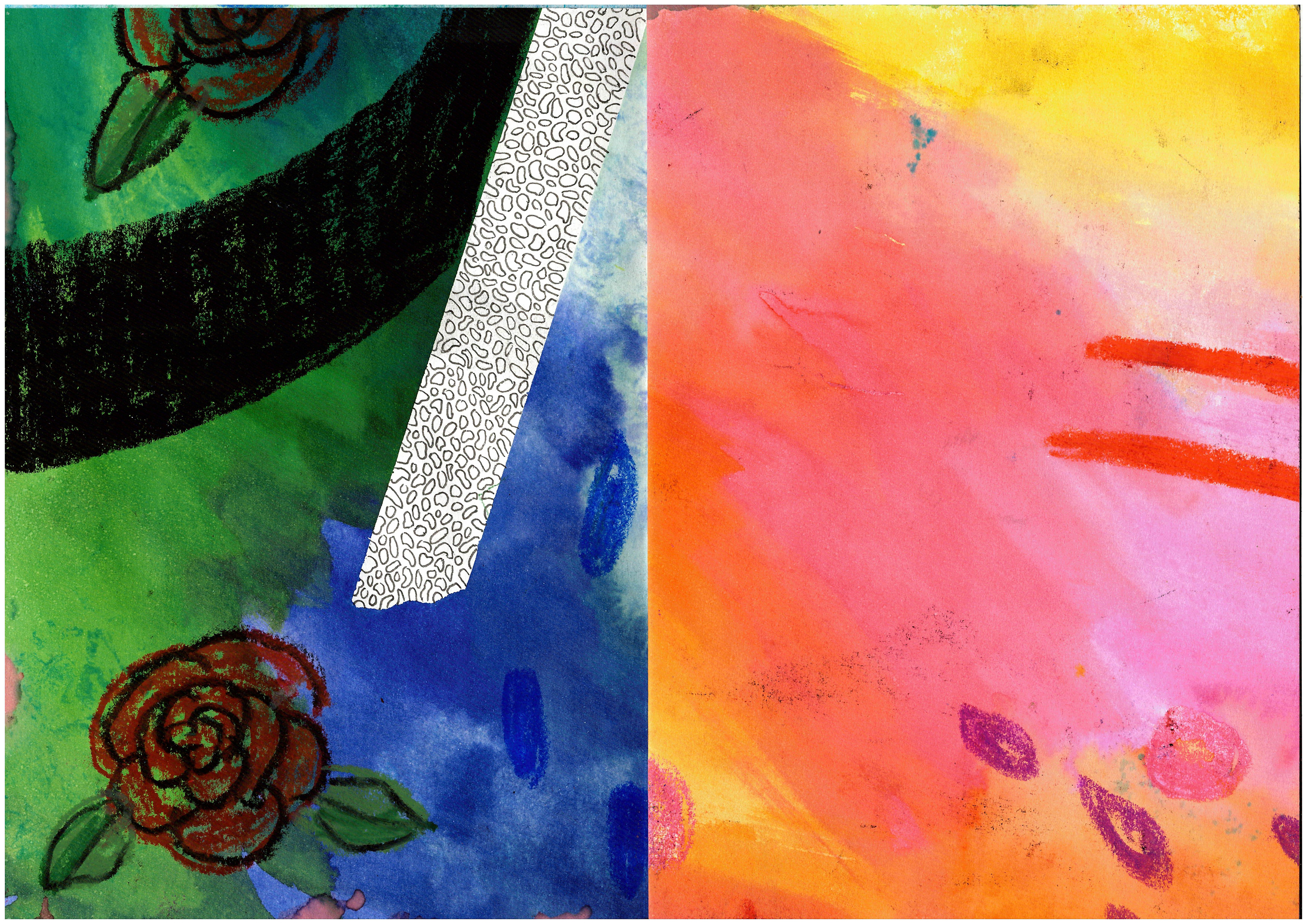
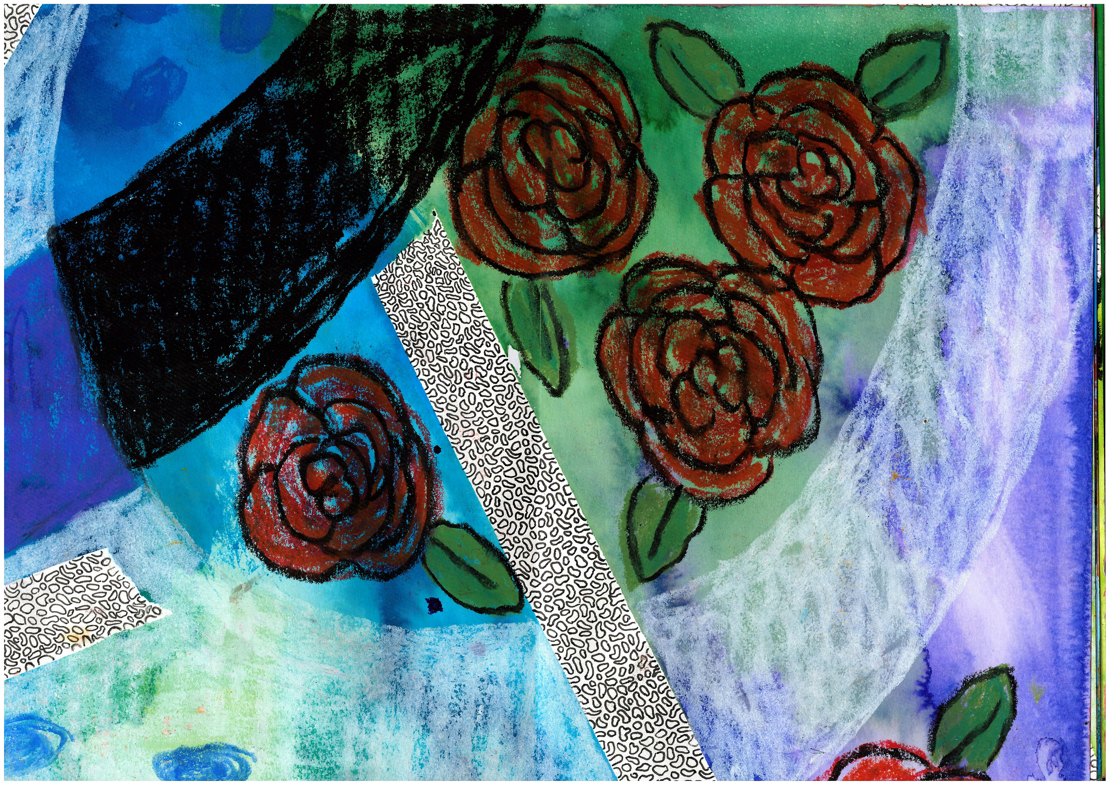
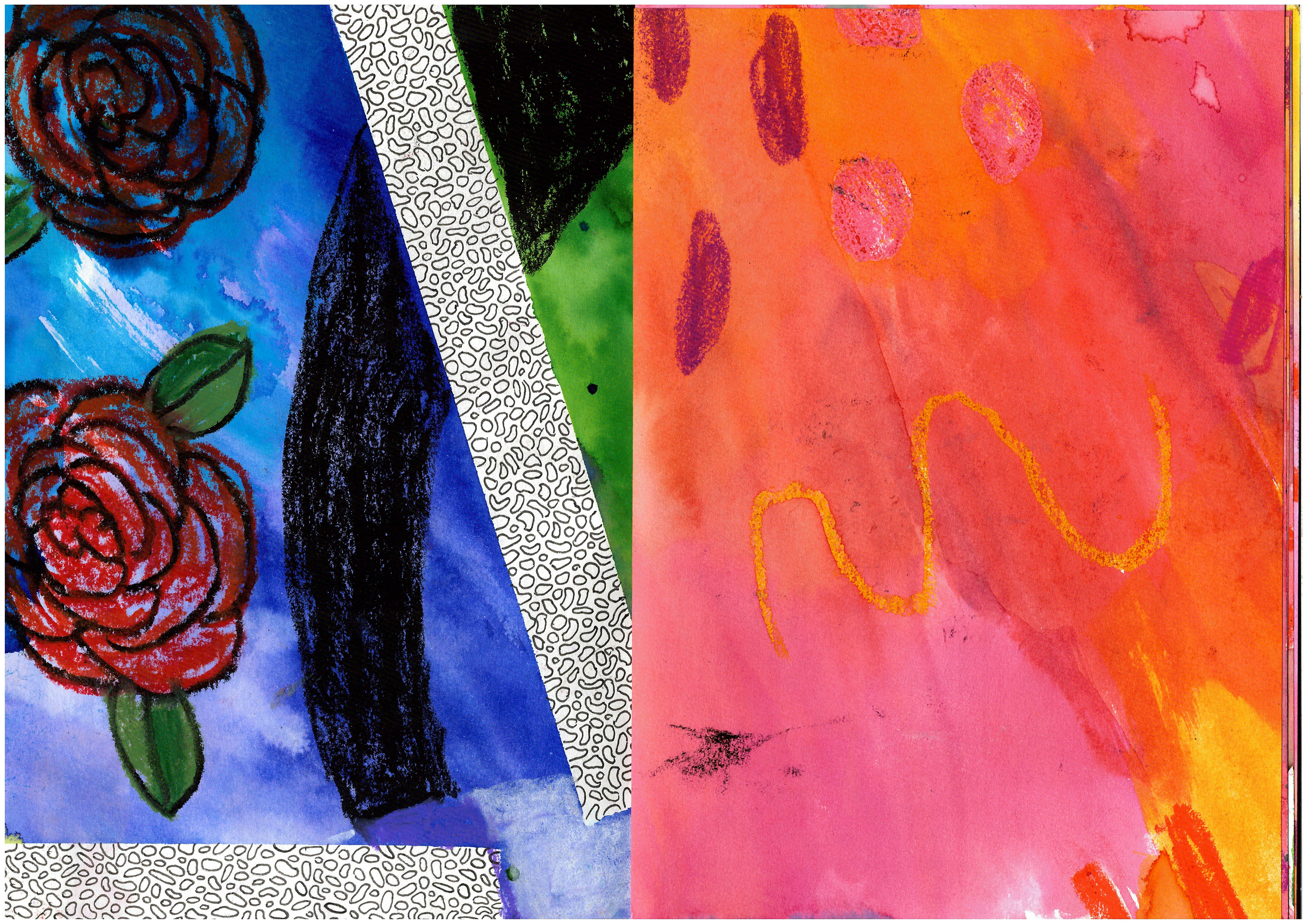
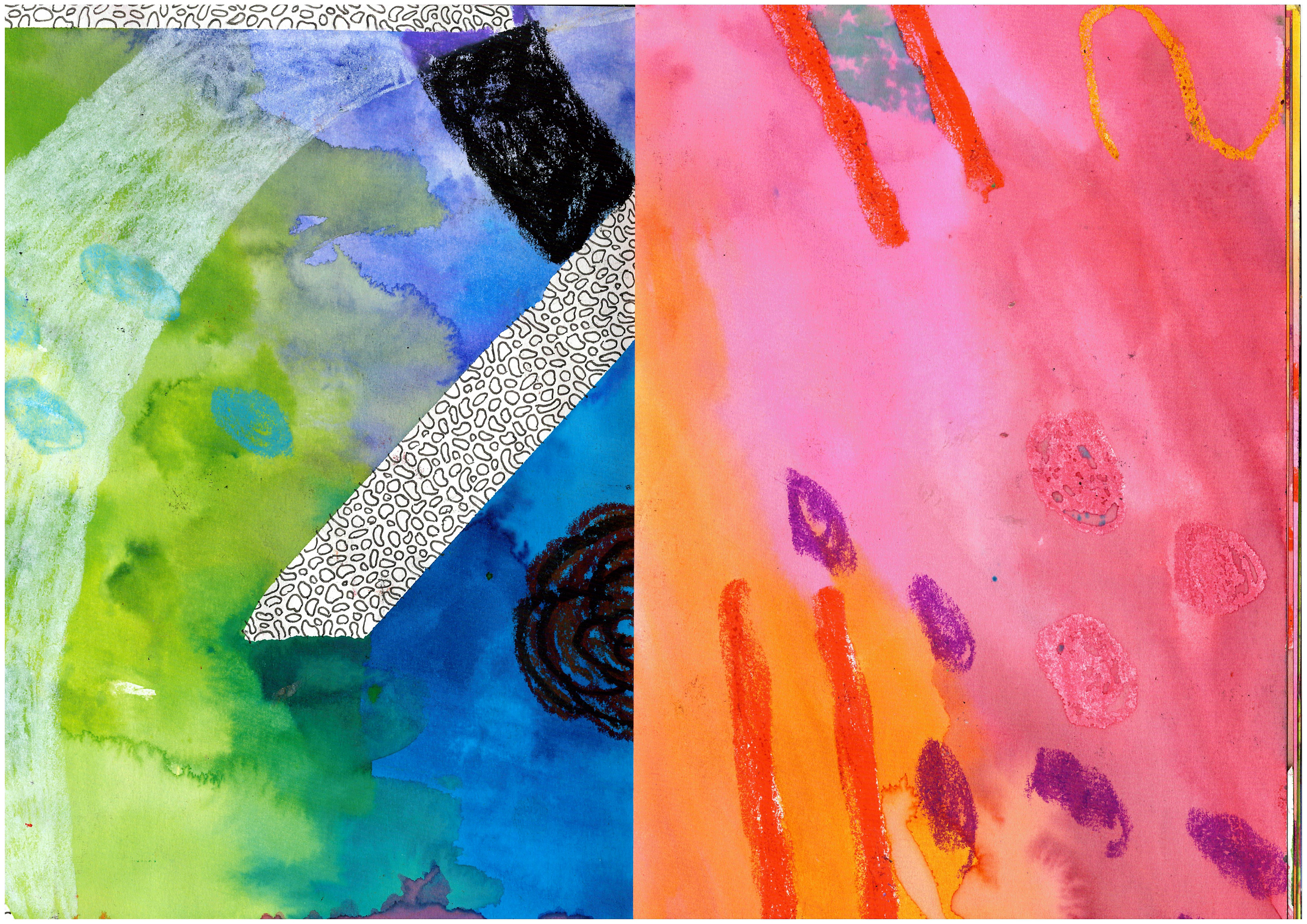
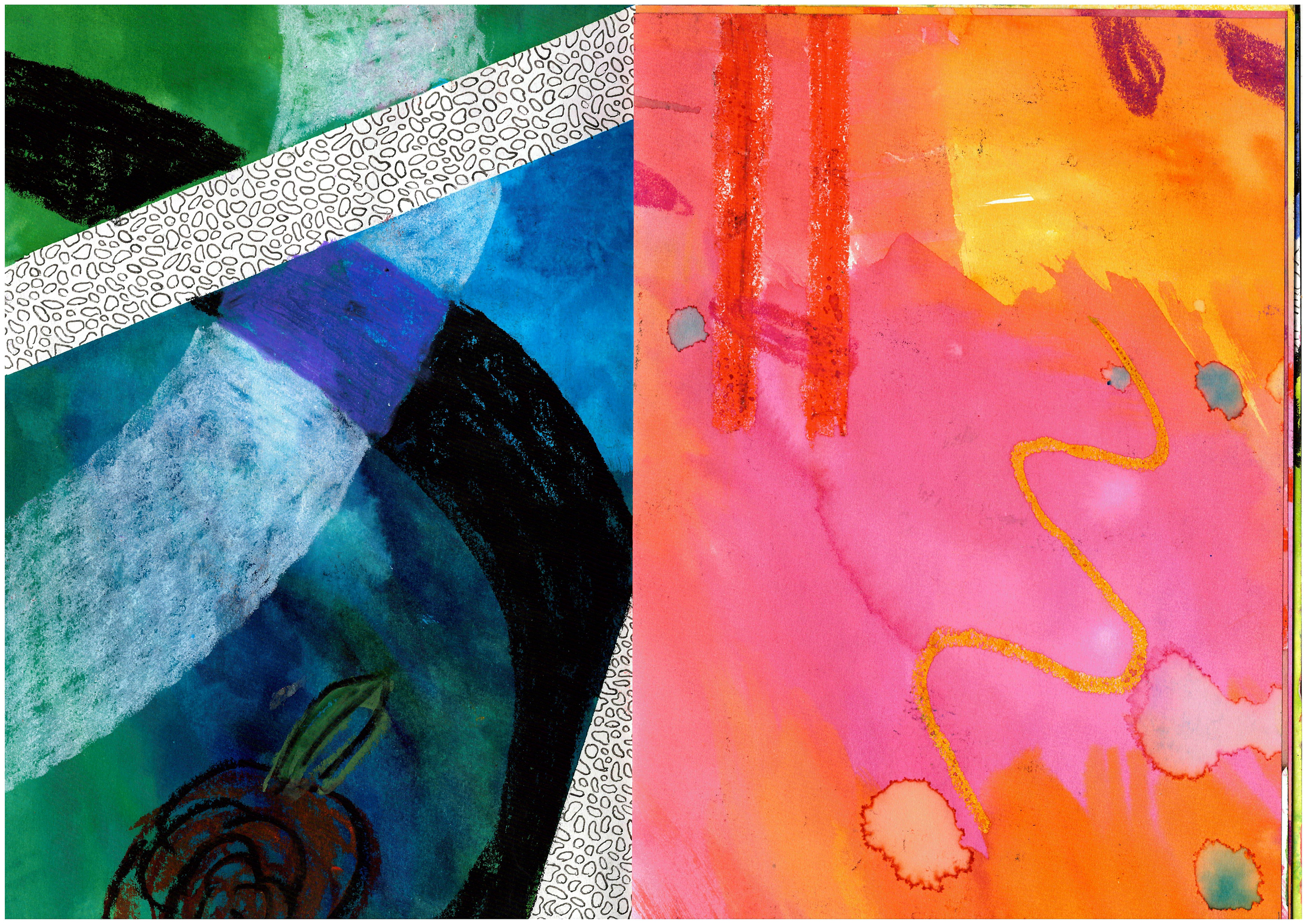
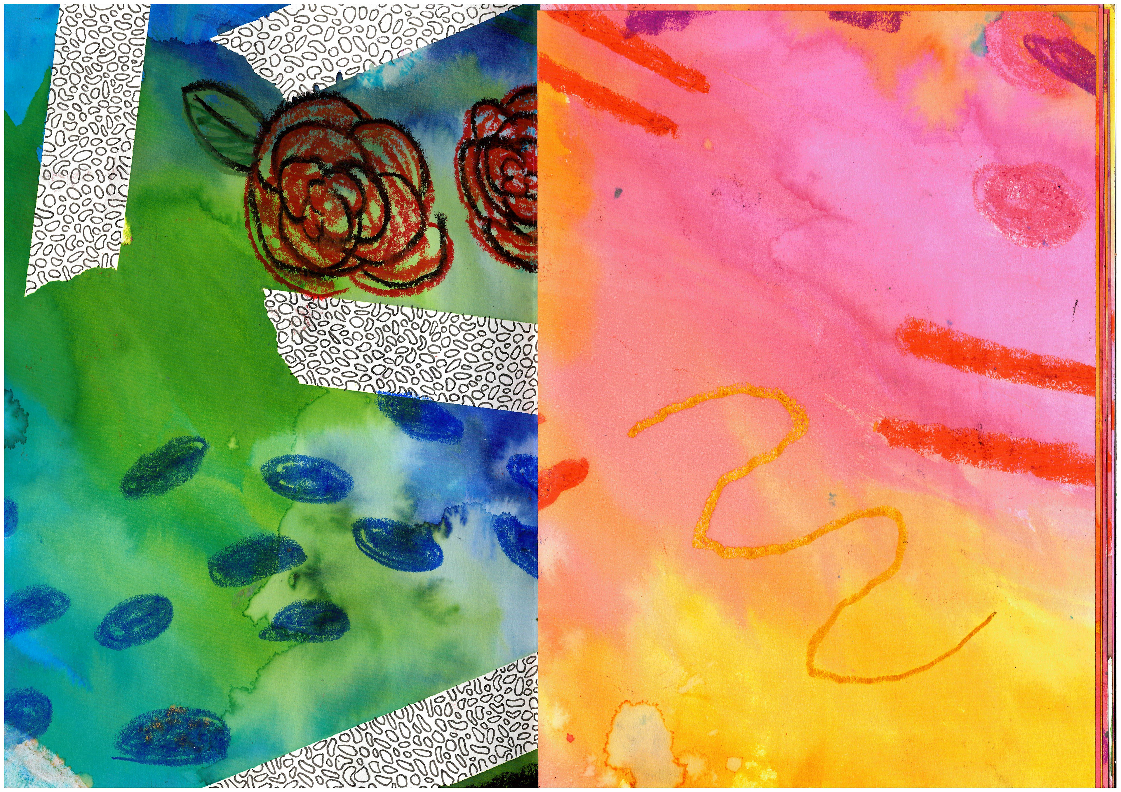
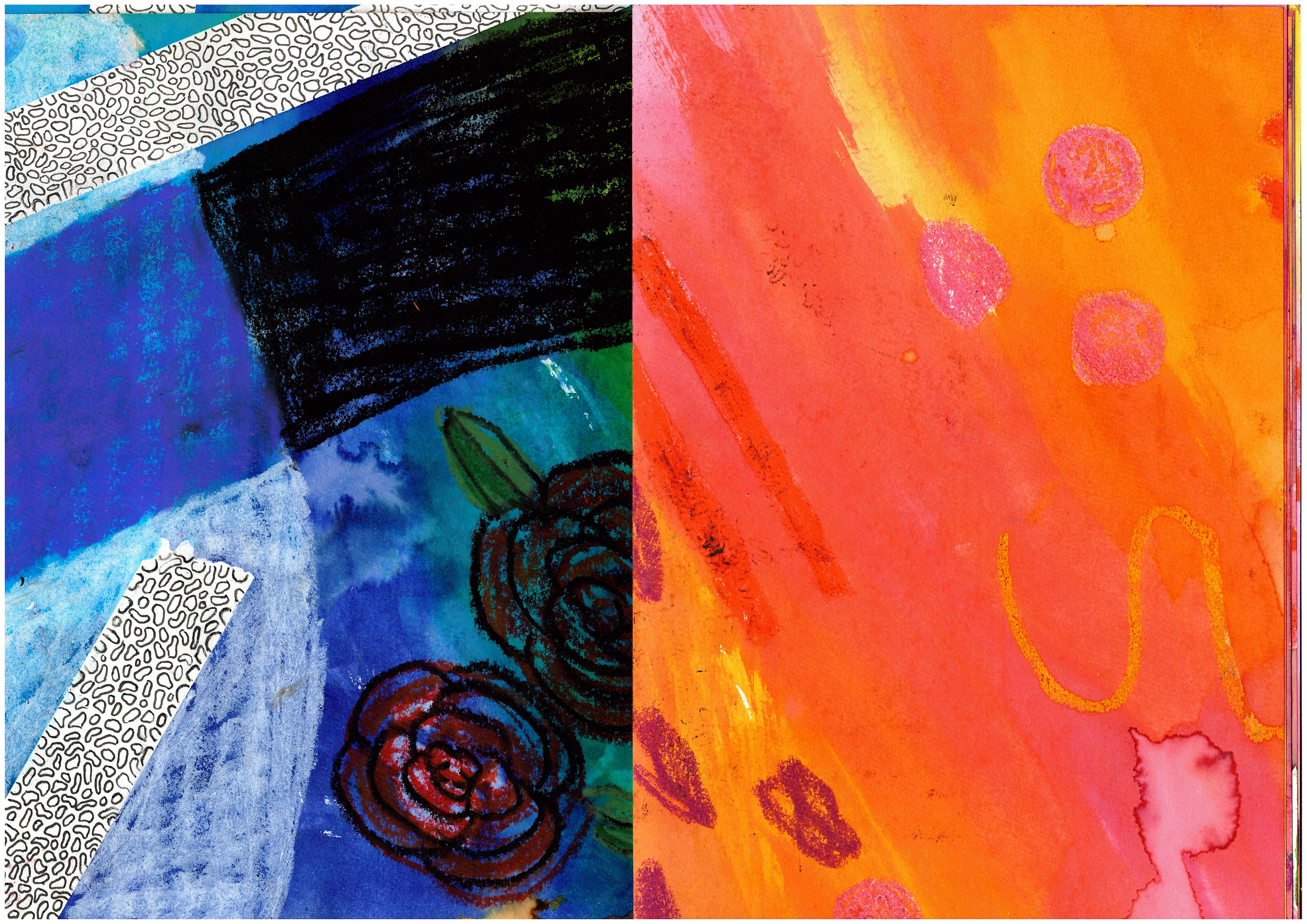
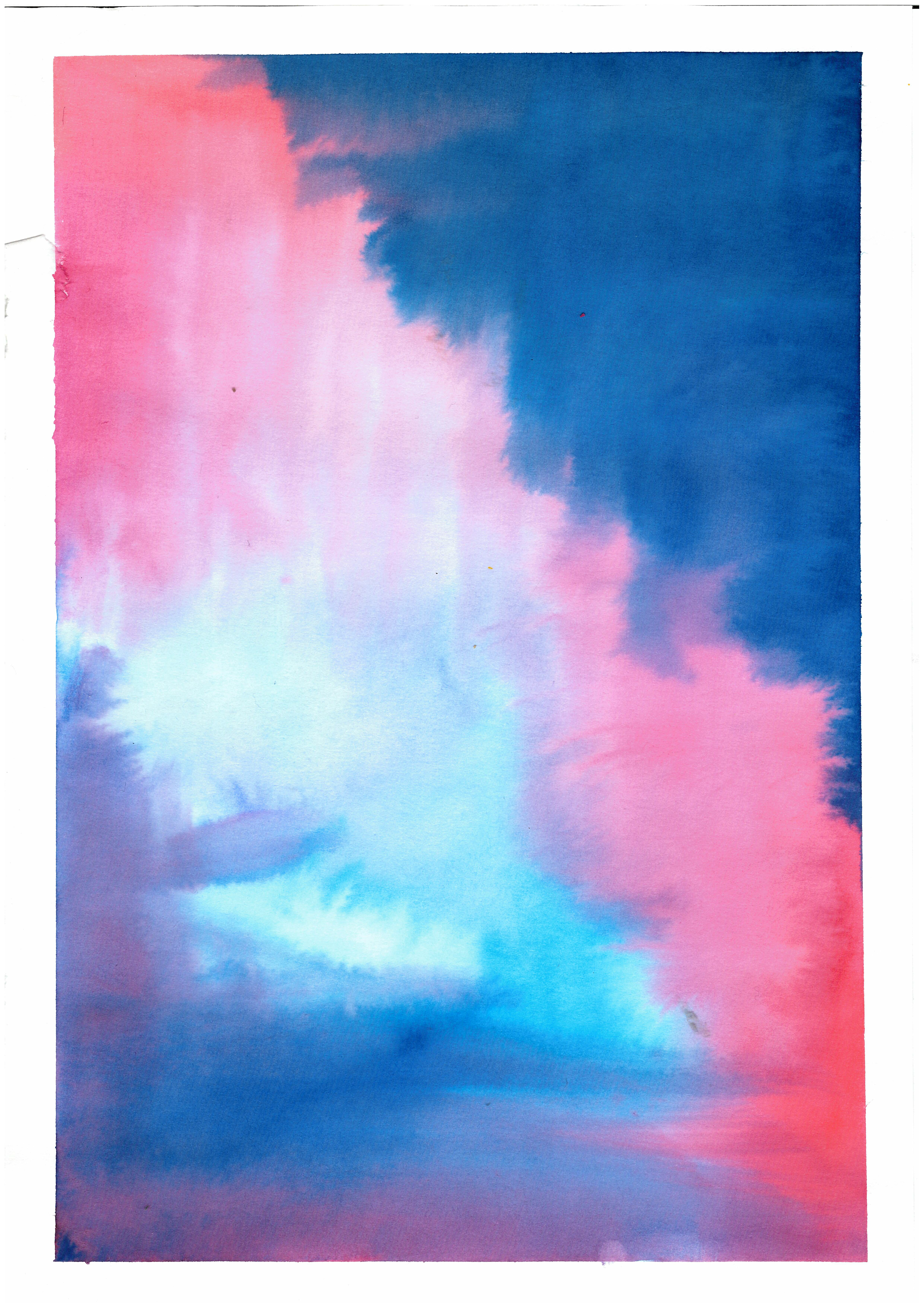
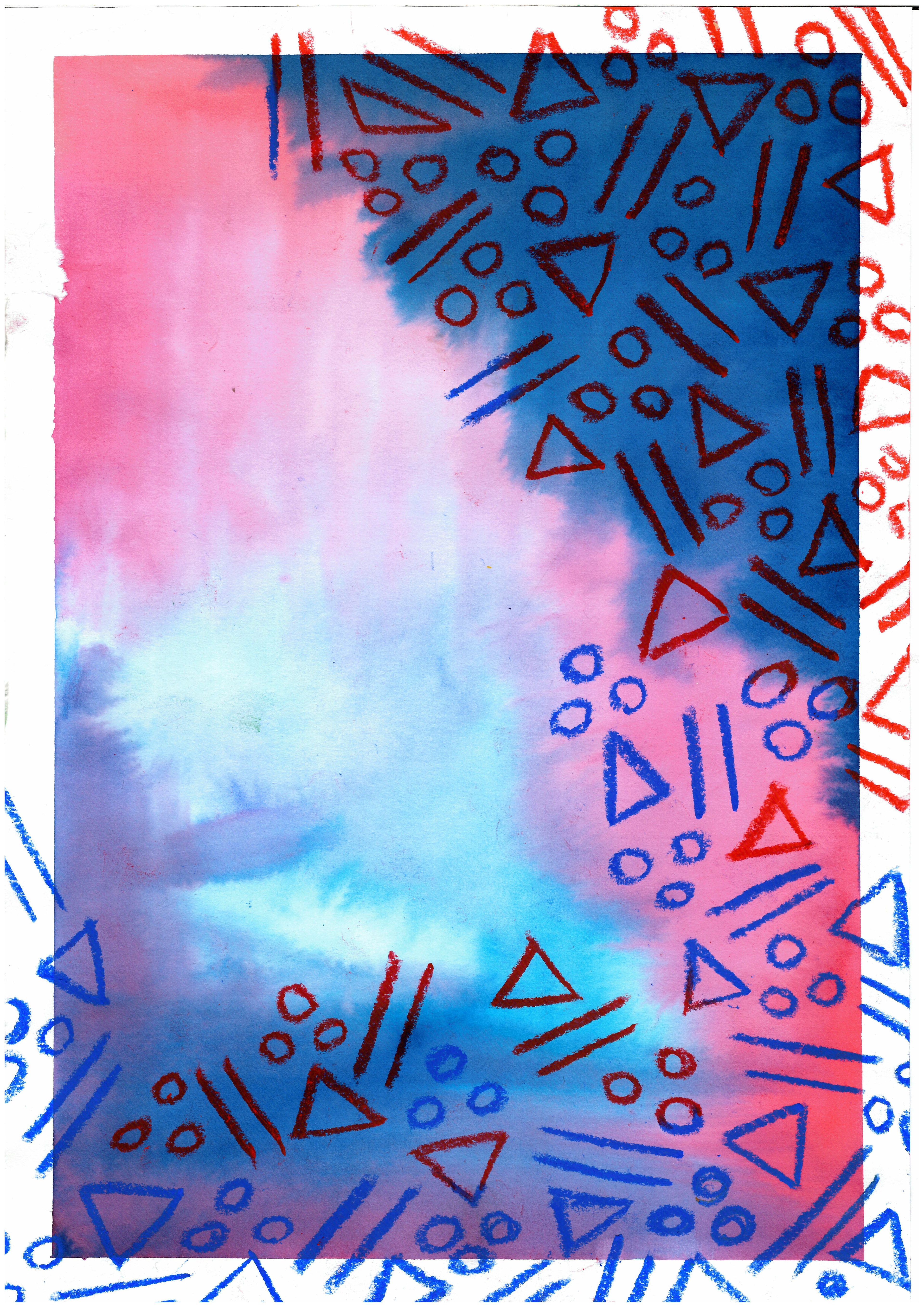
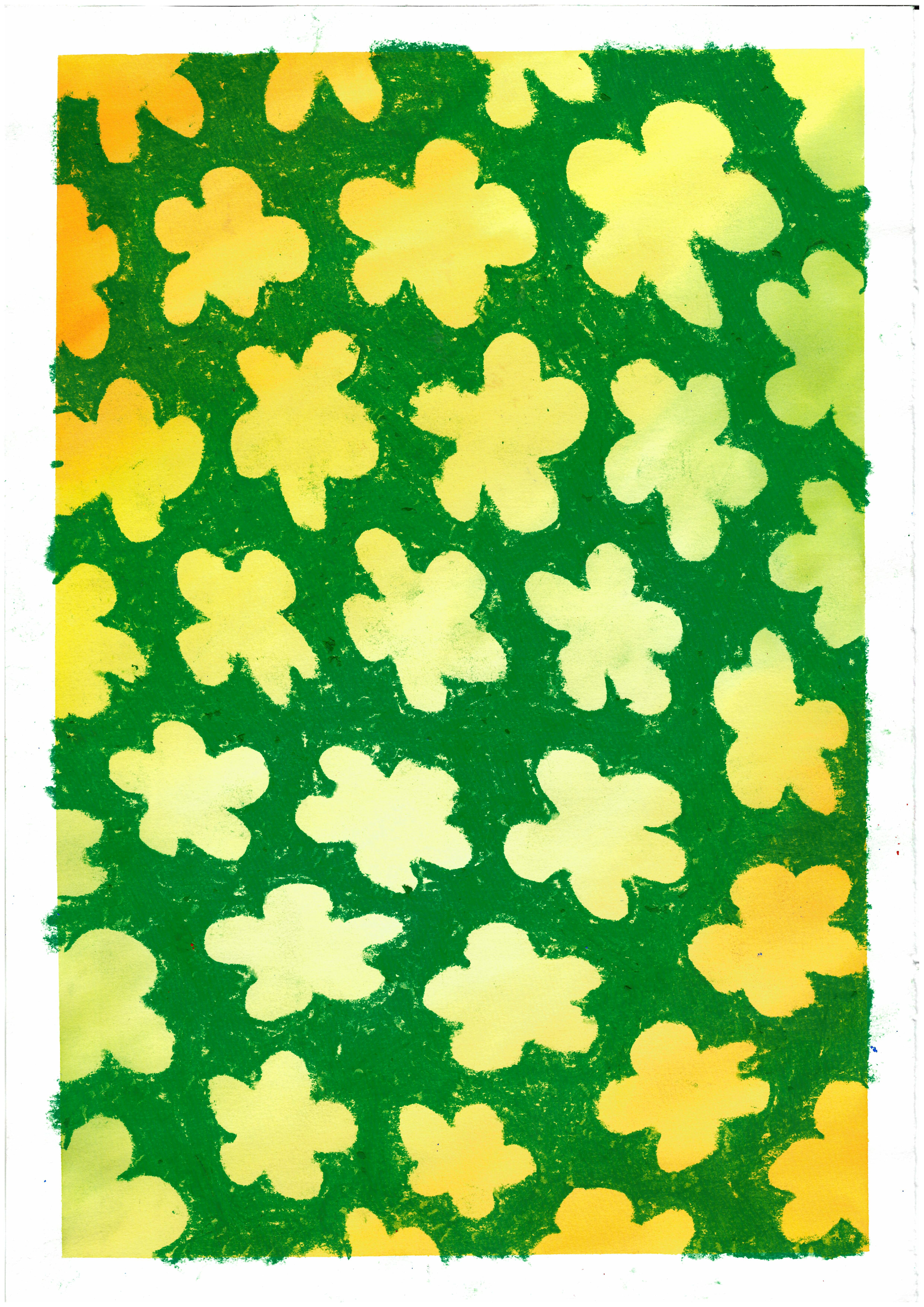
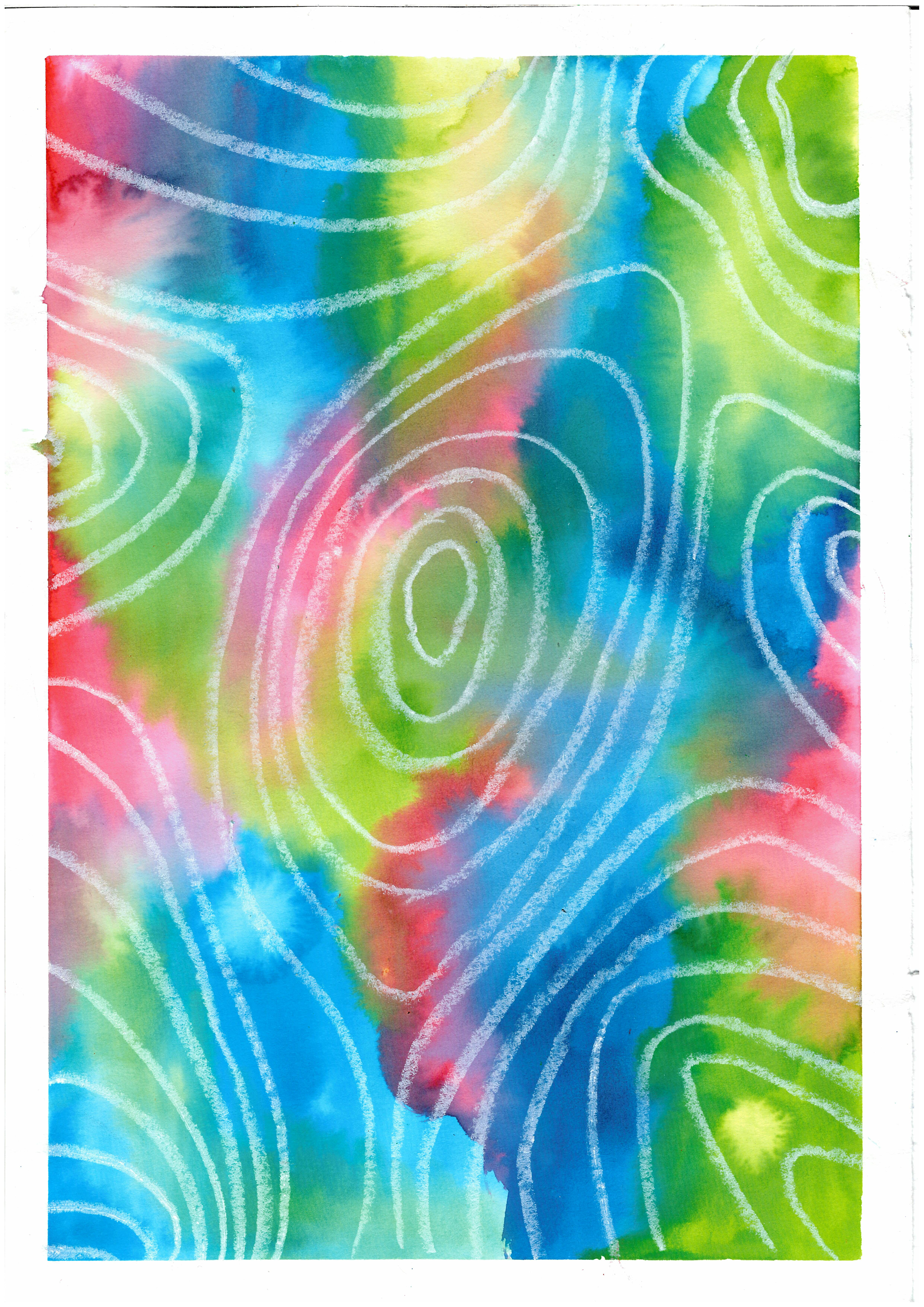
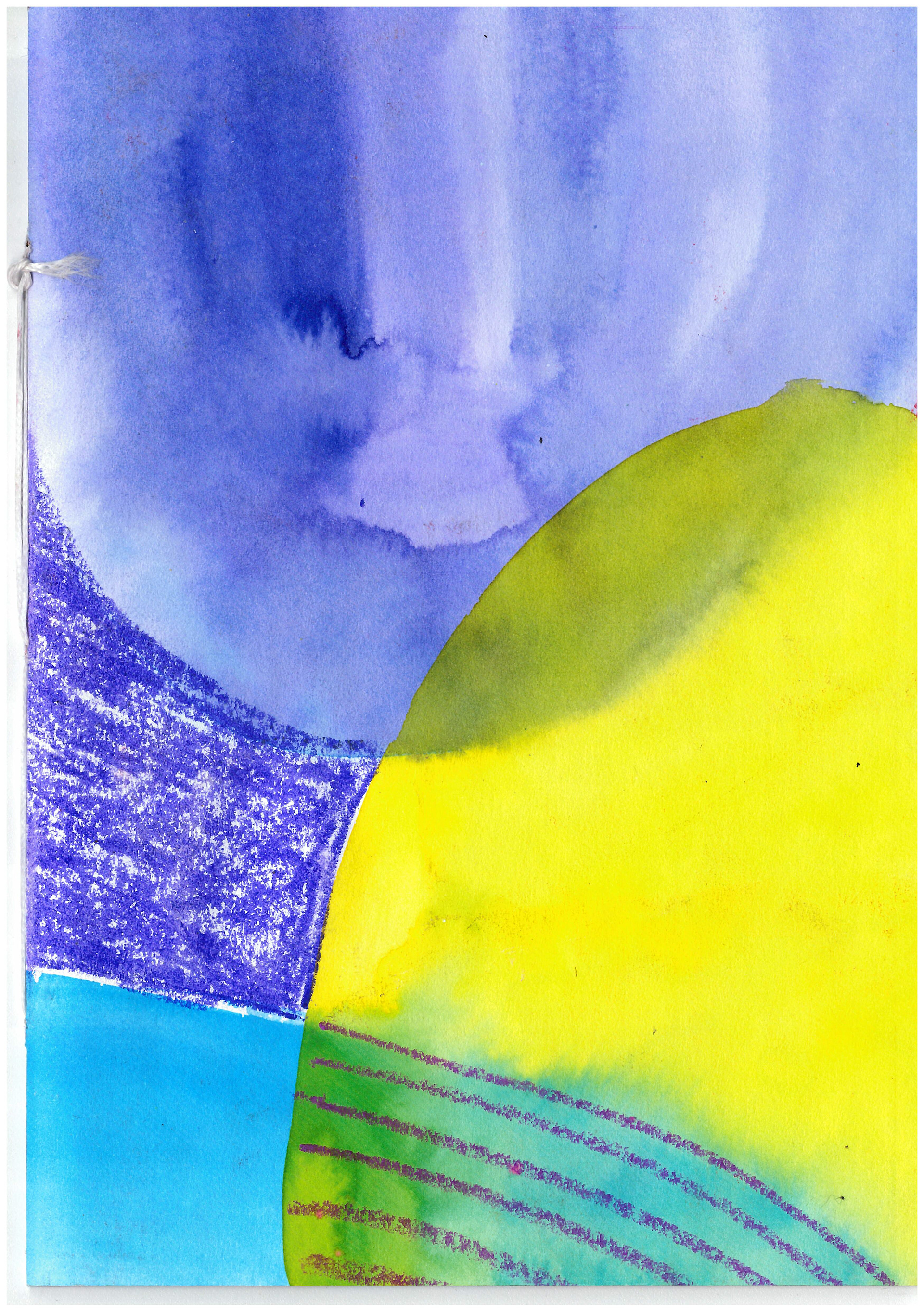
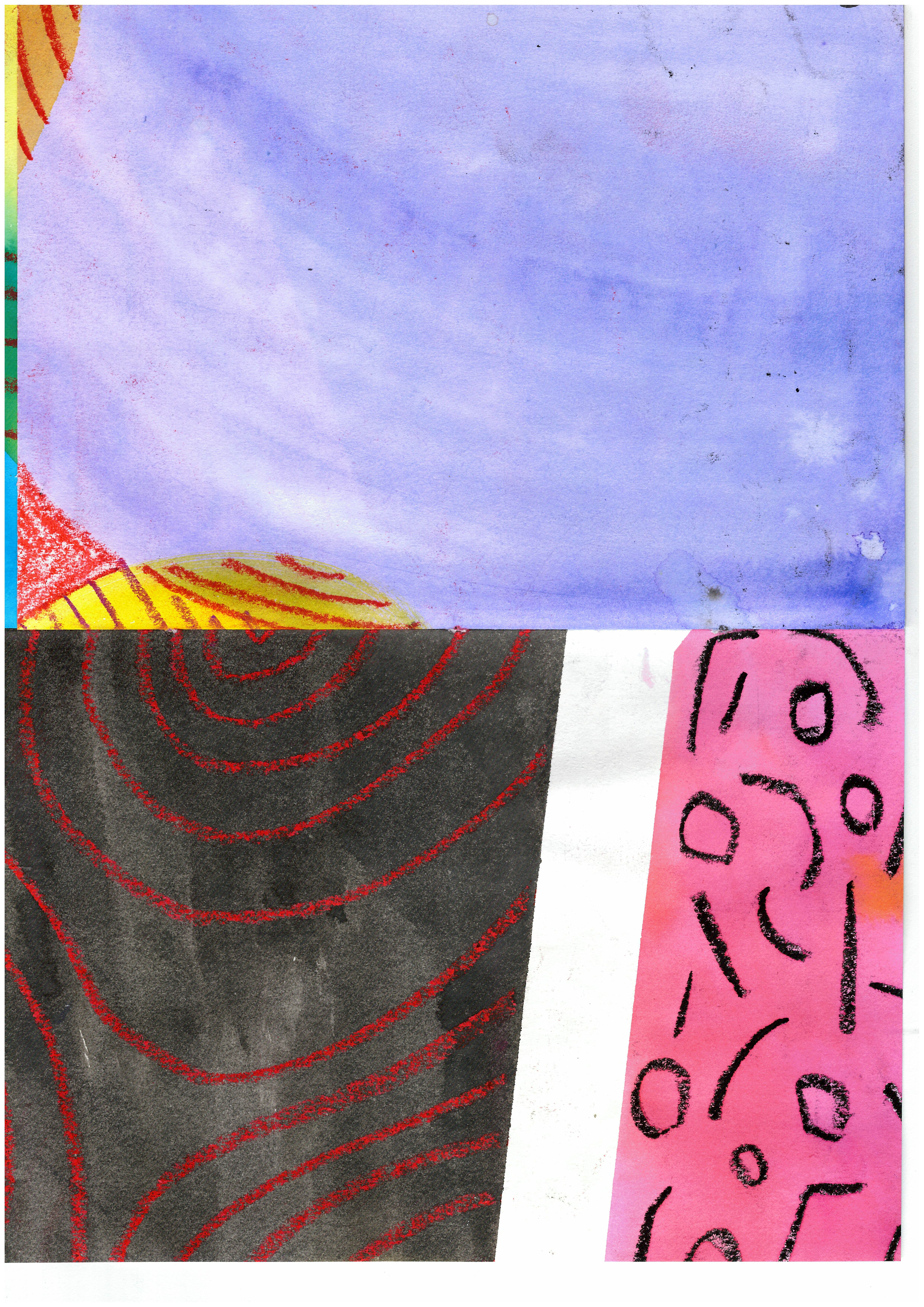
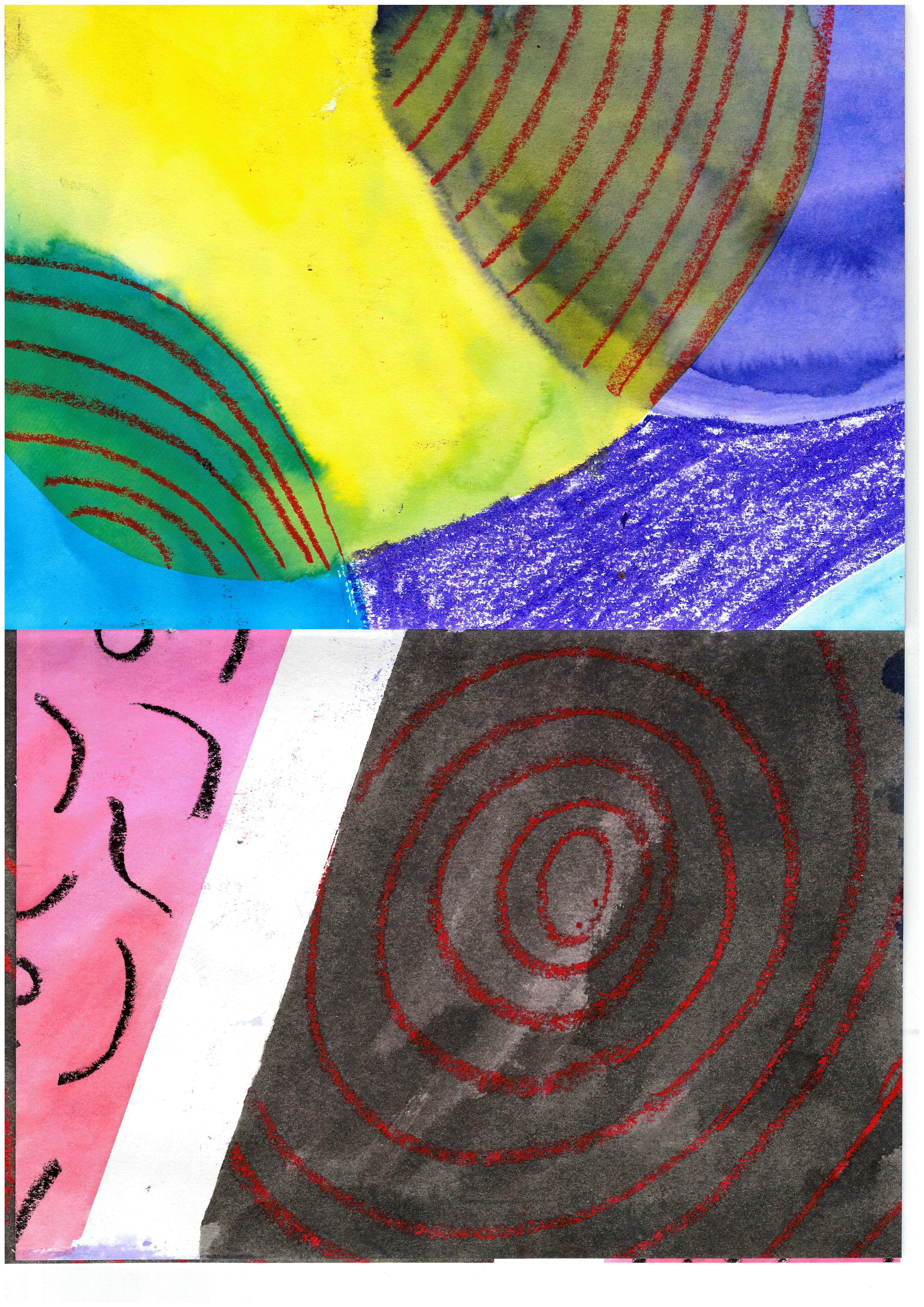
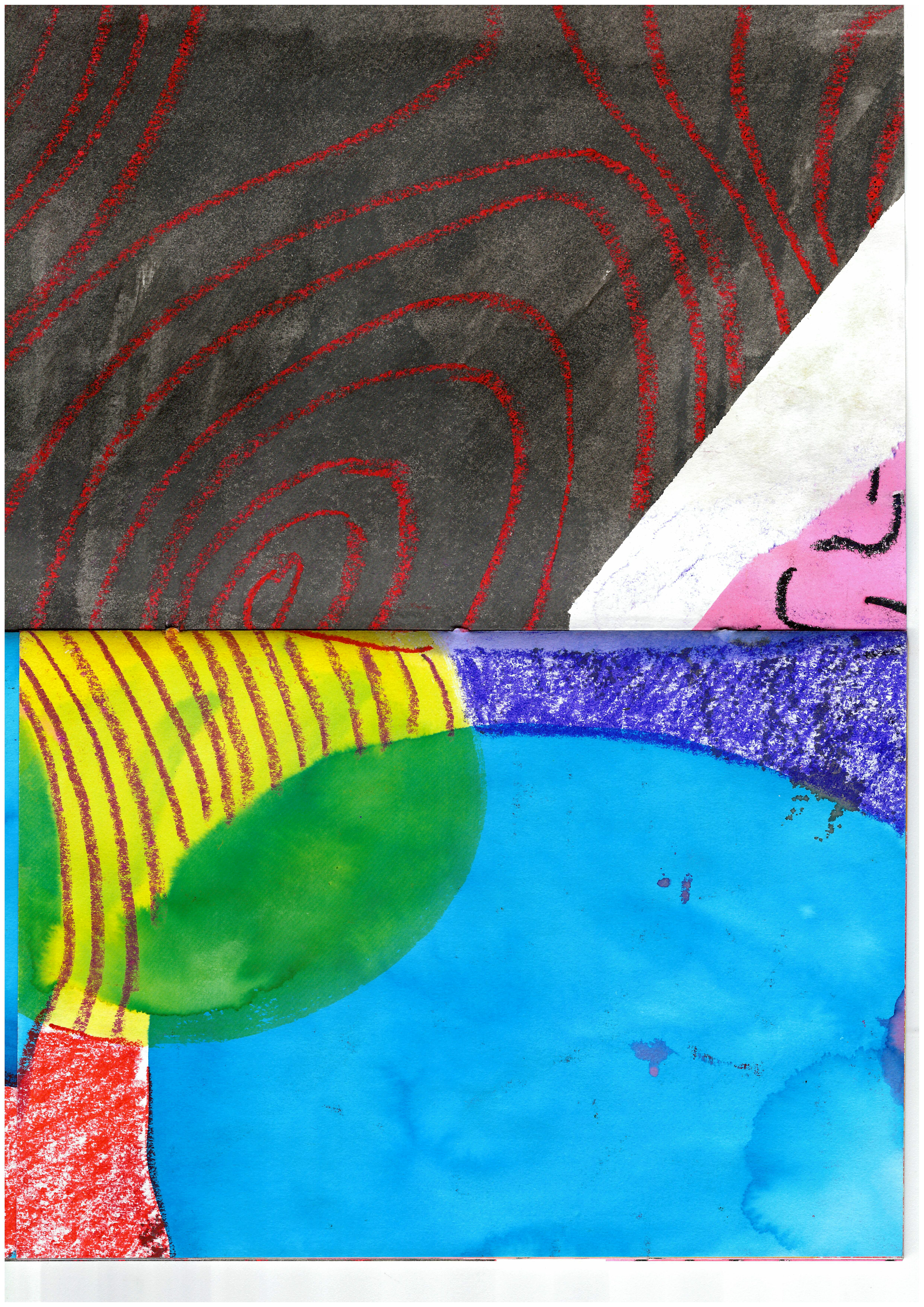
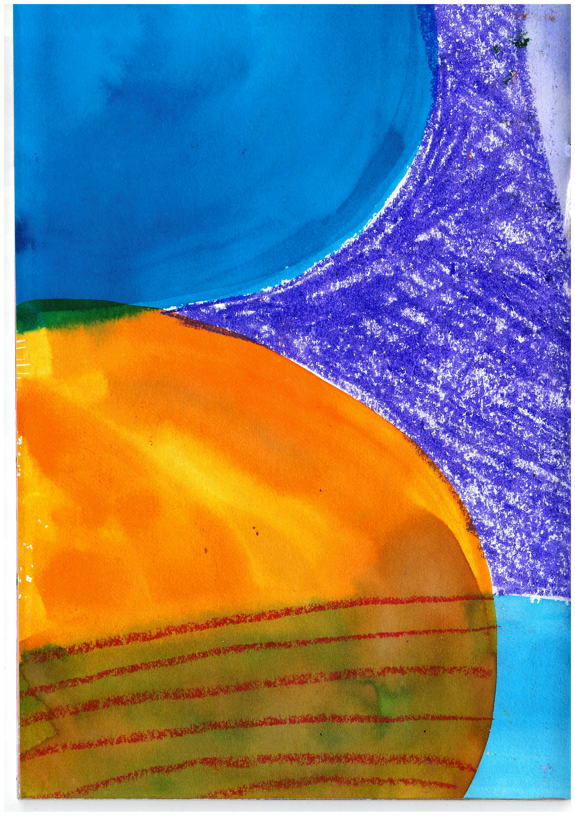
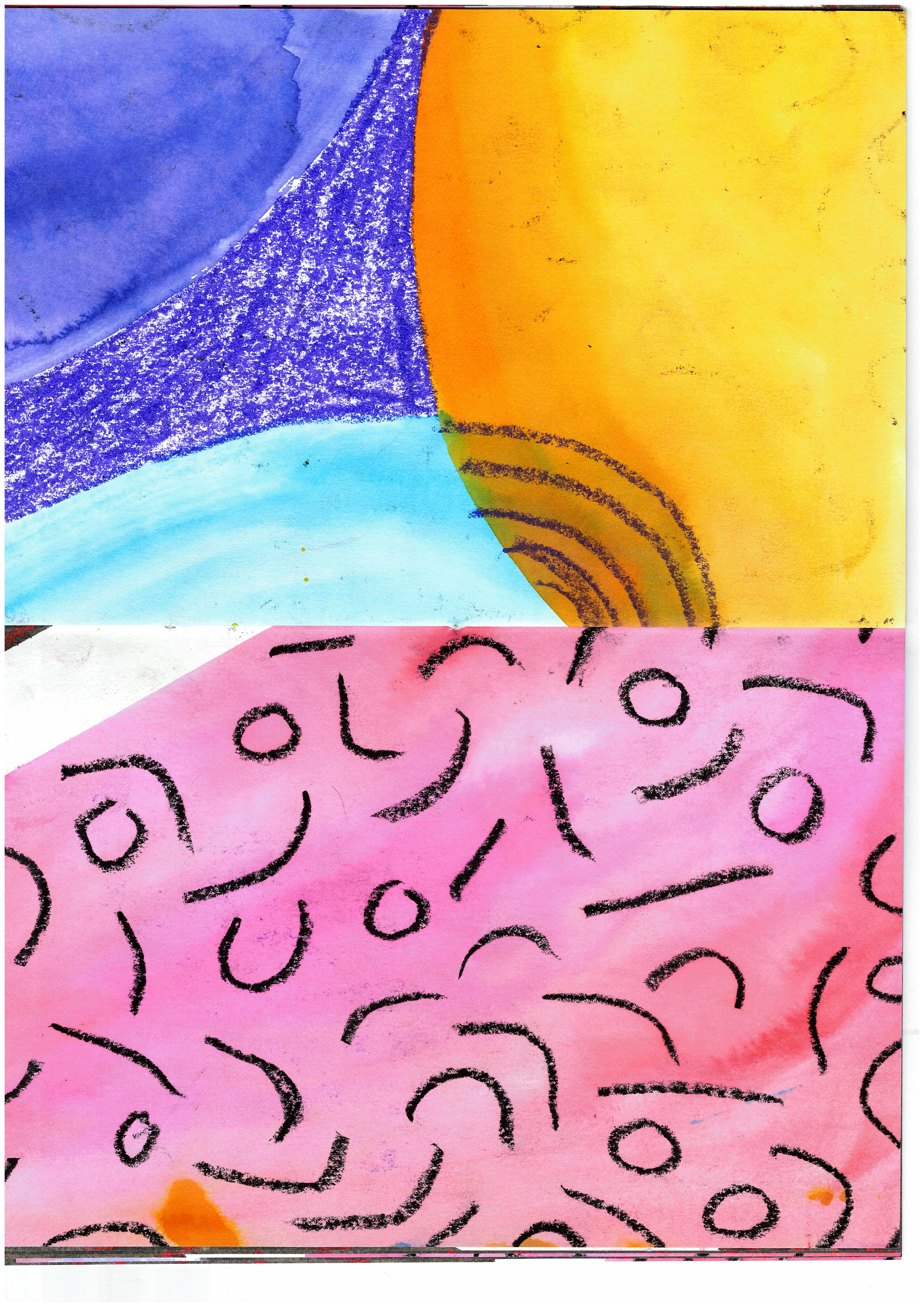
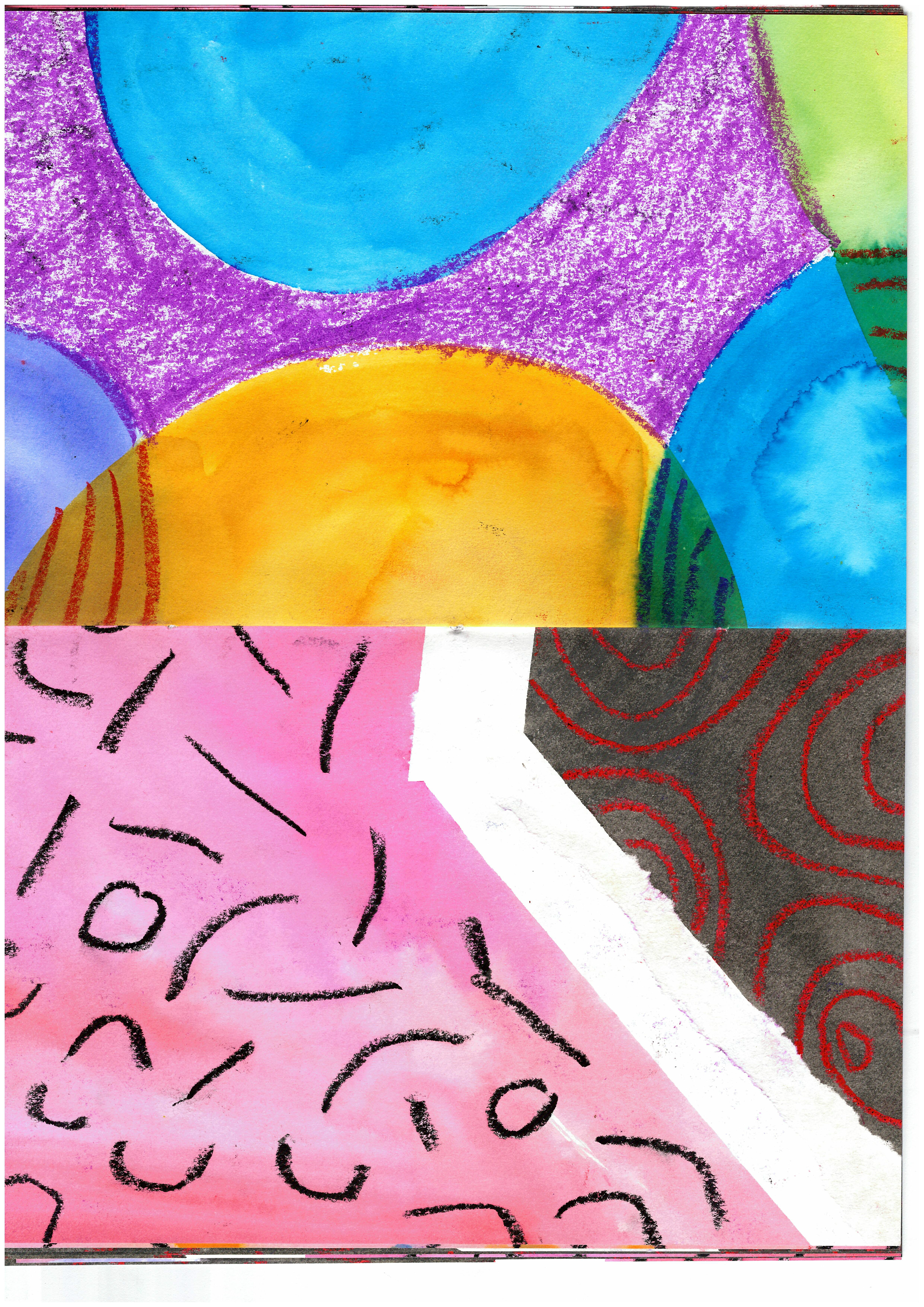
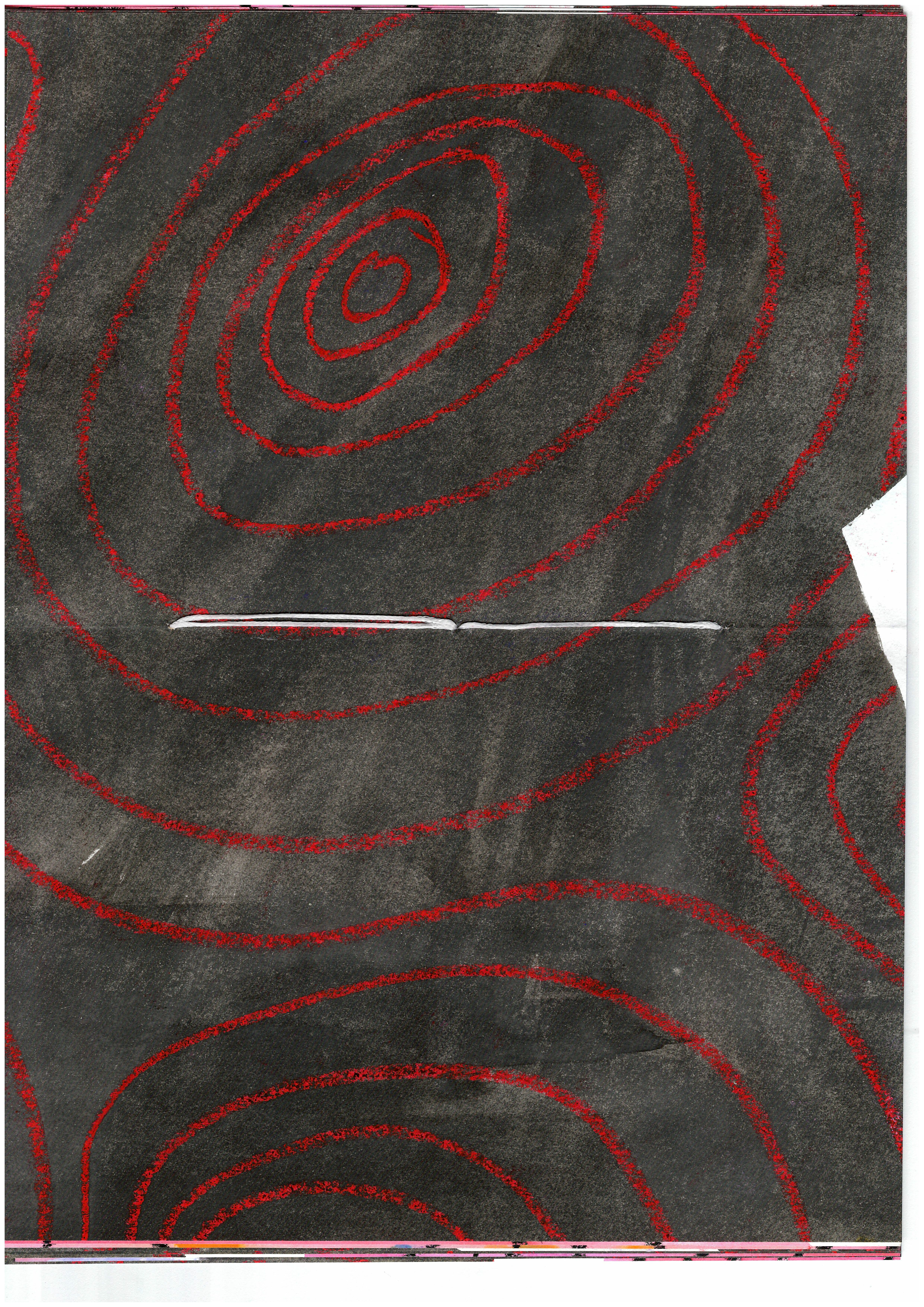
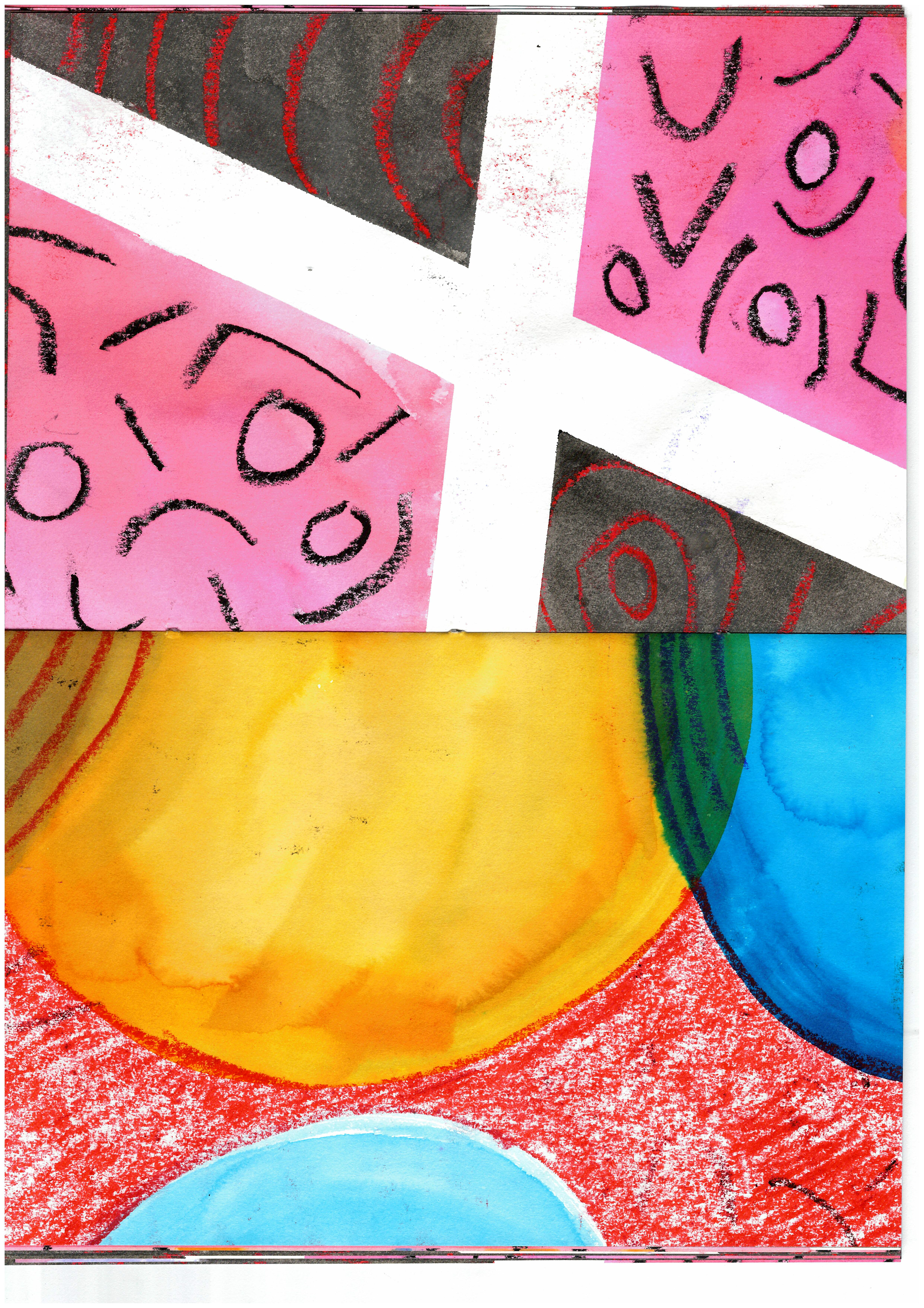
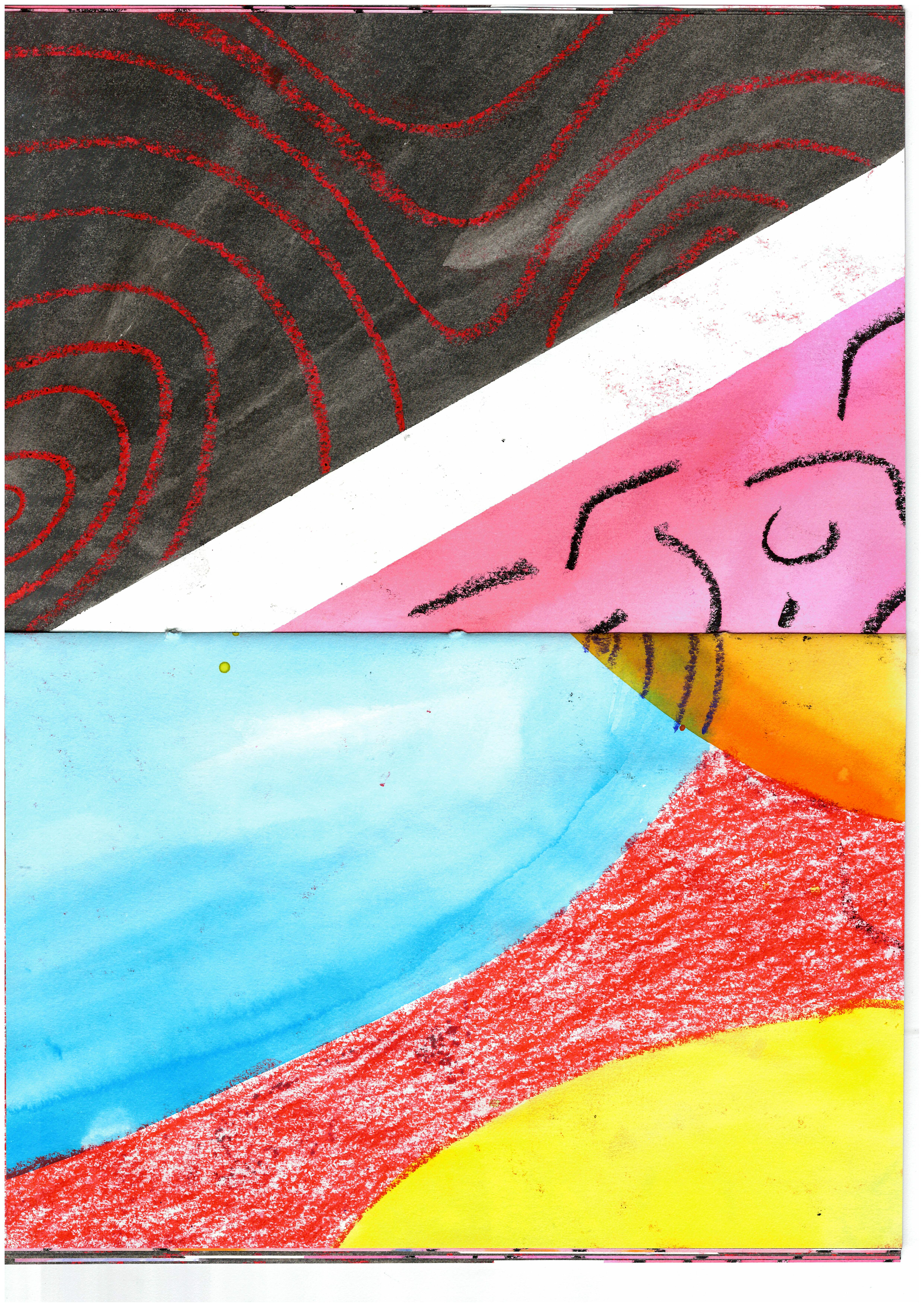
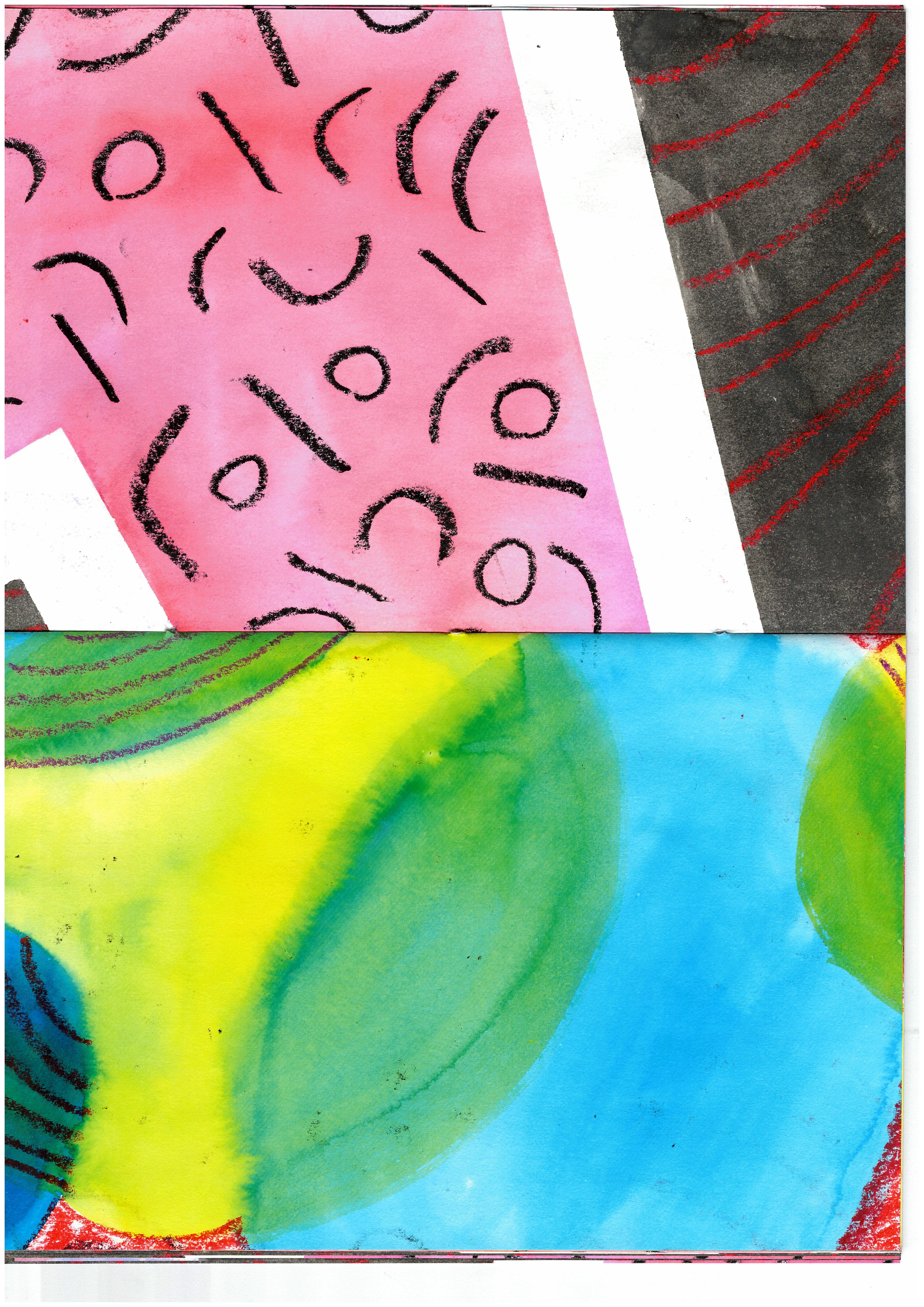
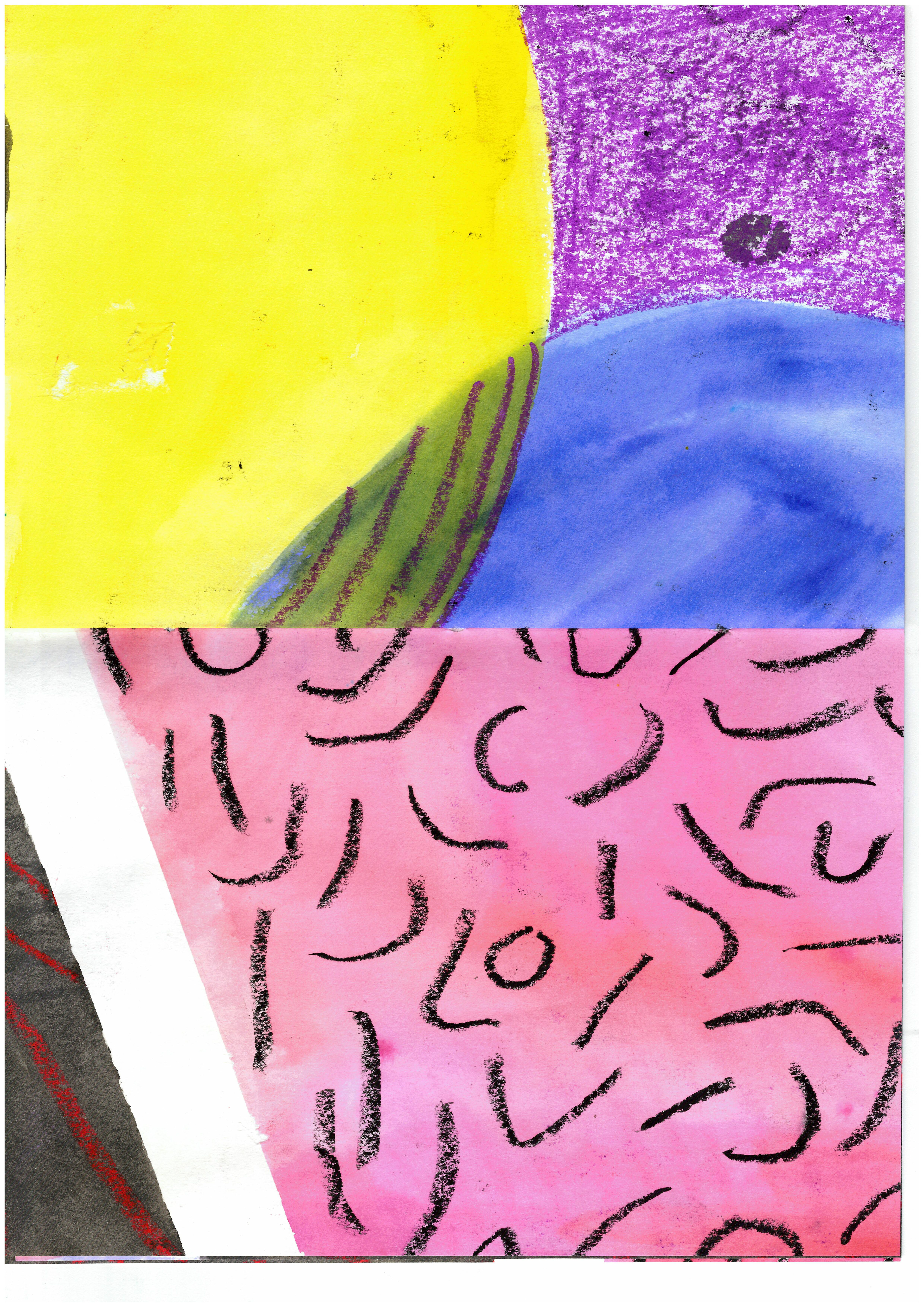
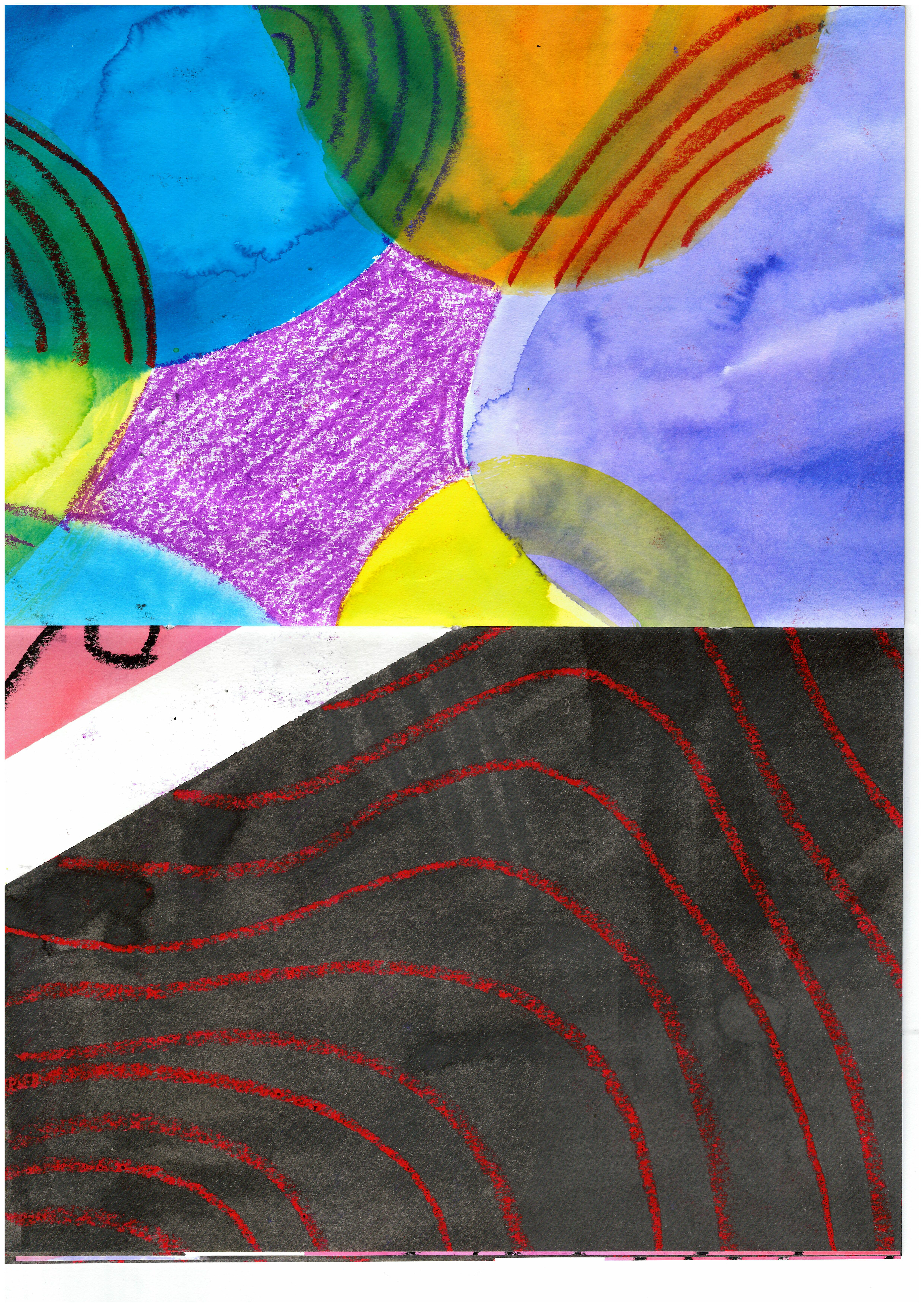
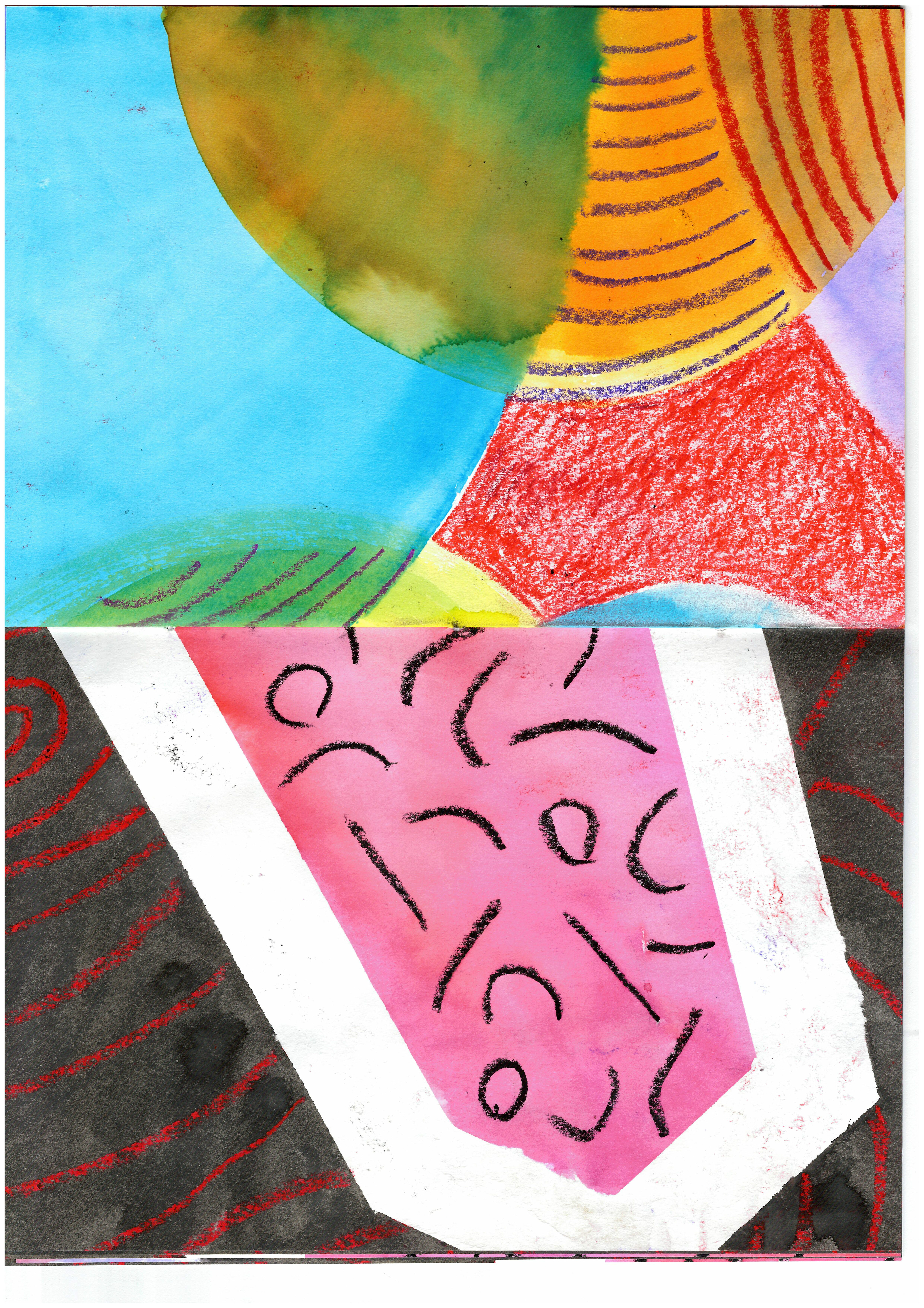
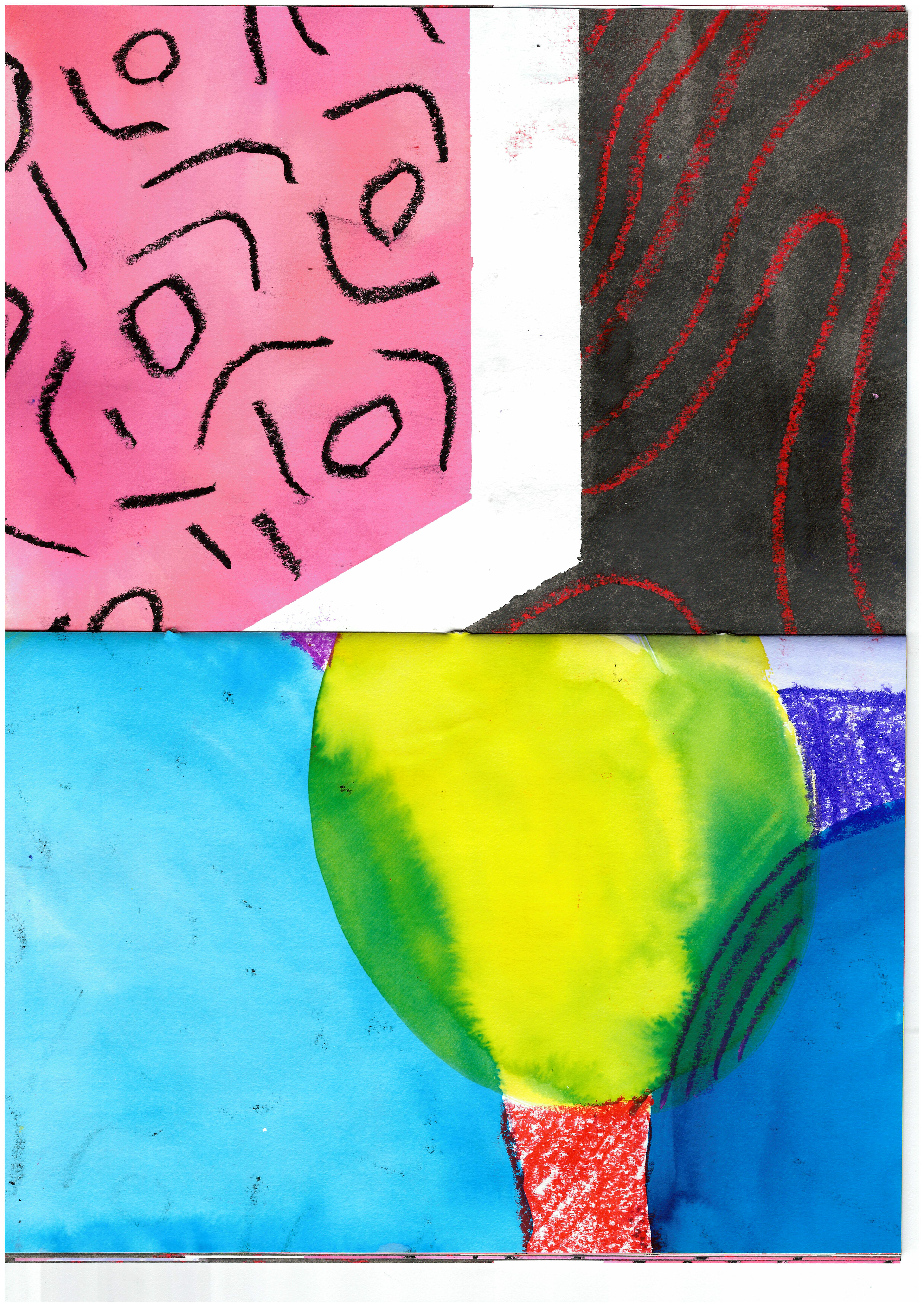
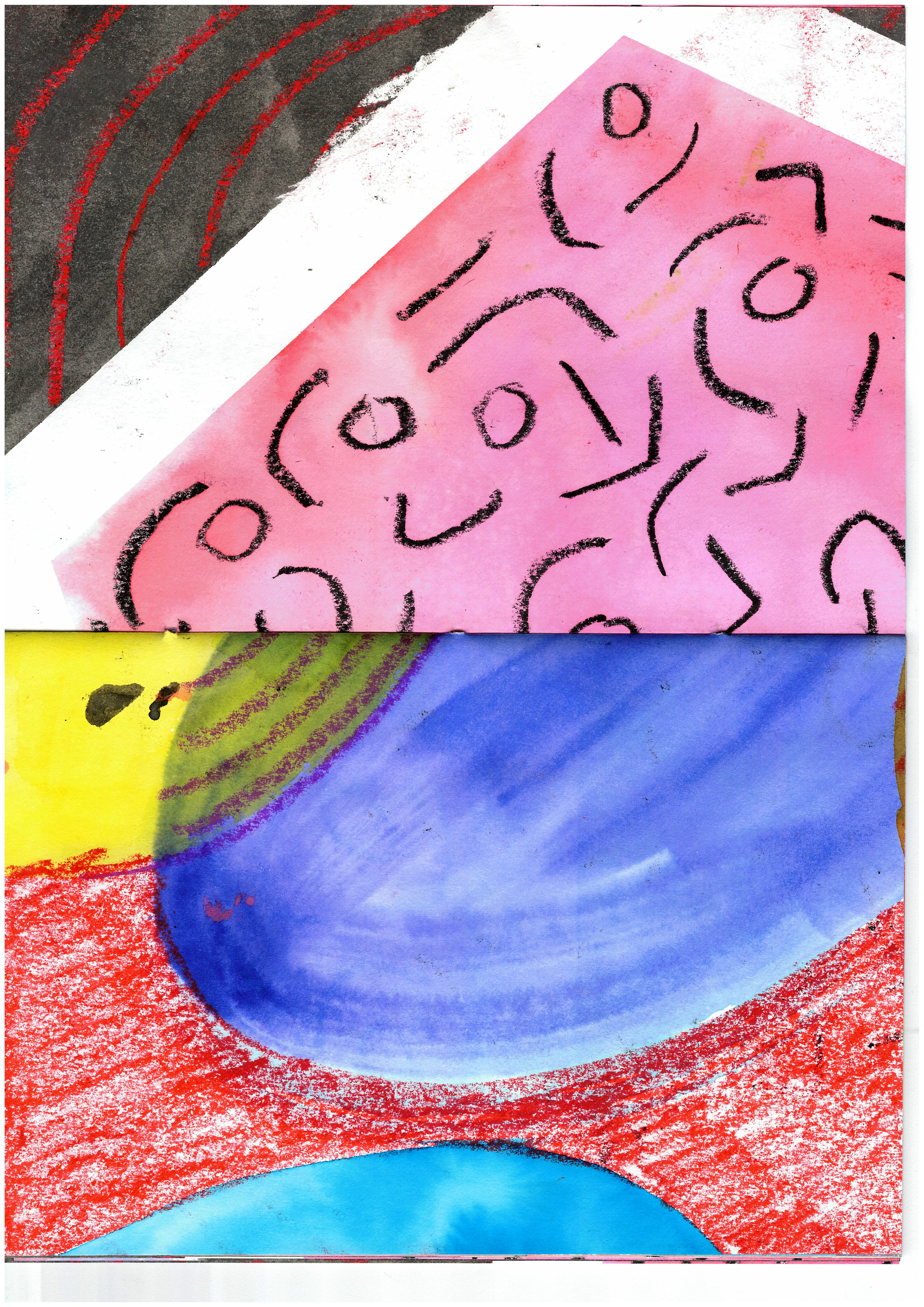
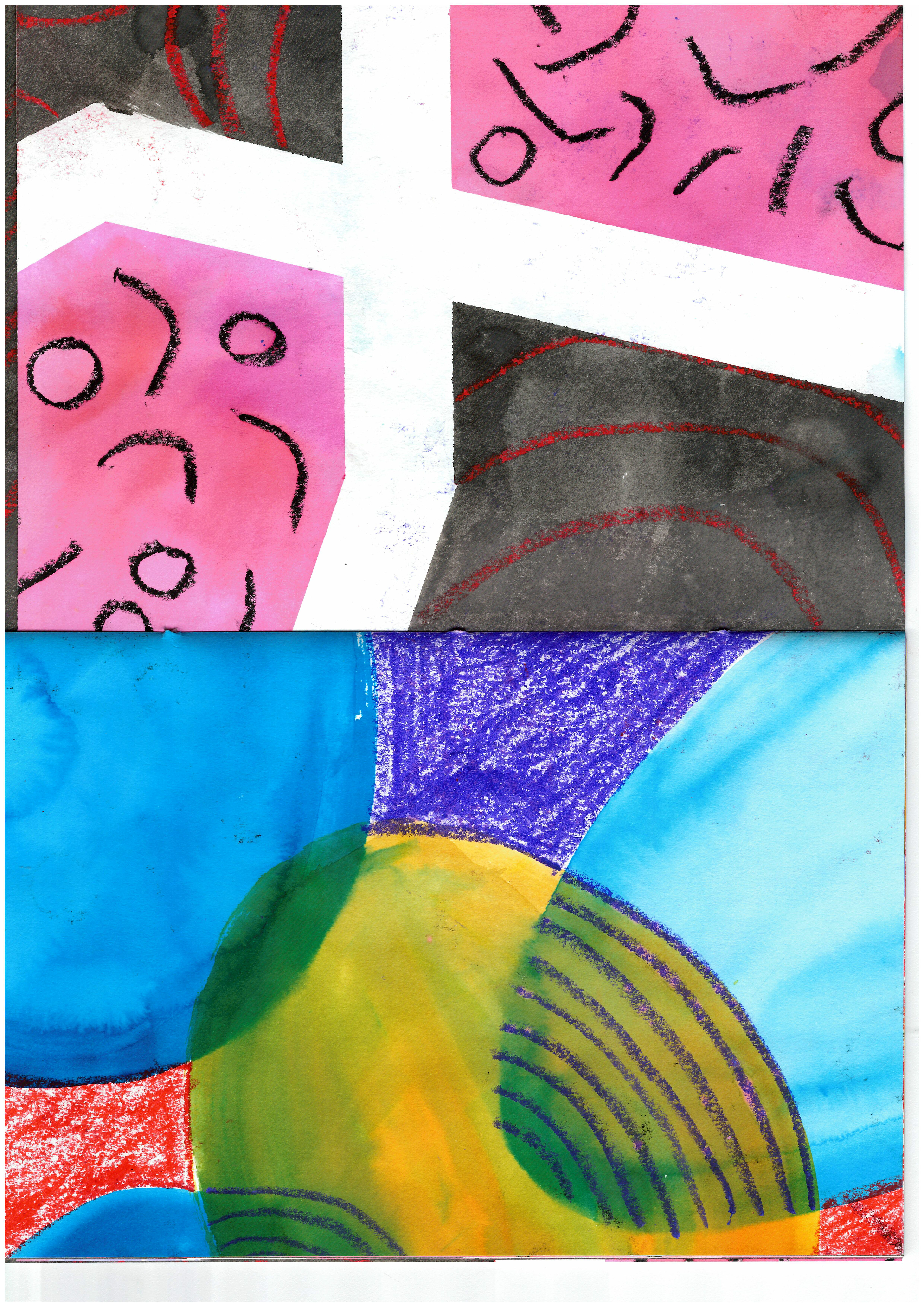
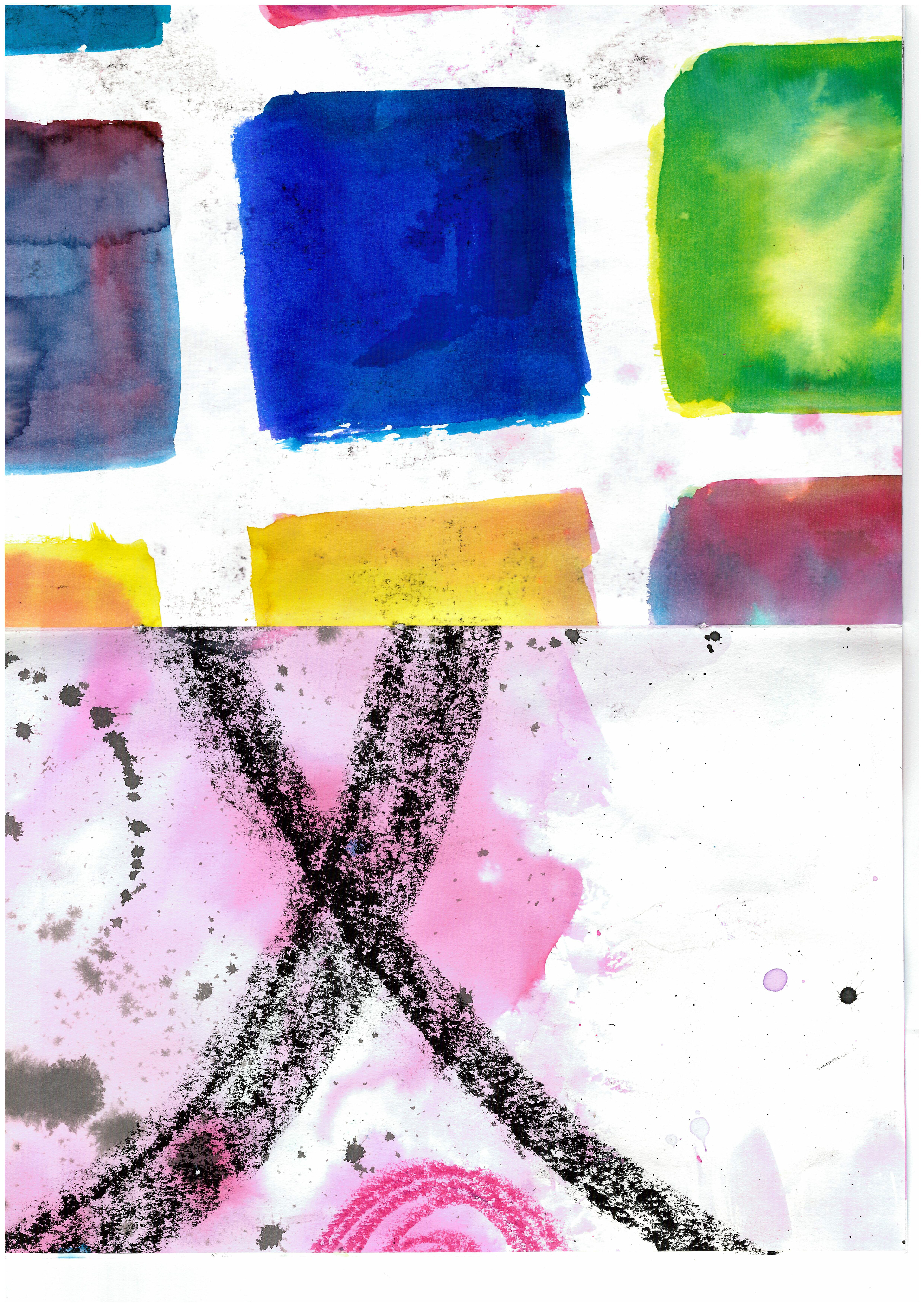
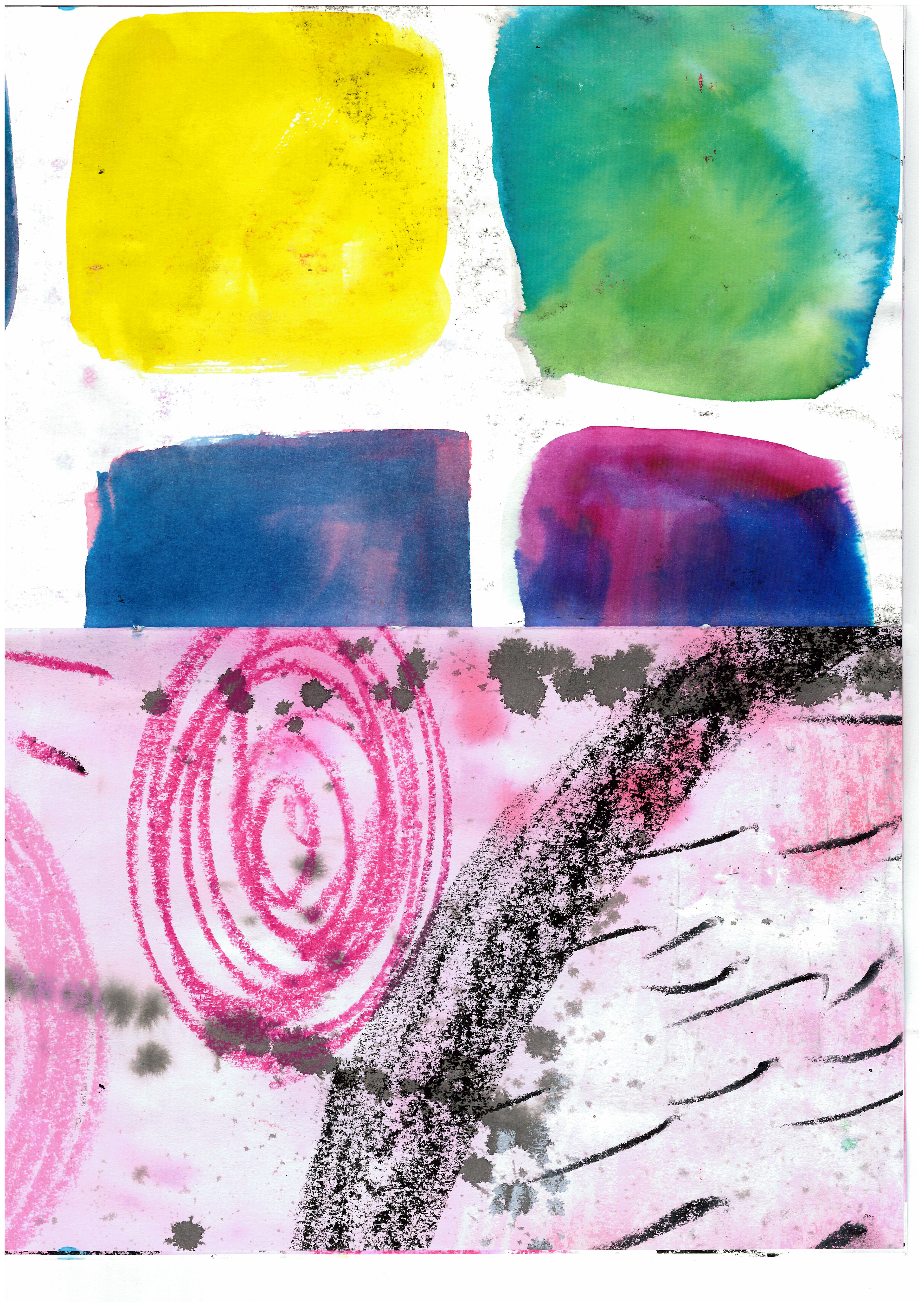
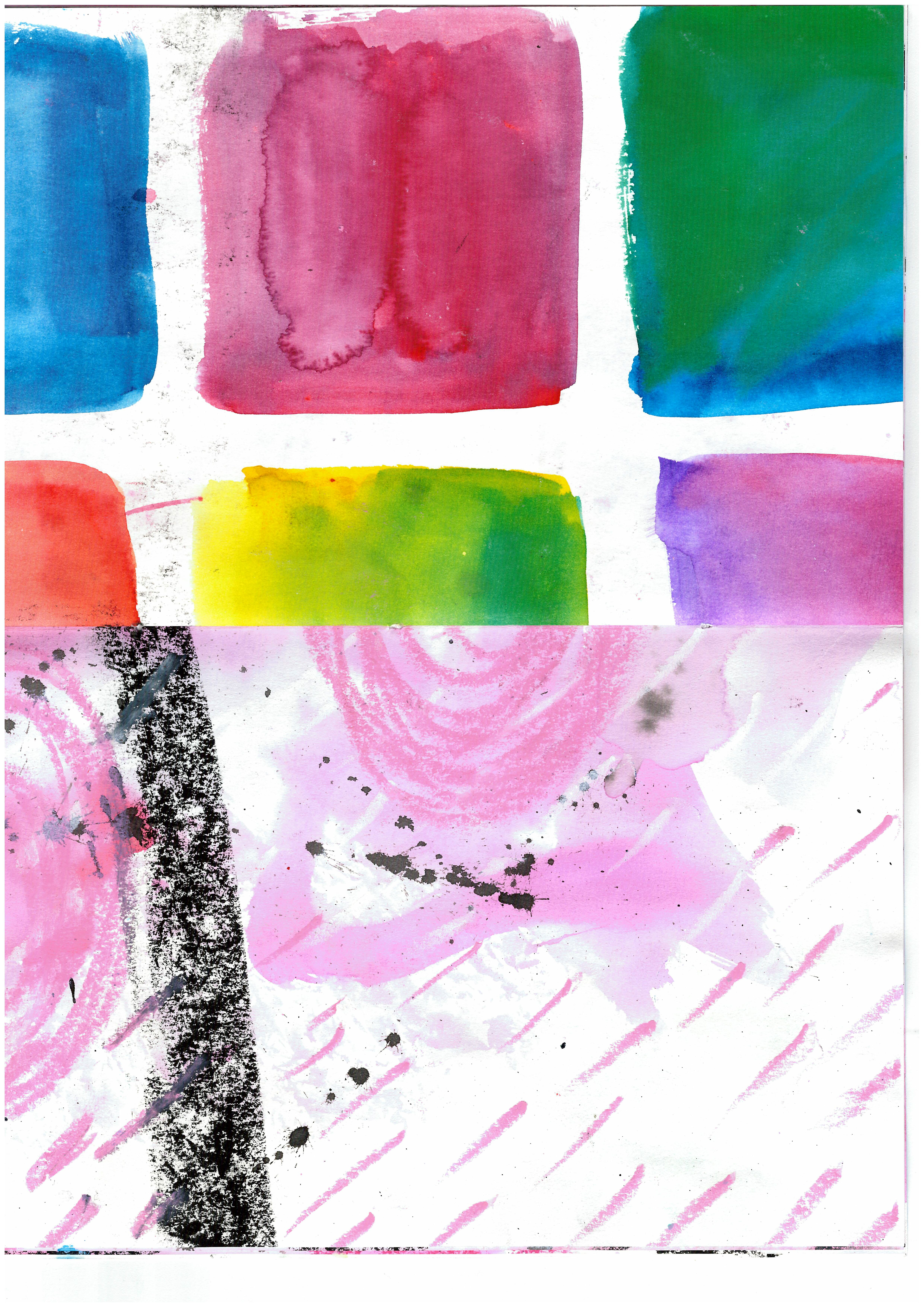
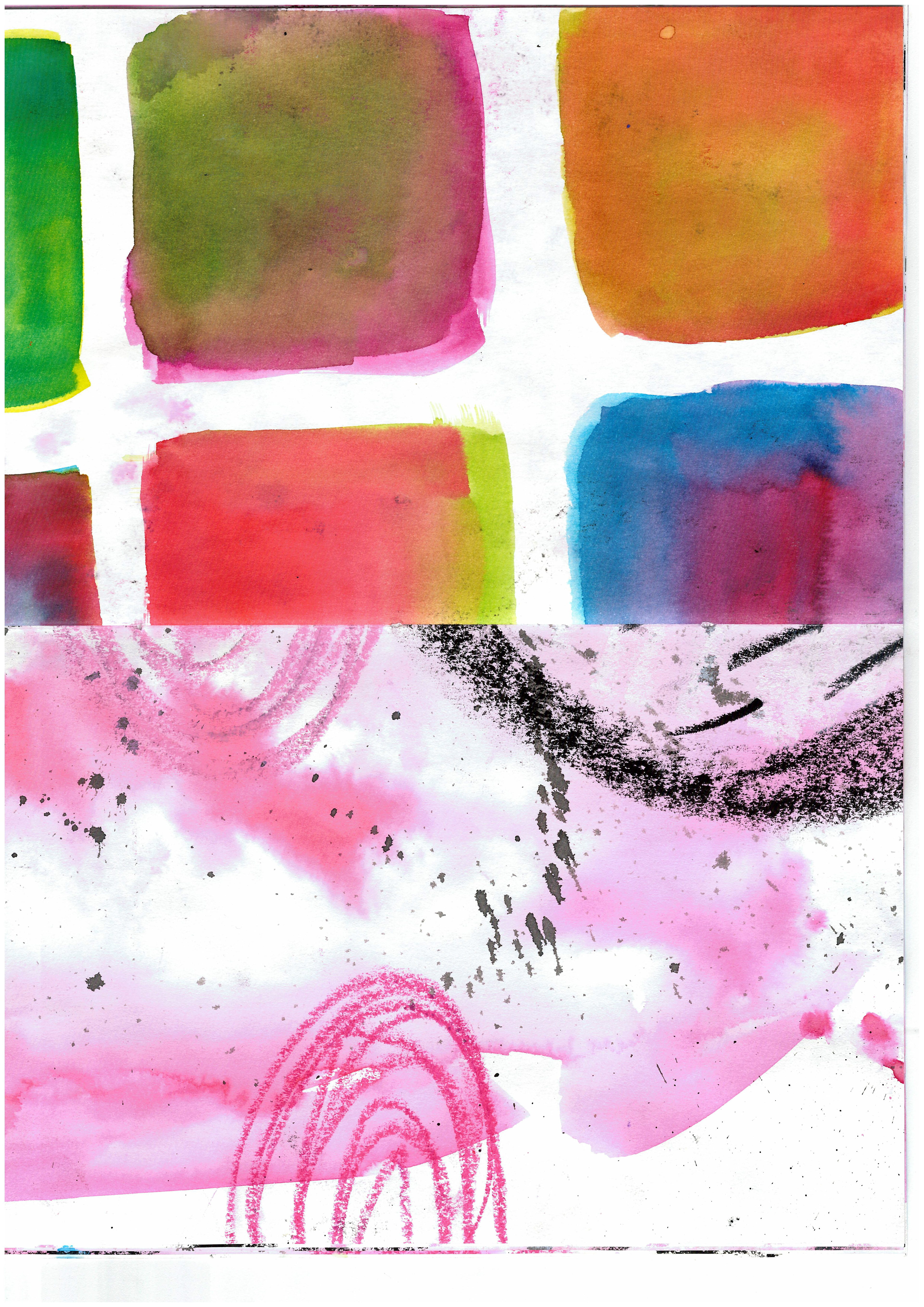
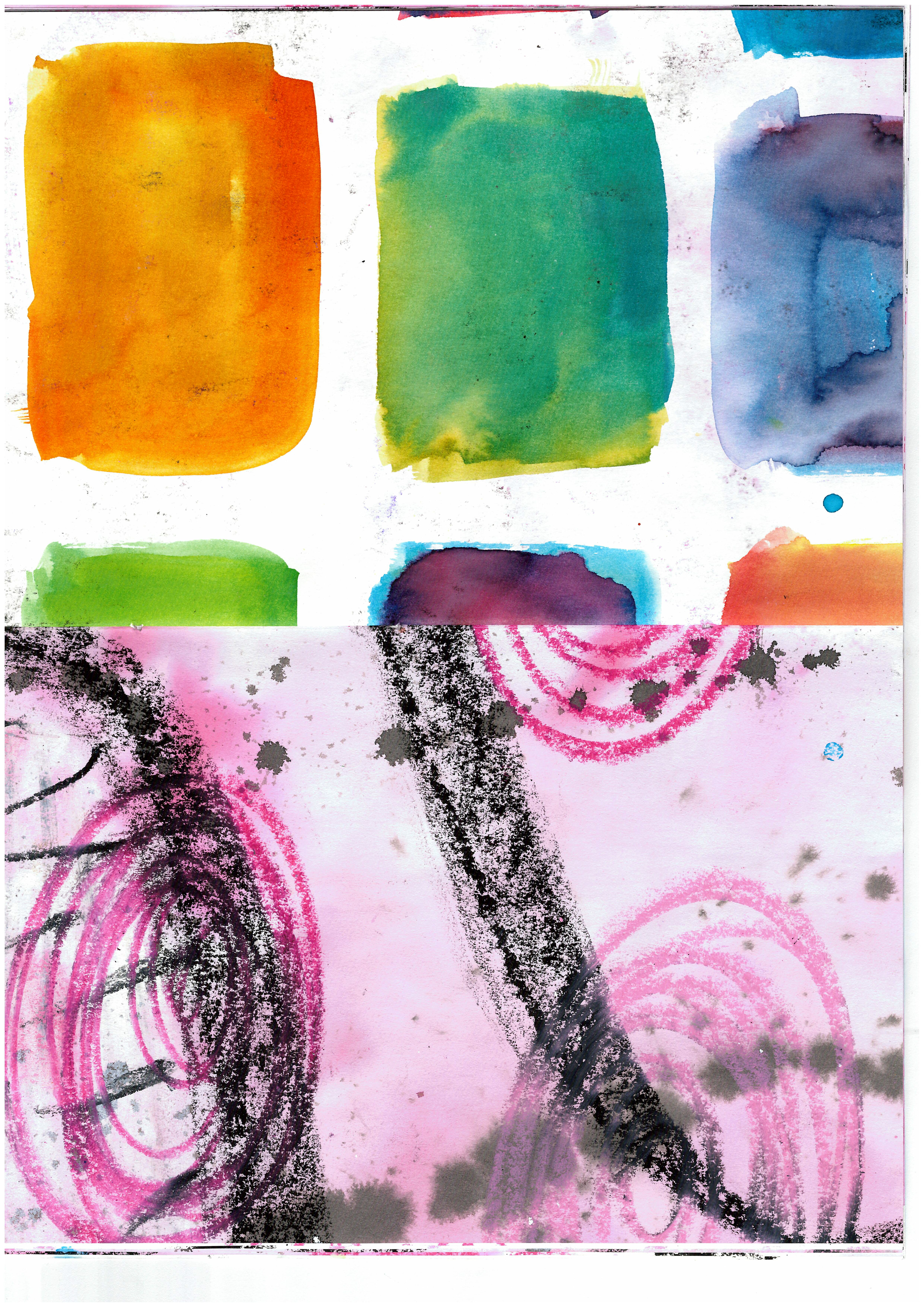
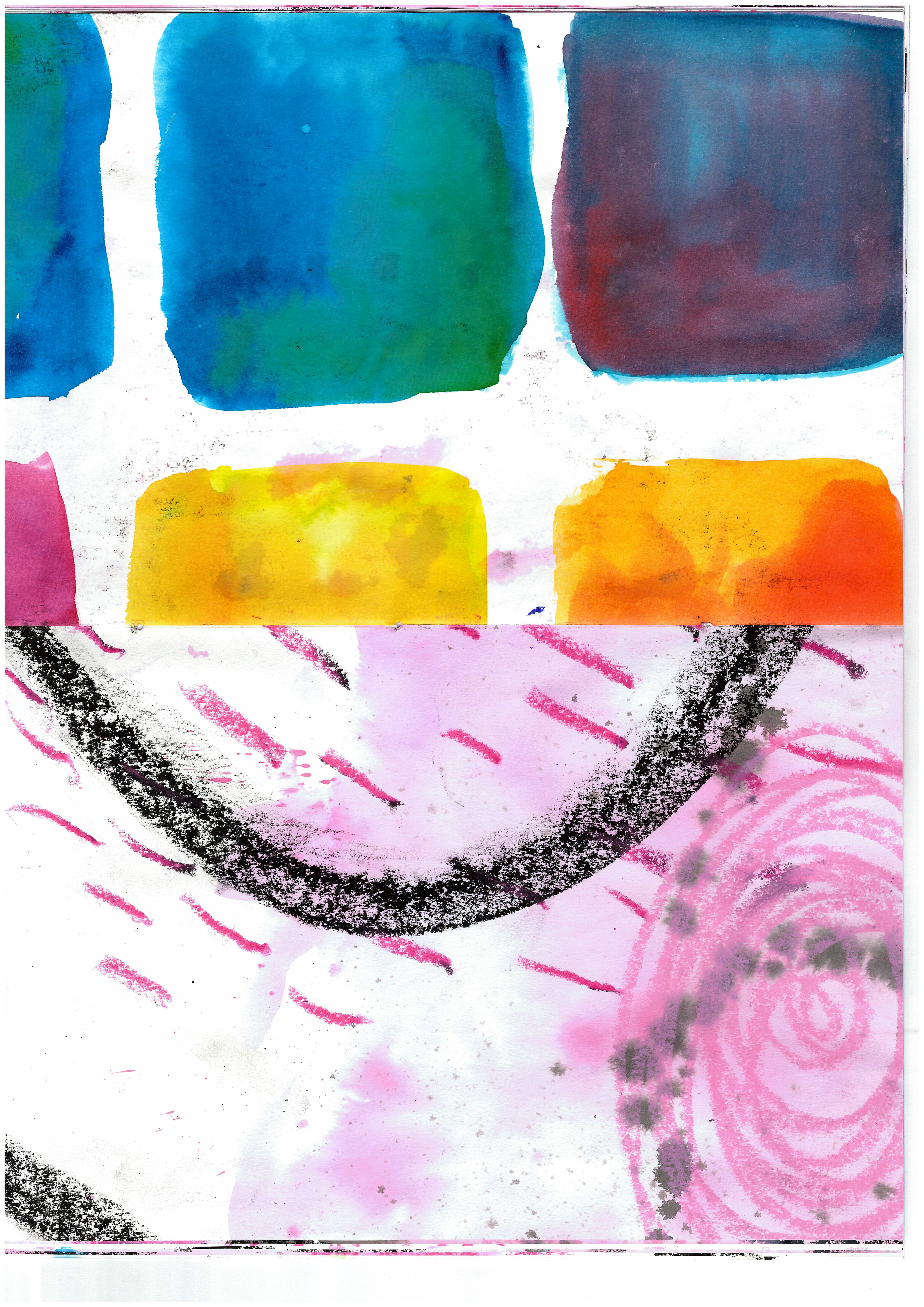
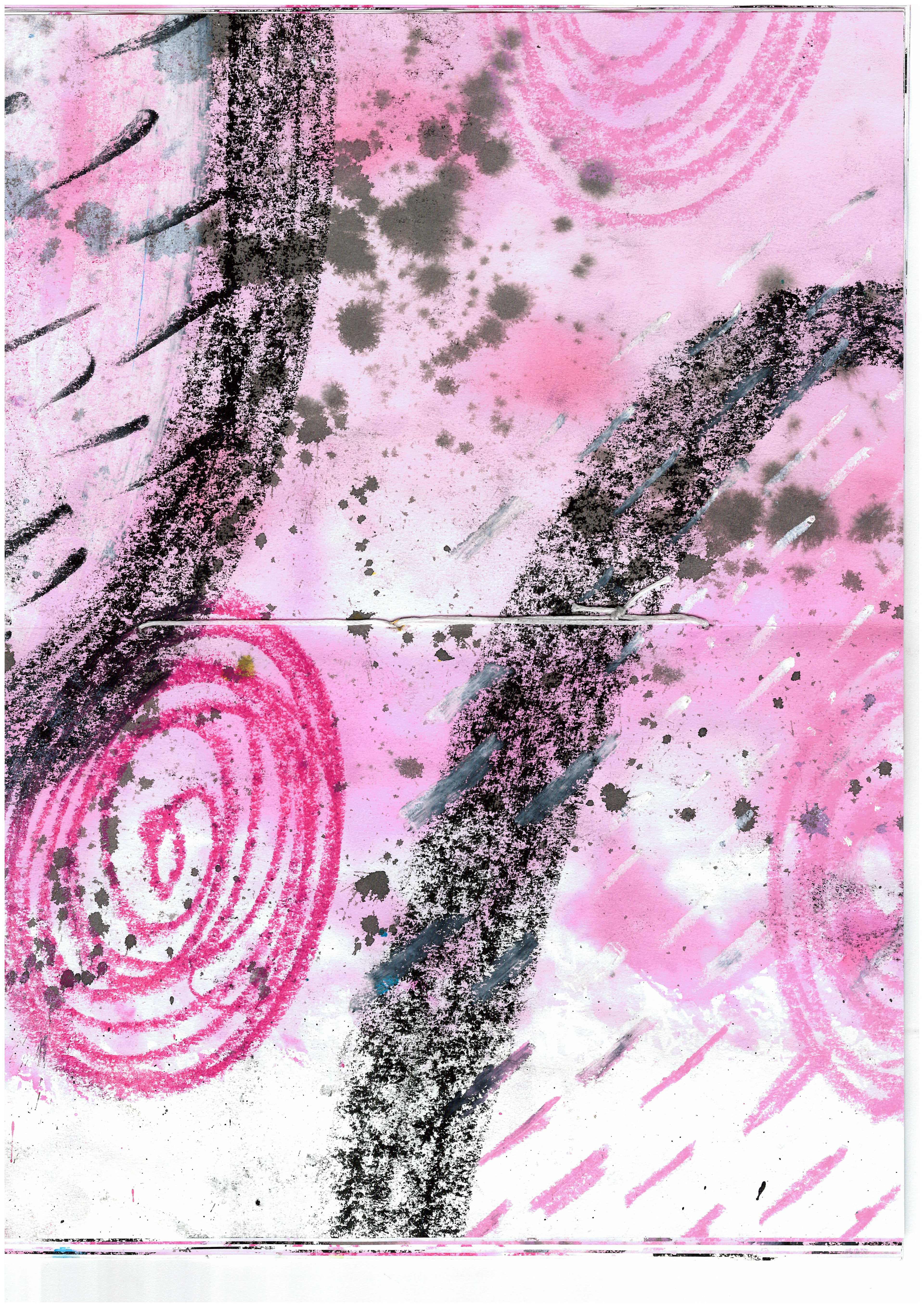
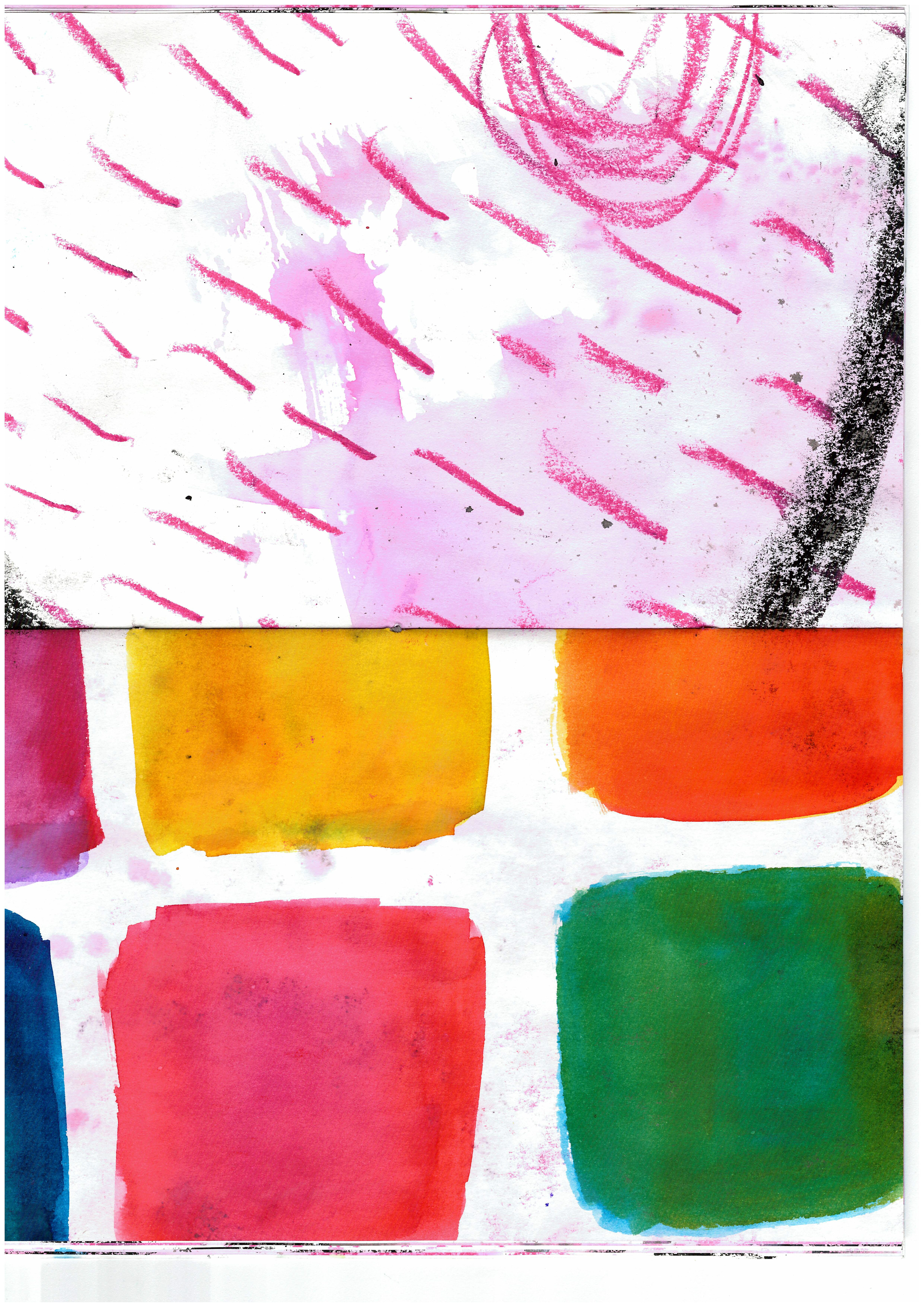
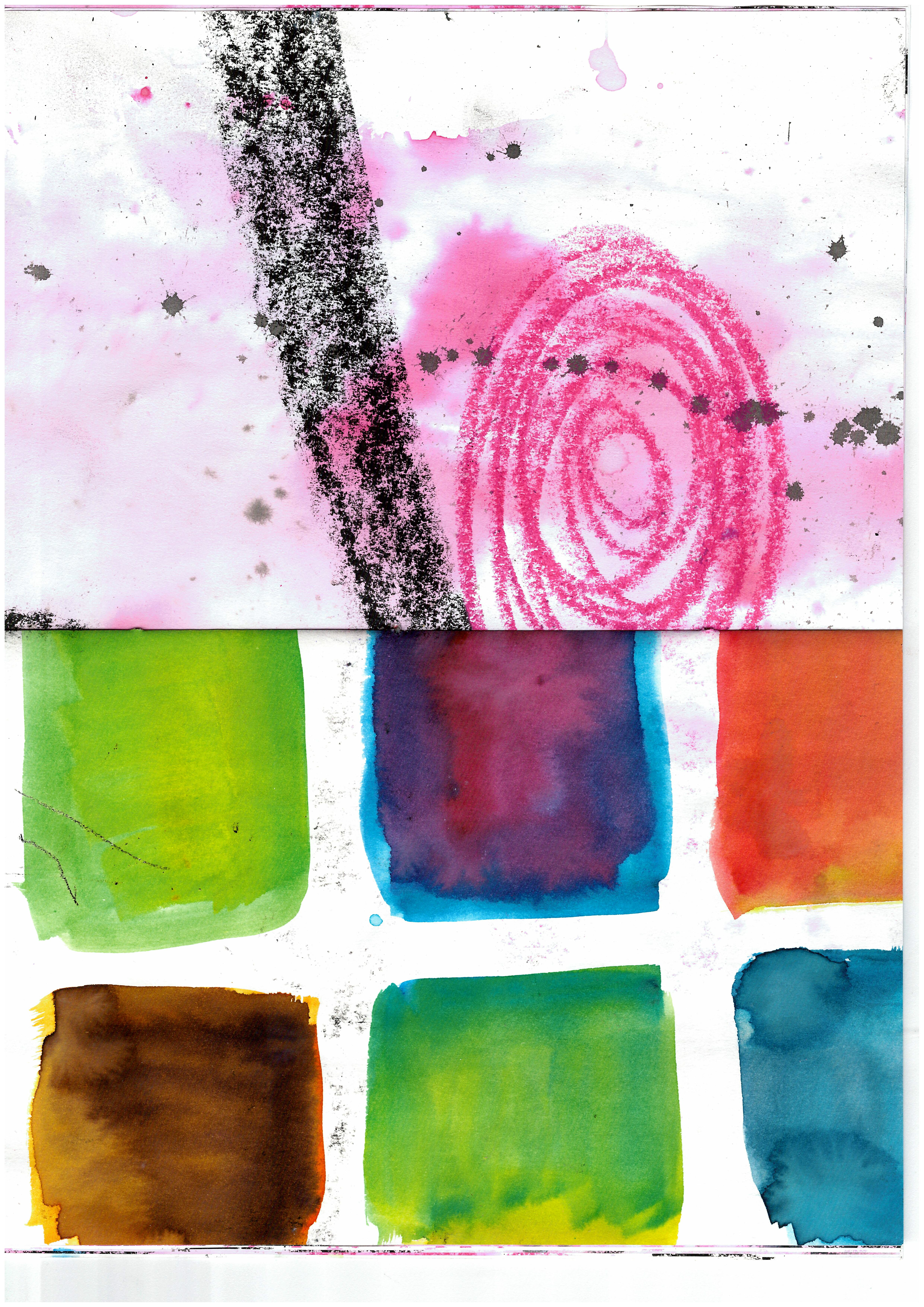
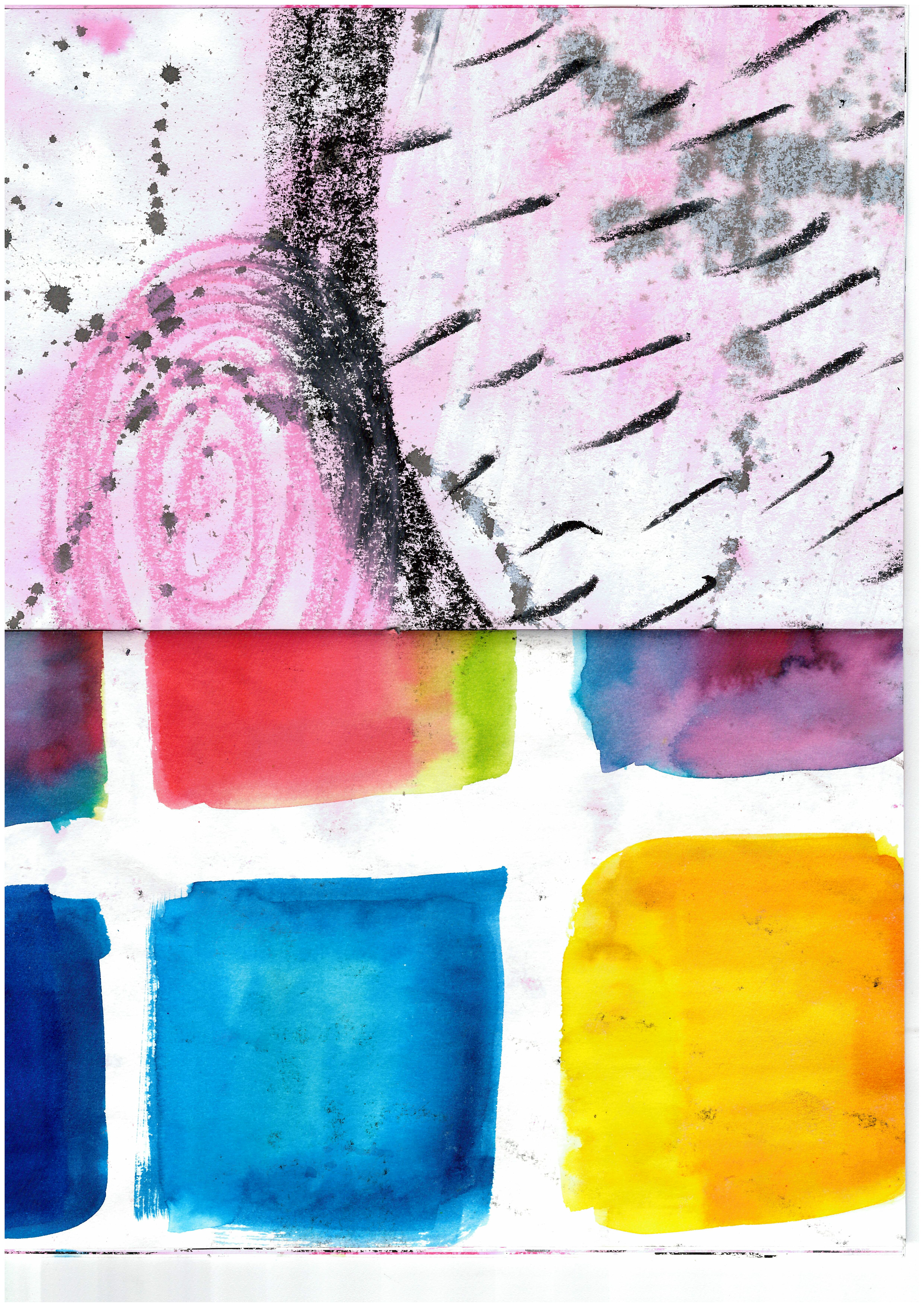
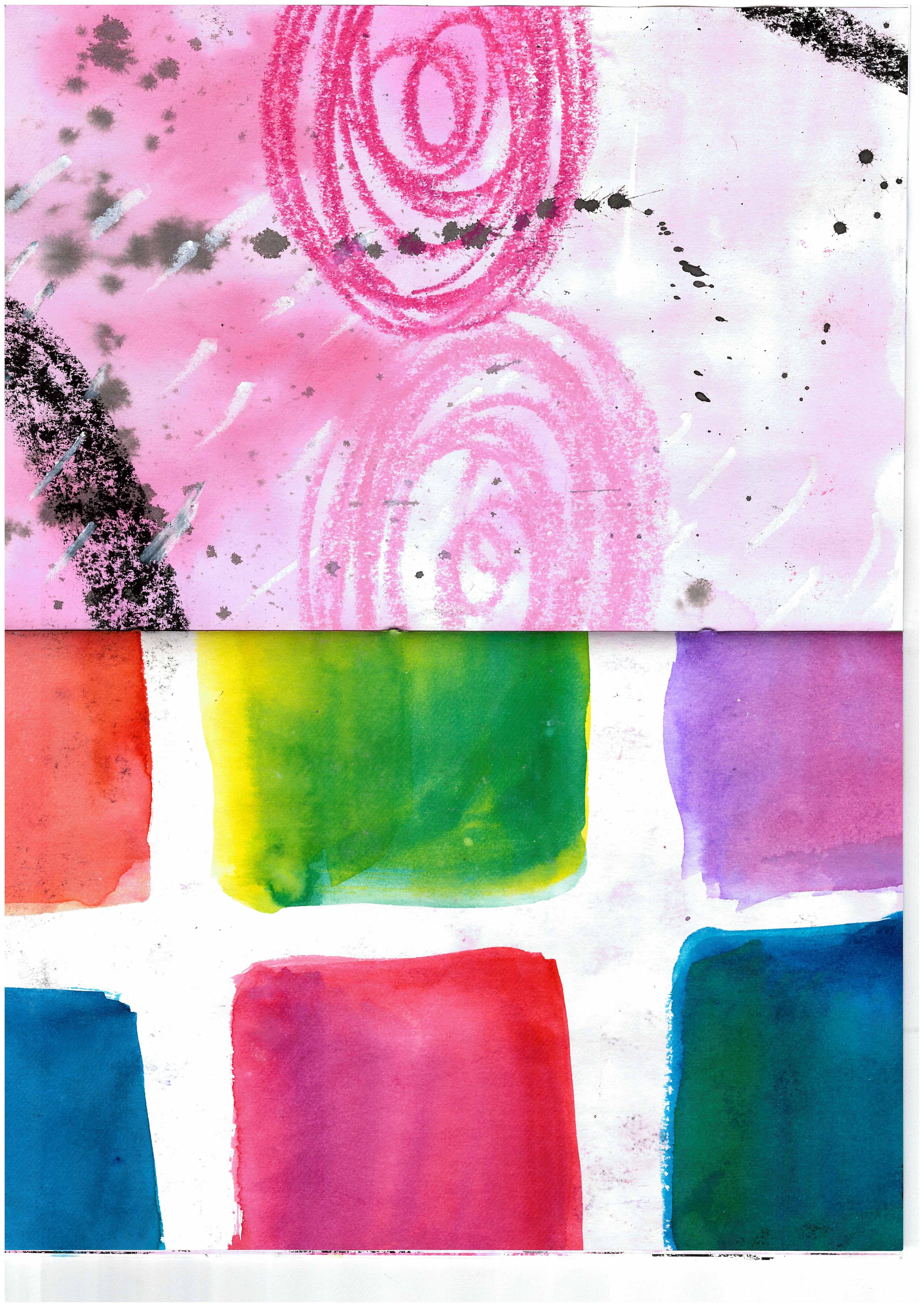
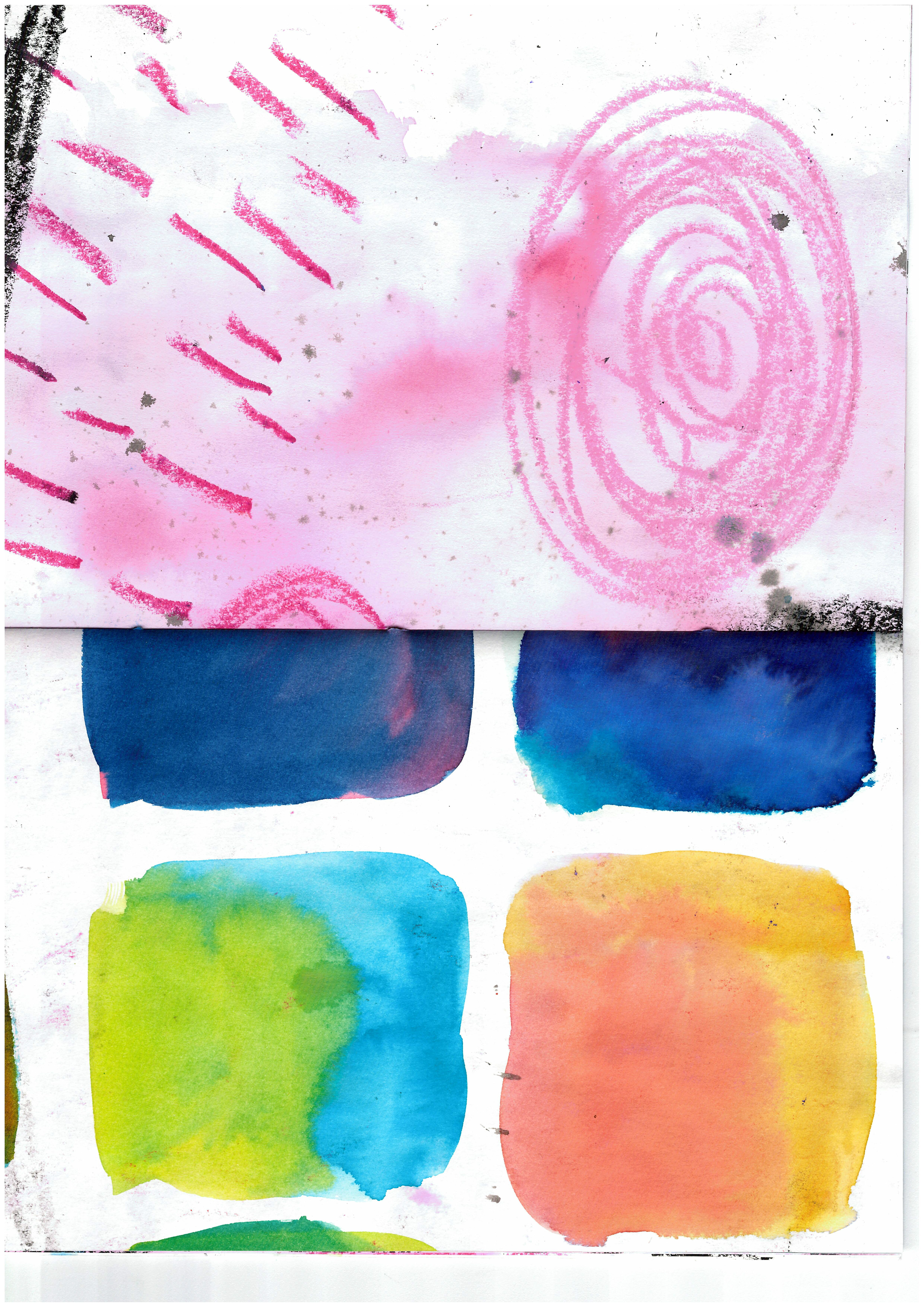
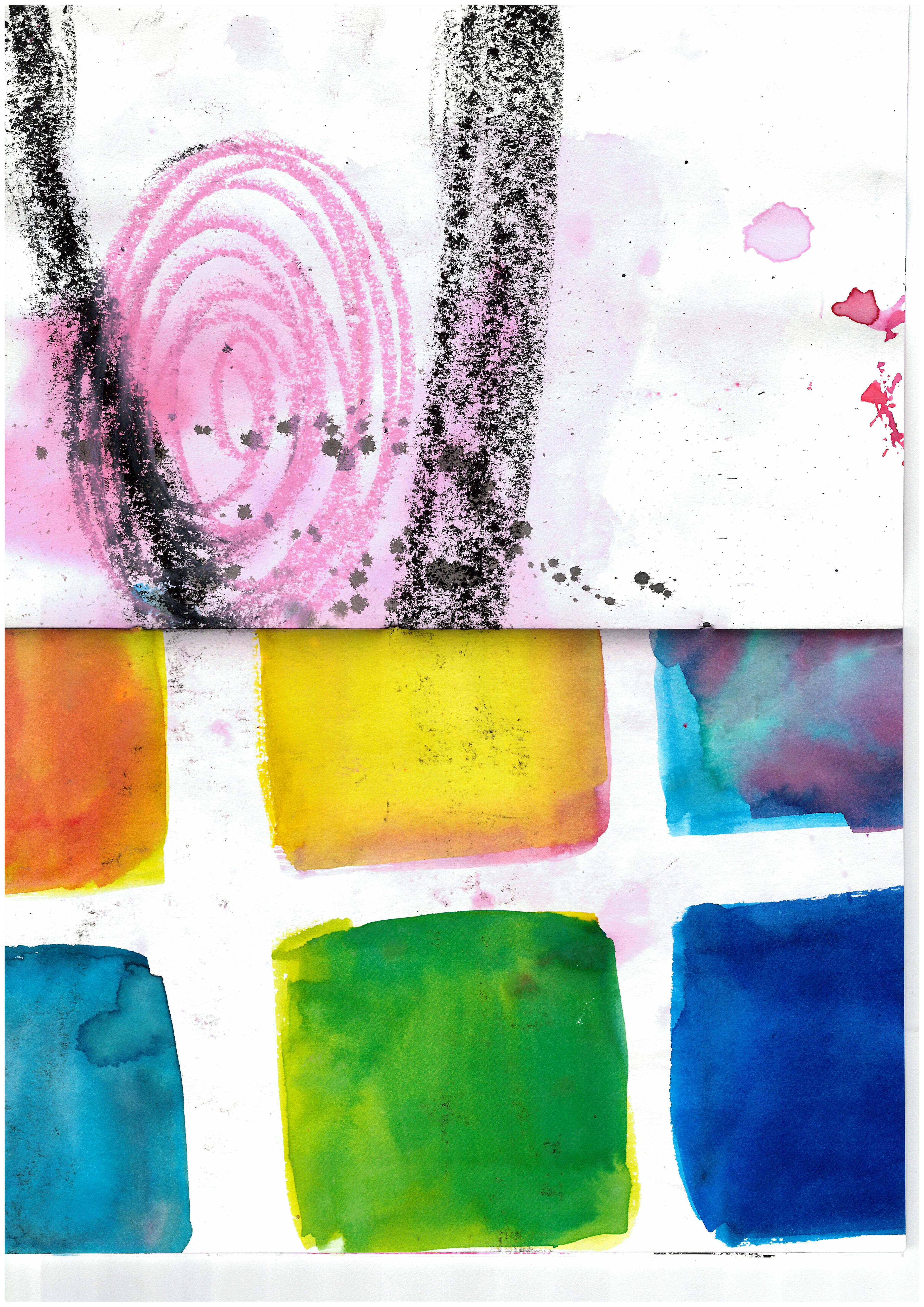
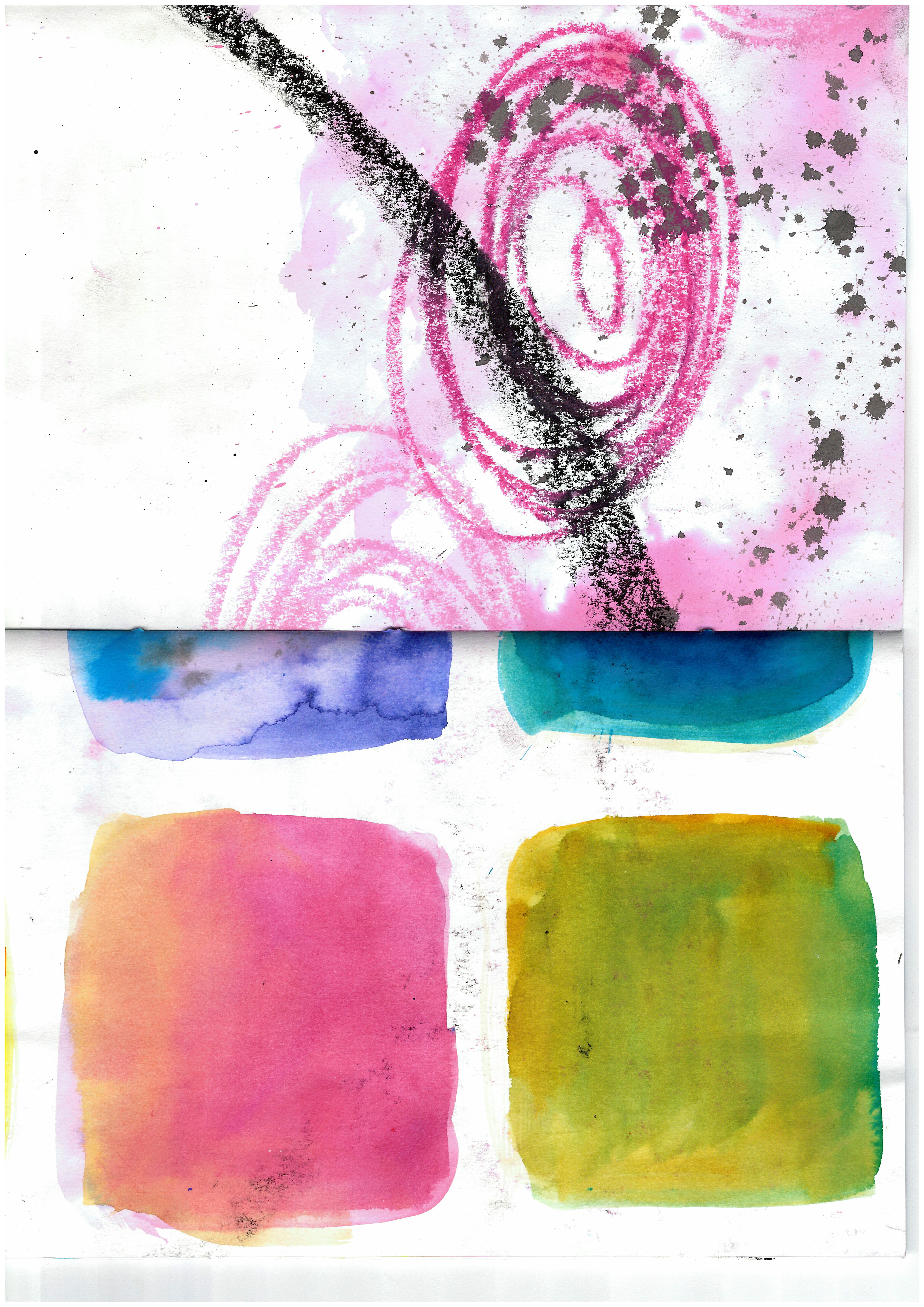
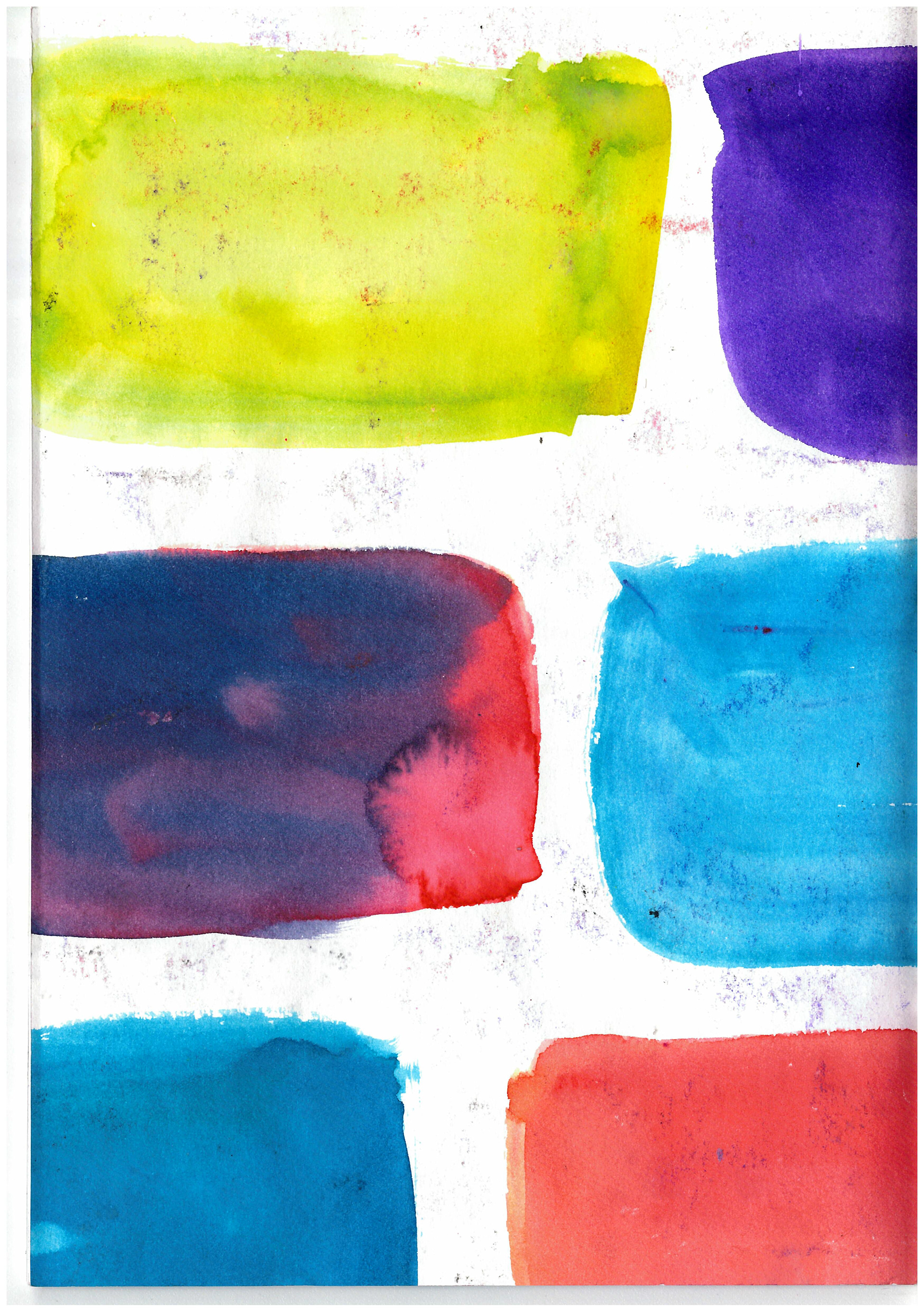
I kind of dig the squished look of all the images, Anyway, This is a lil piece ive deemed as a starting task. I have taken a bunch of small inspiration ive gotten from some of the research ive done, The roses are fromt he very popular flowers and bones poster, the black and white stripes and curves are from the increase of optical illusion art that occured in the 60s/70s and the vivid backgroud colours are purely because pyschedelia art was very vivid. theres not really a meaning or story behind it all or the contrast of the pages, but merely a test if i can take inital things ive noticed, put them all together and make it look 'good'. which i find was successful. i would like to do more with the pink/orange side, which i will update when i do, because it is rather bland, but that in itself is a contrast towards the other side.

TRippy artists and lots of colour (of all kind)
Lui ferreyra
tomasz mro (overlapped pieces)
alex garant
mikos gyftakis (my favourite)
Wassily Kandinsky
jackson pollock
joan mitchell
thomas croft
jenny saville
andy warhol
peter max
Lui ferreyra
tomasz mro (overlapped pieces)
alex garant
mikos gyftakis (my favourite)
Wassily Kandinsky
jackson pollock
joan mitchell
thomas croft
jenny saville
andy warhol
peter max
SOME words to wrap my head around
Hauntology - originally a philosophical concept. a mash of haunt and ontology, ontology being a concept of properties and their relationships (right?). postmodern philosopher jacque Derrida coined it as a representation of ''the figure of the ghost as that which is neither present, nor absent, neither dead nor alive.'' it has associations with unrelated objects, concepts and time. an object or other that is described as "haunted" has association with something that would be unrelated to it. it can also be related to false nostalgia and recontextualisation of cultural artifacts. a listener of the music is unable to distinguish the past from present from future.
nostalgia
retro
Hippie (beats/beatniks/love child)
consumerism
normal


SO, this project isnt resonating with me anymore, something about the sheer scale of it all and that i'm trying to capture a whole era of art and culture in singular pieces, and it isn't working. SO lets look at it on a more word by word basis...
some words that stick out to me are, psychedelic, Freedom, rock'n'roll, retro, consumerism.
One of the main aspects of the Hippie counterculture, was their will to be free, freedom against war and consumerism. they had entire music festivals in nature, including Woodstock, which was so many generations of people coming together to celebrate freedom, love and music.
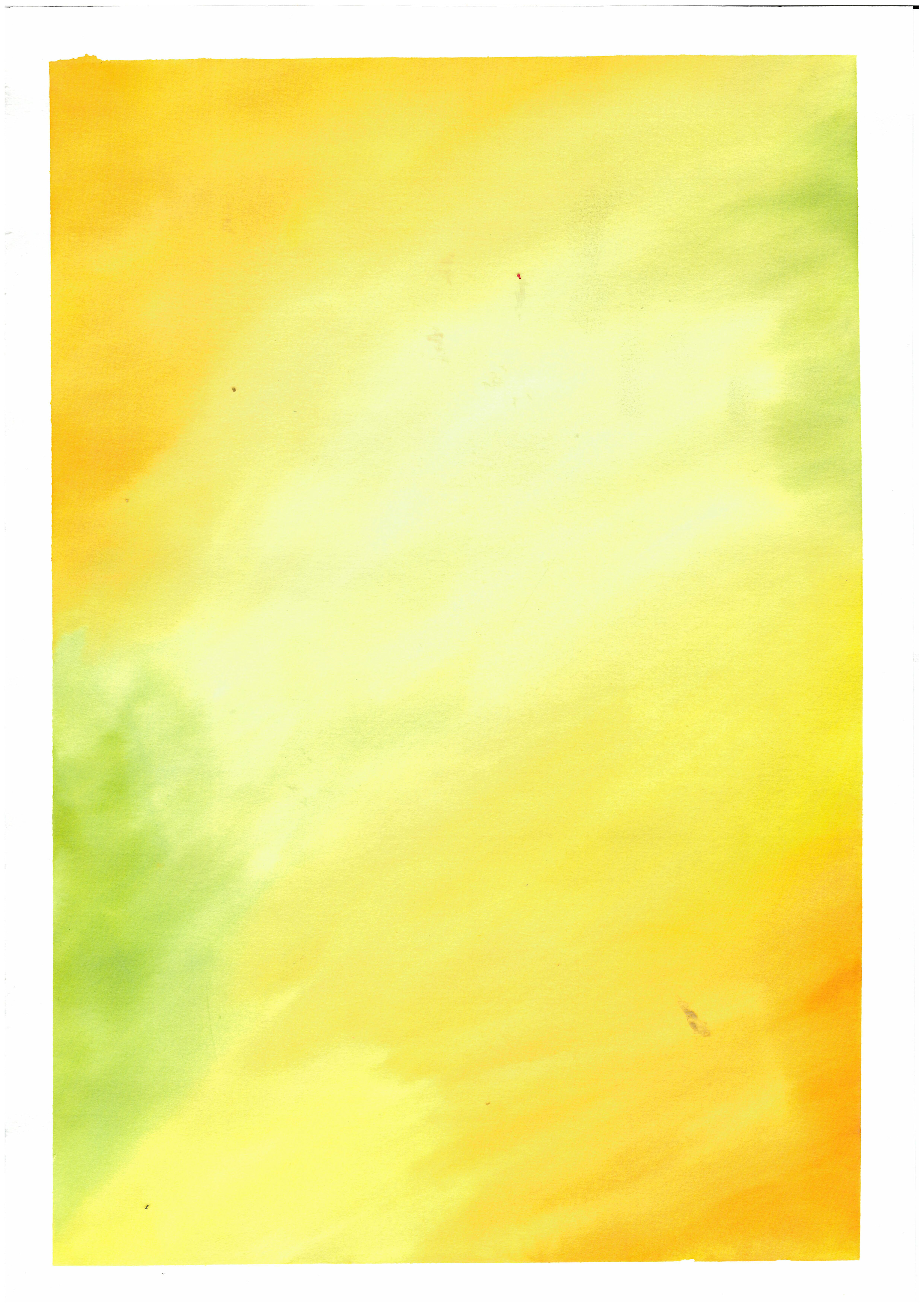
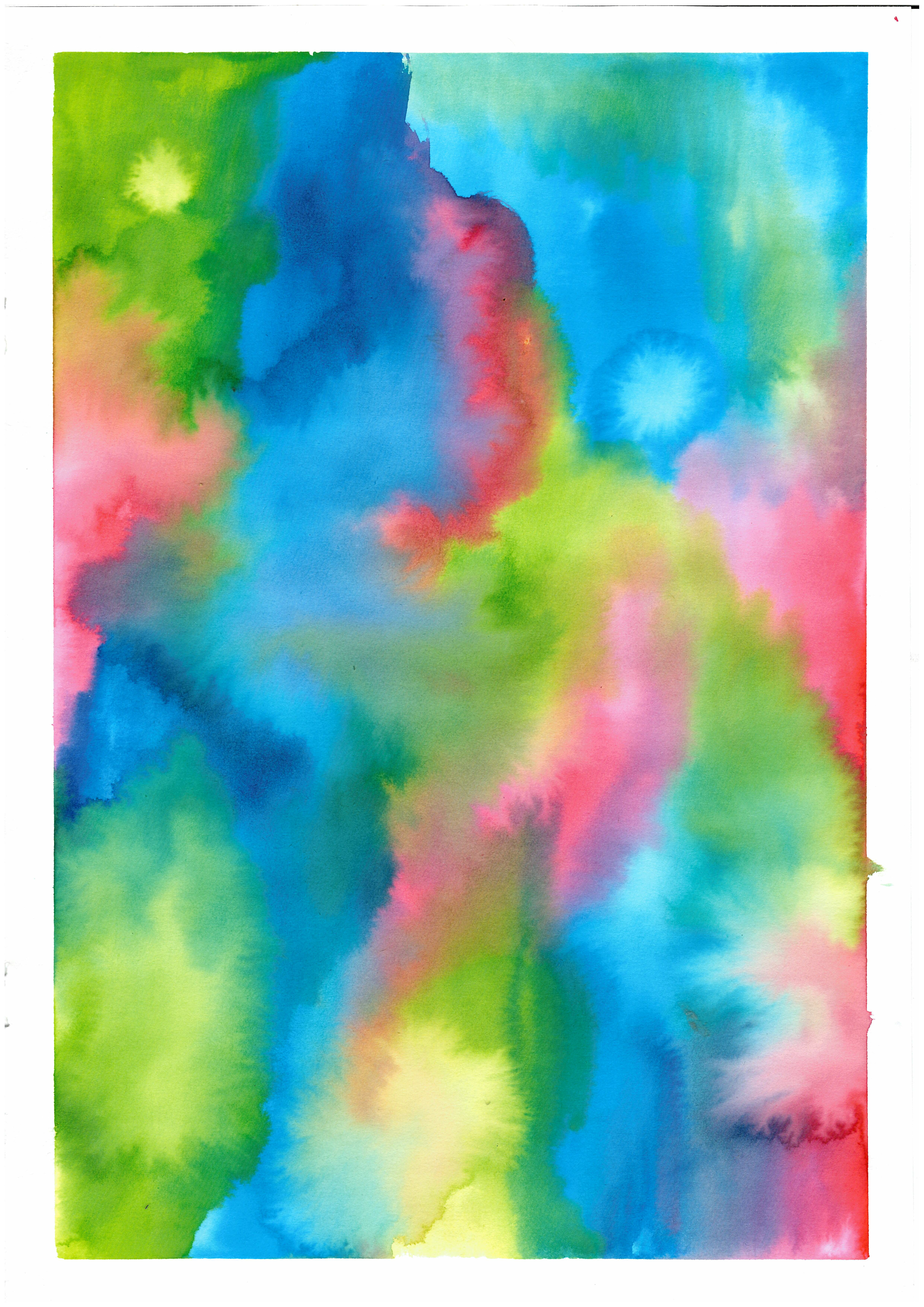
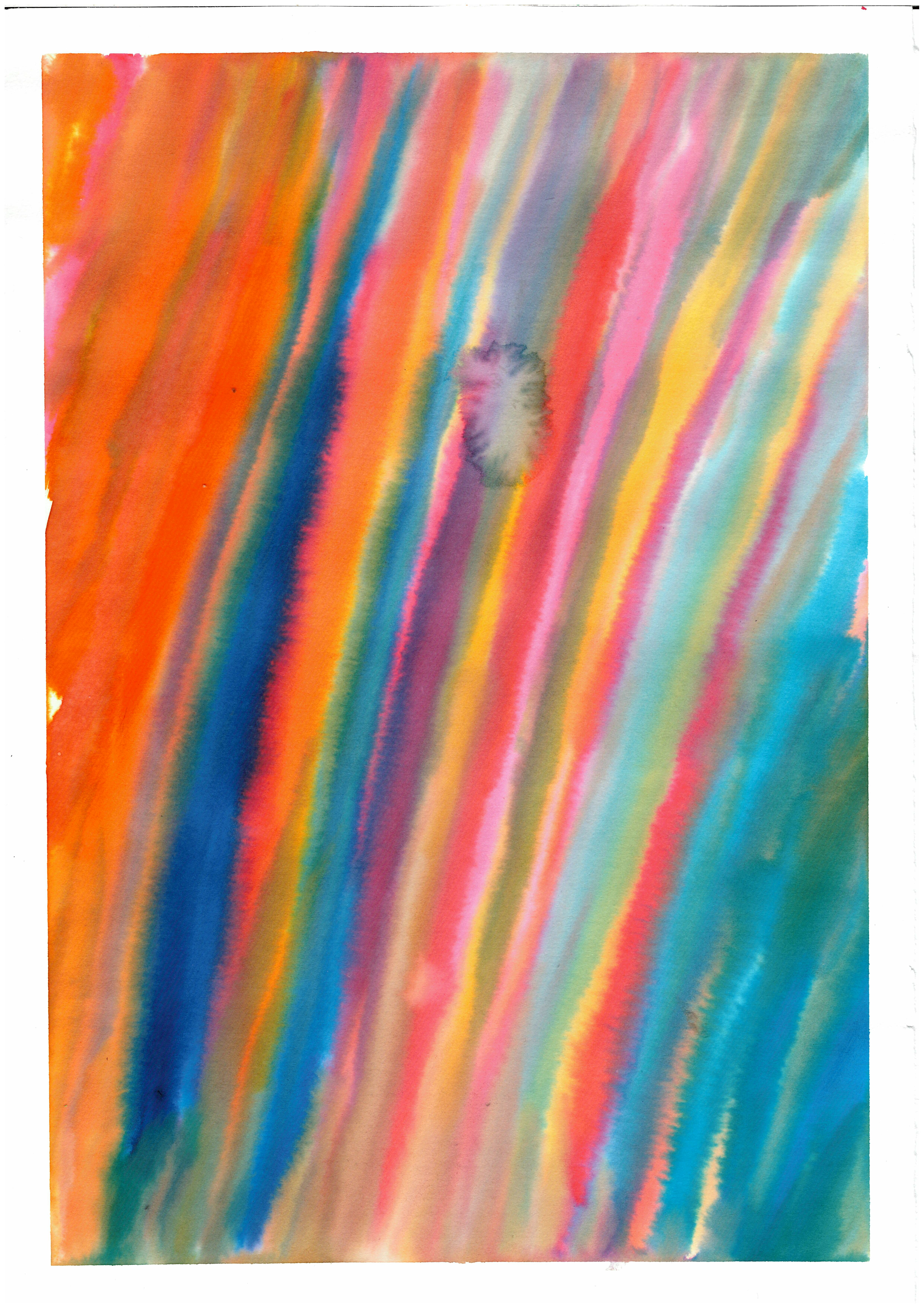
I'm going to play around with the idea of freedom, in the art form i'm most comfortable with, which is abstract and colour, make patterns and shapes that to me, represent a type of freedom, or wanting to be free. then go from there.
and potentially relate it back to my own identity
some words that stick out to me are, psychedelic, Freedom, rock'n'roll, retro, consumerism.
One of the main aspects of the Hippie counterculture, was their will to be free, freedom against war and consumerism. they had entire music festivals in nature, including Woodstock, which was so many generations of people coming together to celebrate freedom, love and music.
I'm going to play around with the idea of freedom, in the art form i'm most comfortable with, which is abstract and colour, make patterns and shapes that to me, represent a type of freedom, or wanting to be free. then go from there.
and potentially relate it back to my own identity
This is the brief that I was basing my work off of whenever I had a small chance to.