some ideas i have come up with for my personal exploration this year include looking into..
street art
digital art (specifically for videogames or advertisement)
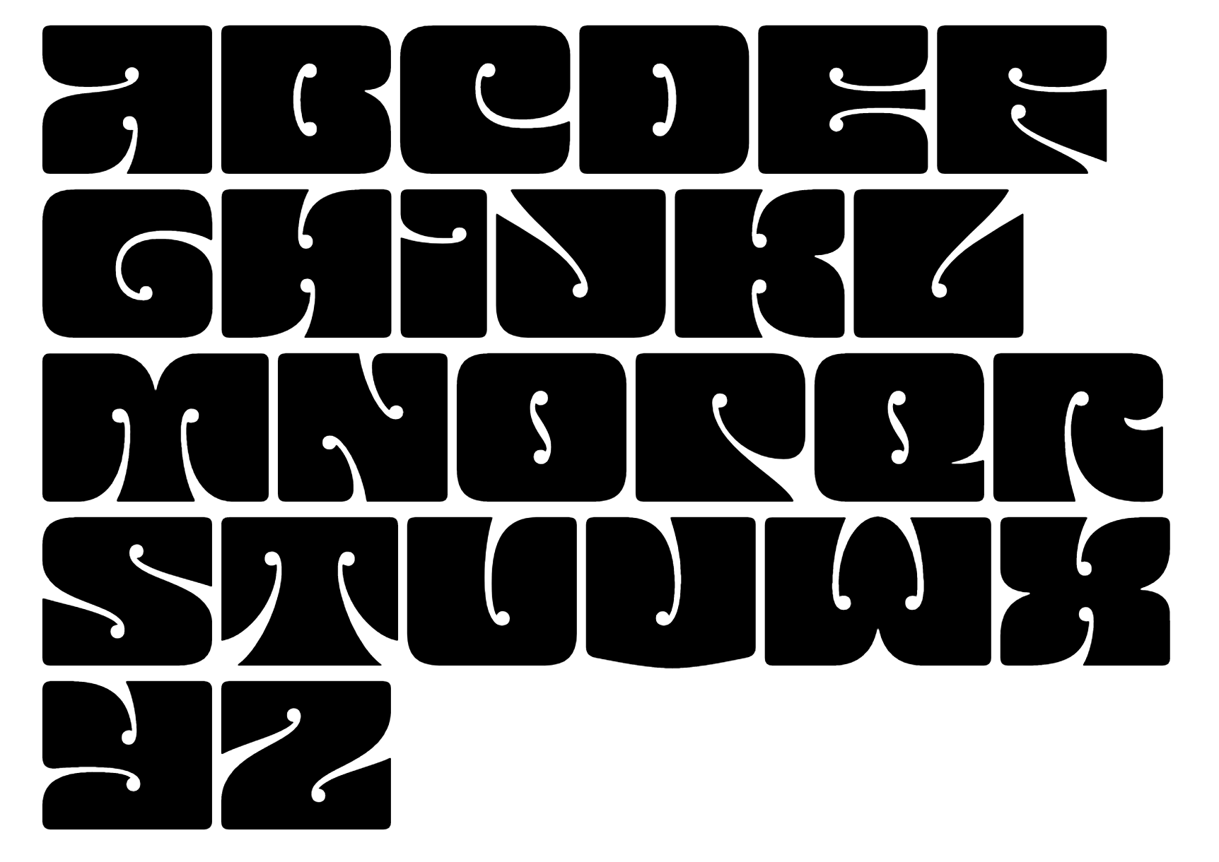
typography from the 60s, 70s
album covers
retro portraiture
authenticity
street art
digital art (specifically for videogames or advertisement)
typography from the 60s, 70s
album covers
retro portraiture
authenticity
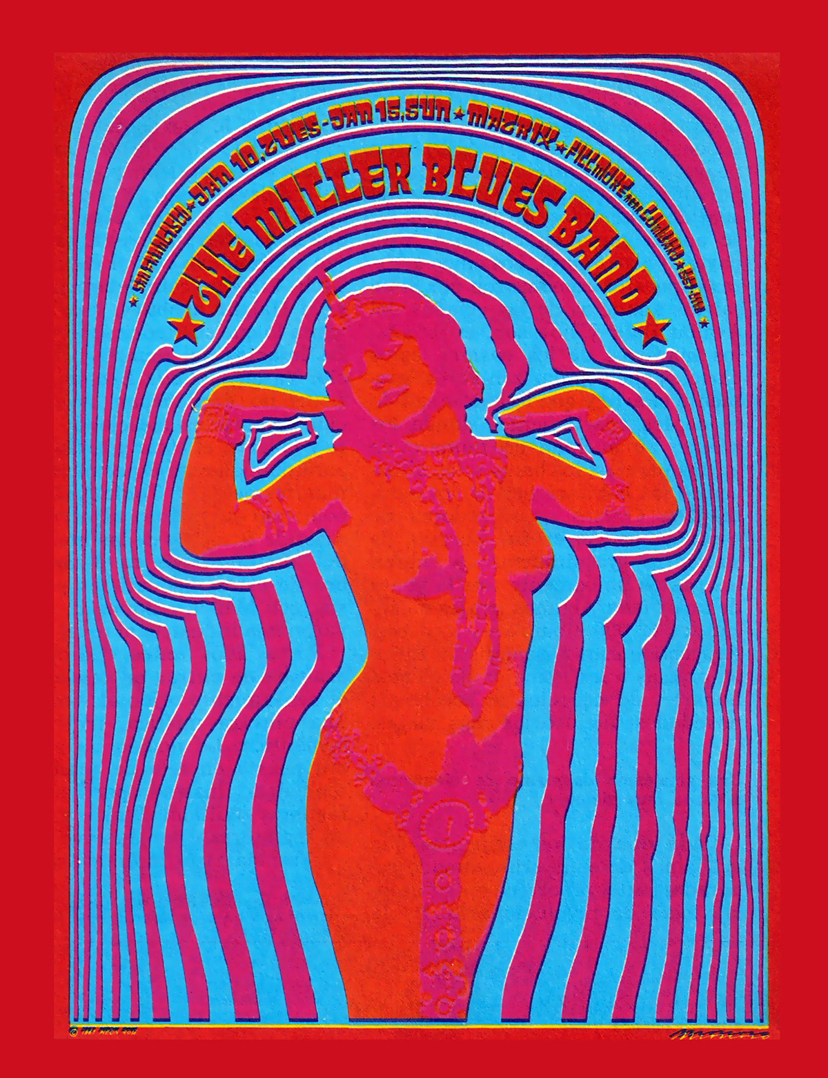
WES wilson
wes wilson is a poster artist from the 1960s. his posters were created with inspiration from many sources such typefaces by alfred roller to art by aubrey beardsley from 1893. there is a popular saying that wilson said because of the illegibility of his typeface which was 'they'll stop to read it because they cant read it'. obvioulsy forcing people to stop and look at the work rather then skim and walk past. as hard as they are to read, i do feel as though the words blending together in of itself looks and creates shapes in the pieces. I also reall ylike the use of colours and framing, which i find is key aspect to create a poster that stands out.


The alfred roller typeface wes wilson used in many of his works.
Stanley Mouse
Best known now a days for his poster art for the rock band, 'grateful dead', stanley mouse became massively popular as a rock visual artists in the late 1960s ad onwards. hes done hot rod painting, painted the beetle logo for the band journey and created in real time, t-shirts for fairs. he is a master of creating the style that feels like the music its for. same as wes wilson, i really the use of the typeface, especailly int he grateful dead posters. lots of his pieces like from his monster art collection, are considered to look like an lsd trip.


alton kelley
alton kelly worked quite closely with stanley, usually being paired with one another. he has created a ton of psychedelic rock posters.
RICK GRIFFIN
quote from rick
'All of the best artwork is accidental. It happens when the artist works through his self control and goes beyond, into the realm of the unexpected and the unknown. That’s when the great stuff happens.'
Rick griffin worked with artists such as jimi hendrix, grateful dead etc and created incredible album covers, posters and logos for them. he was also a surfer and later created surfing art for movie and surfer magazines.
Rick griffin worked with artists such as jimi hendrix, grateful dead etc and created incredible album covers, posters and logos for them. he was also a surfer and later created surfing art for movie and surfer magazines.


Vitcor moscoso
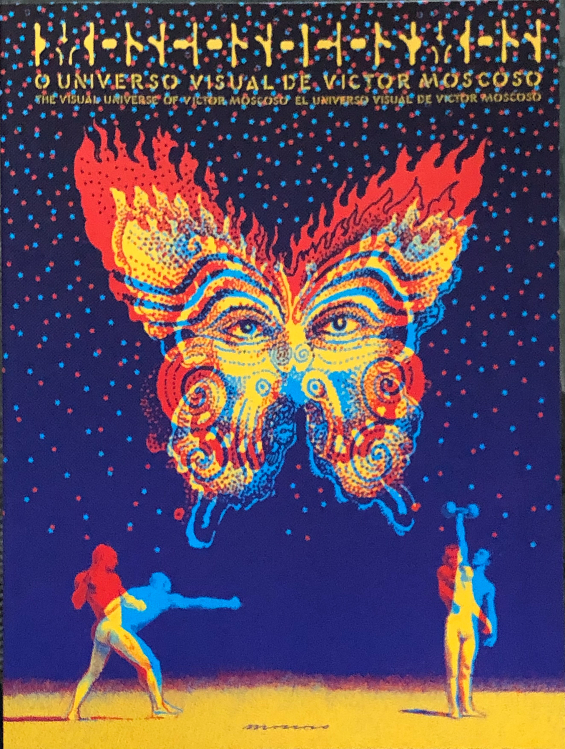

victor mosoco is among the great rock artists of the 60's seemingly using a type of risograph style that none of the other used. he learned after leaving art school that good posters want the viewer to look for as long as possible, and so started making the lettering illegible to keep everyone engaged, rather then people just looking and then leaving in a few seconds. the first of the big 5 to have his posters shown int eh museam of modern art.

Image of the 'big 5' of pyschadelia art
(all mentioned above)
(all mentioned above)
https://journals-sagepub-com.ntu.idm.oclc.org/doi/full/10.1177/0022167816671579
https://www.youtube.com/watch?v=aH03zy7C8No
https://www.youtube.com/watch?v=aH03zy7C8No
David Esquivel


Martin sati


Matt w. moore


Ray oranges


Muhammed sajid


martin naumann


ahmed khedr


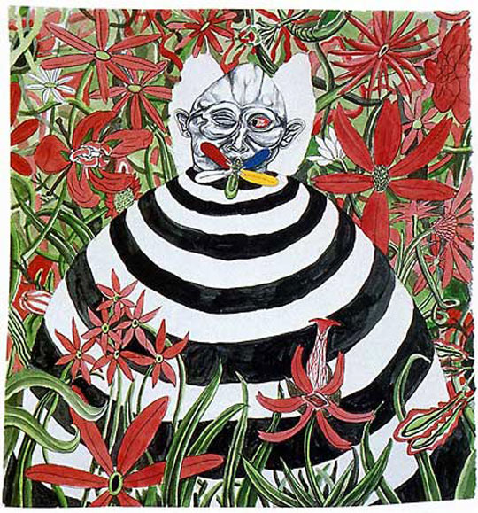
Tokio Aoyama
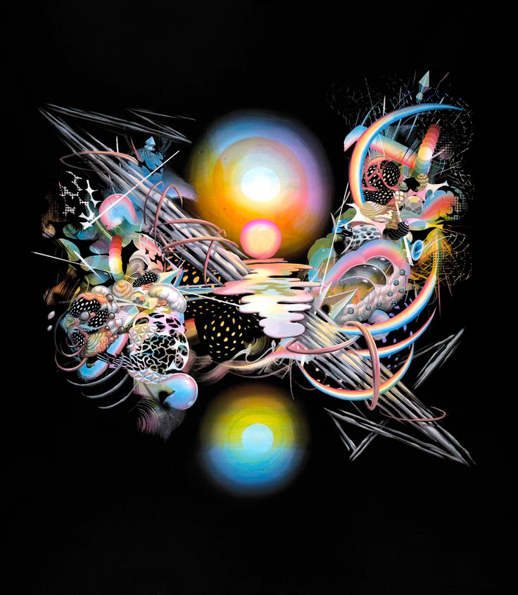
tokio aoyama is a japanese artist whos work combines surrealism with psychedelia. and also has a look of eastern spitiuality. its a combination of soul music and asian spirituality.
his work really is a weird mix of asian spiritual pieces and visuals of music and the essence of african american music culture specifically, he does not use colour in a realistic sense, like making people their skin colour etc, but the colours still perfectly blend together and bring the pieces to a whole. Its weird and its a lot to look at, but its fun and has meaning to him in the way he chooses what goes where. theres symmetry but also asymmetry.
https://www.steppinintotomorrow.com/post/tokio-aoyama


mario martinez


Joan Miró
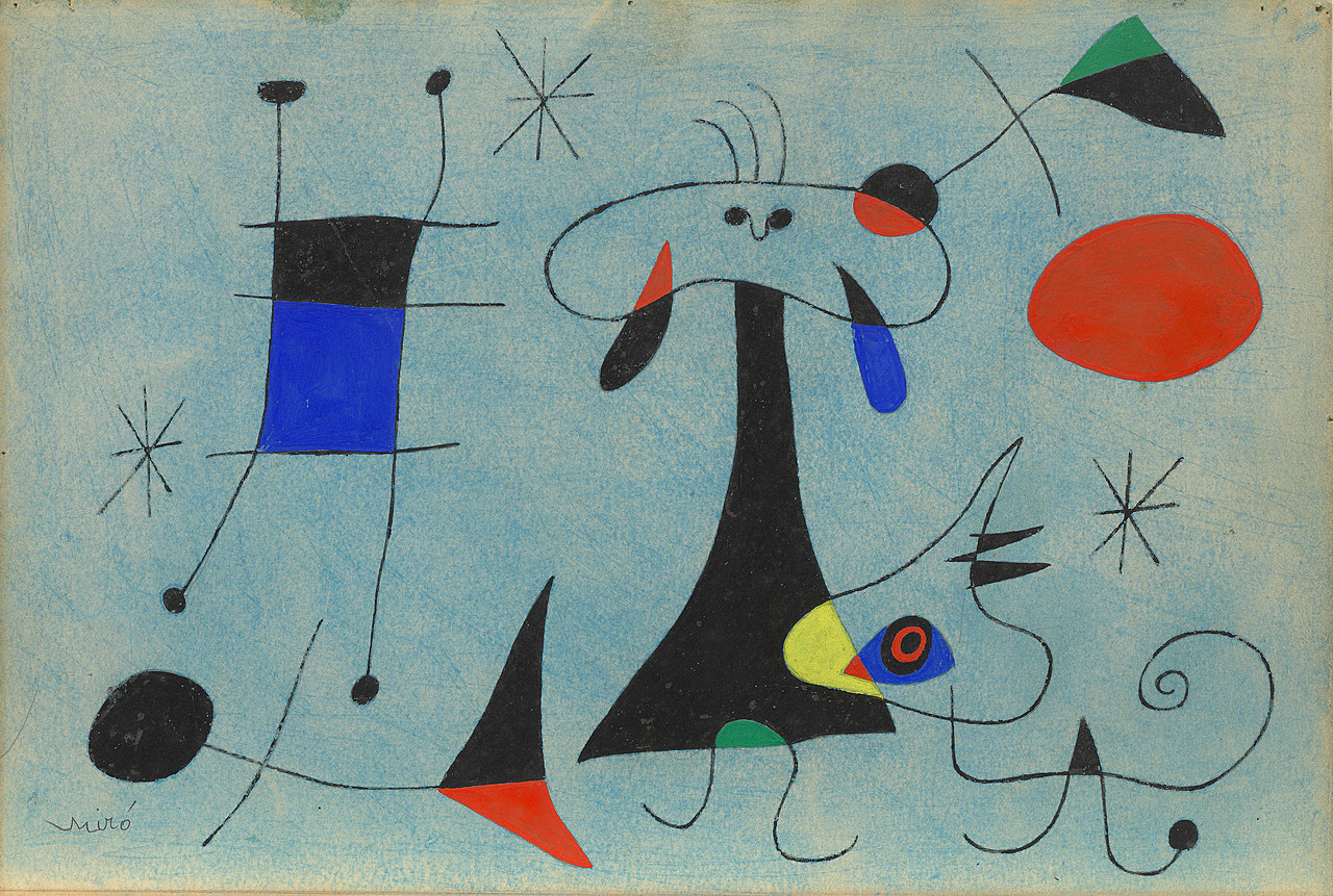
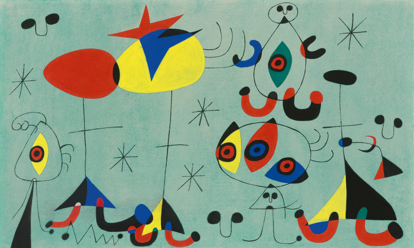
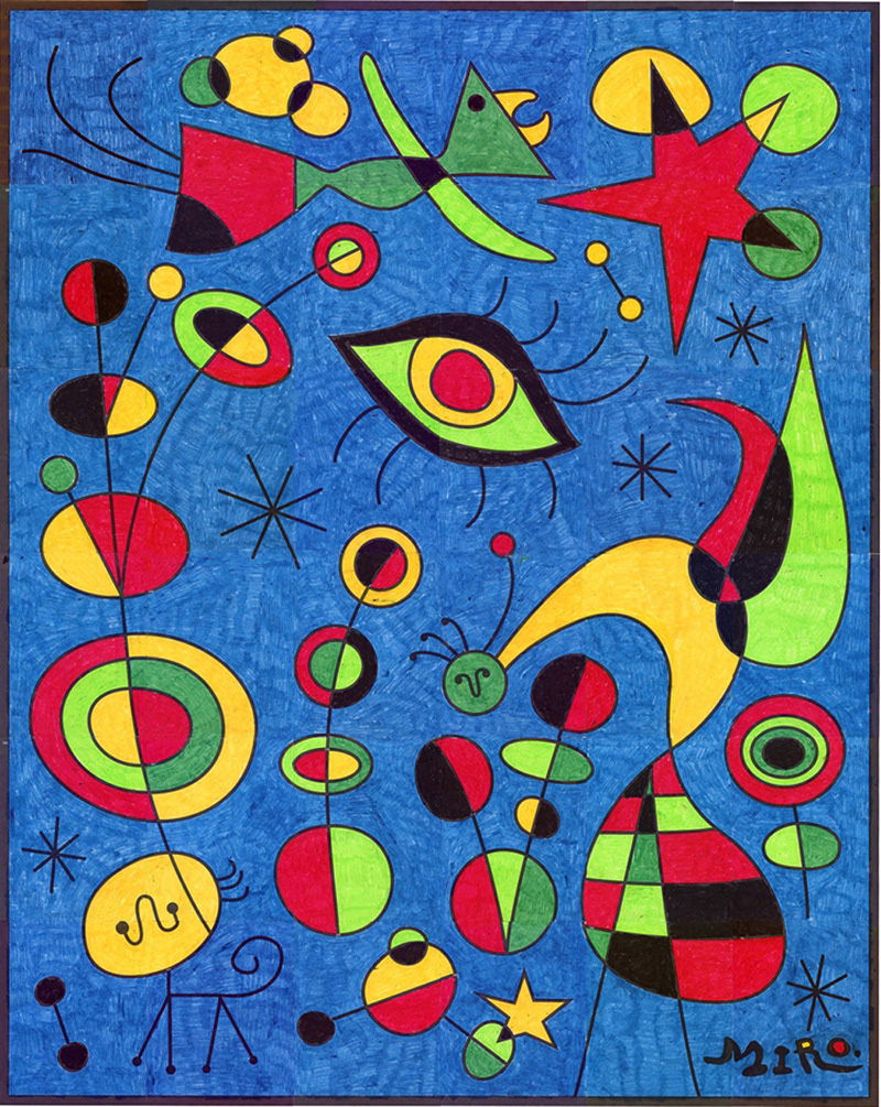
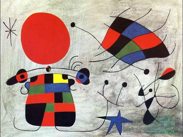
a bit of a different approch to the abstract surrealism, but its mainly in here for the use of colour and expression. also one of the oldest artists i have looked at, Joan Miró is a spanish painter and sculptor.
https://www.joan-miro.net/
https://www.joan-miro.net/
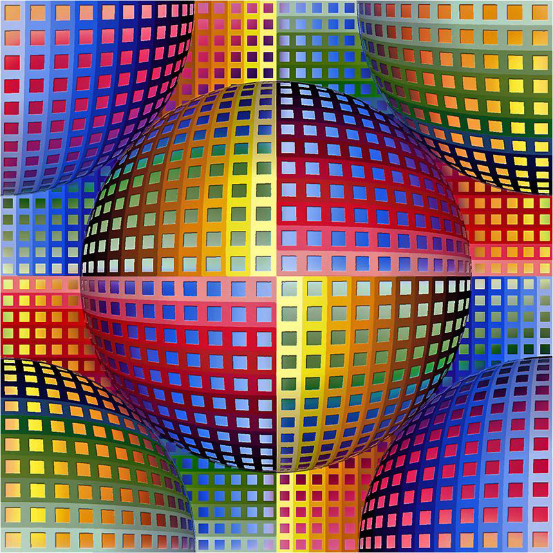
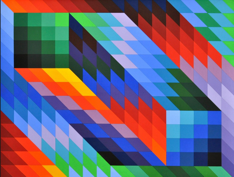
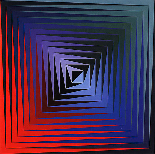
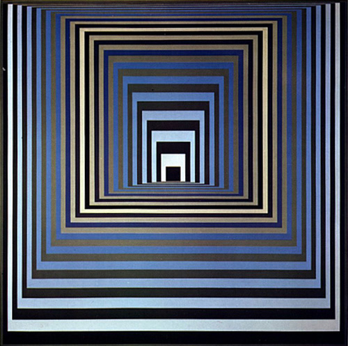
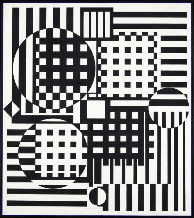
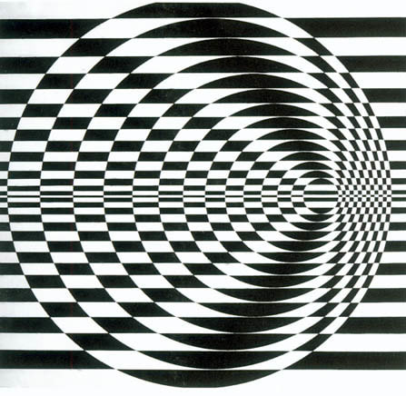
Victor Vasarely

bridget riley

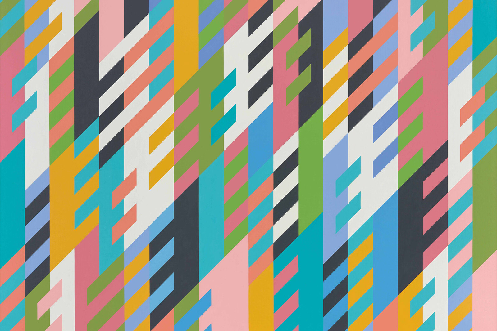


patterns that were quite popular in the 60s were paisley, polka dots, tie-dye, geometric prints, floral designs, and psychedelic prints
Trenton Doyle Hancock